How Many Squares
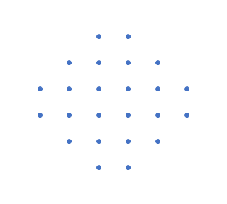
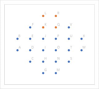
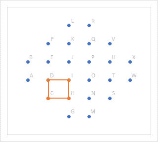
My friend and colleague Carlos Barboza posted a question on LinkedIn: How Many Squares? Given the partial grid of dots shown, how many squares can you form using these dots as the vertices of the squares?

Challenge Accepted!
I decided to make my own workbook, so I could more easily keep track of squares as I identified them. Then I decided I’d set up a way to draw each of those squares in turn. Then I added a scrollbar to make it easy to select and display any of these squares. I built this workbook in much less time than it took me to write this article about it, and probably in less time than it is taking you to read the article.
You can download my workbook from the link below (actually it’s a zip file containing the workbook).

Setting up the Dots
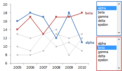
Here is the data I used to plot the dots in an XY Scatter chart. I labeled these 24 points with the letters A-X and added a (nonexistent) point Z to my list with #N/A for its X and Y values. I plotted the dots using Excel’s default blue color for the first series, and I used light gray text for the labels. The labels help to keep track of the points while counting squares.
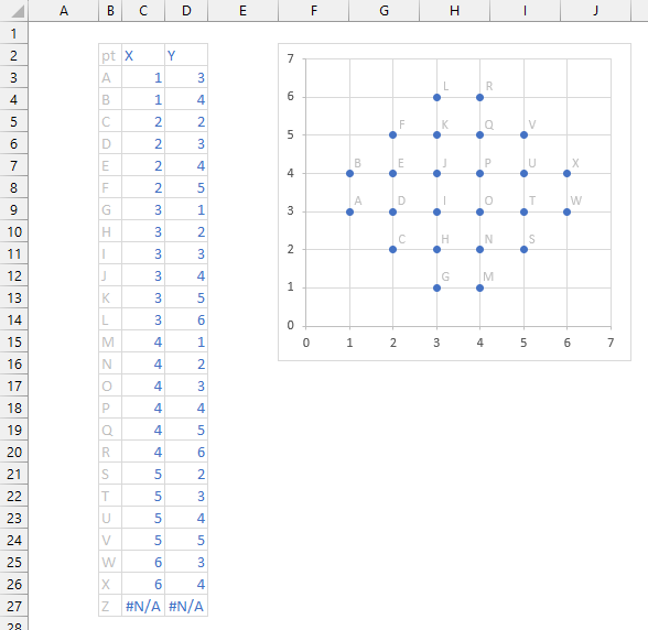
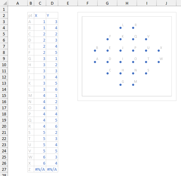
Then I hid axes and gridlines and used a light gray for the plot area border. The two outlines (plot area and chart area) seem redundant….
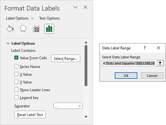
You can label data points using a different range than the X and Y values. Select the labels and press Ctrl+1 to format them. Uncheck all the other boxes in the task pane, check Values From Cells, click on Select Range, then select the range containing the labels.
Listing the Squares
No, I didn’t write an algorithm so Excel could count the squares. I’m not that smart, and I find this kind of mental exercise challenging.
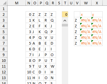
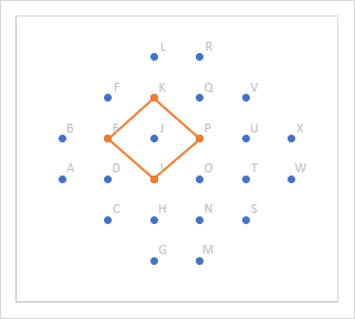
I manually identified all of the squares I could find (I missed a couple the first time through, doh!). I’ve listed all 46 of them below by number and by the four points that make up their vertices, clockwise around the square. There is also a phantom square zero, using point Z for all of its corners.
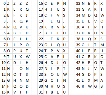
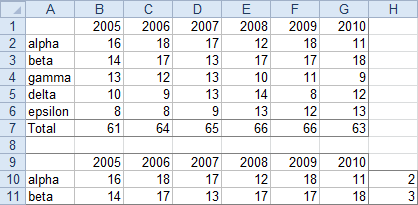
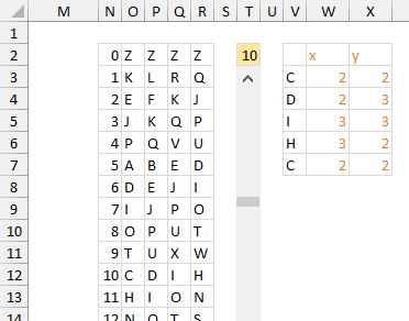
Actually, I put the squares into a single list, shown below in columns N:R. I broke up the list in thedisplay above to make it fit nicely.
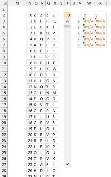
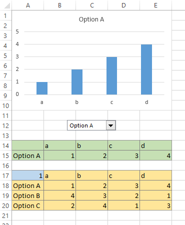
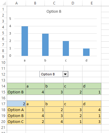
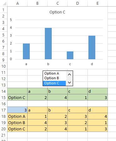
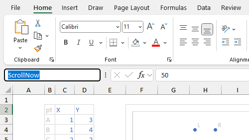
This view also shows the infrastructure used for drawing a square in my chart of dots. I’ve added a Form Menu Scrollbar, which covers T3:T27, to facilitate selecting a particular square. Cell T2, shaded gold above, is named ScrollNow and contains the number of the current square. Cell T3 is named ScrollMin and contains zero. Cell T4 is named ScrollMax and contains the number 46. Cells T3 and T4 are hidden by the Scrollbar.
To name a cell or range, select the cell or range, type a name in the Name Box (to the left of the Formula bar), and press Enter.
The range V2:X7 shows the nodes and coordinates of the current square. Cells V3:V7 contain the point labels for all four nodes, with the first node repeated as the fifth to close the square. In case of bad input (a value not found in column N), IFERROR returns node Z, which has #N/A coordinates and will not be plotted. The formulas in W3 and X3 are copied down to row 7 and contain the X and Y coordinates of each node. Here are the formulas you need:
V3: =IFERROR(INDEX($O$2:$O$48,$T$2+1),"Z") V4: =W3: =INDEX(C$3:C$27,MATCH($V3,$B$3:$B$27)) X3: =INDEX(D$3:D$27,MATCH($V3,$B$3:$B$27))IFERROR(INDEX($P$2:$P$48,$T$2+1),"Z") V5: =IFERROR(INDEX($Q$2:$Q$48,$T$2+1),"Z") V6: =IFERROR(INDEX($R$2:$R$48,$T$2+1),"Z") V7: =V3
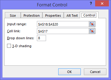
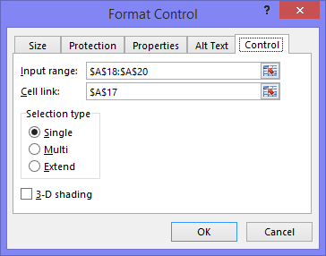
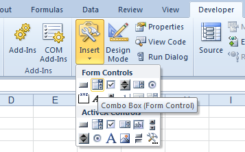
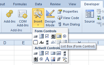
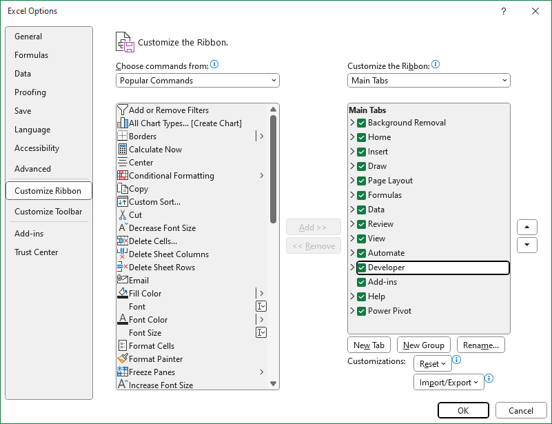
Go to Developer > Insert and choose Form Menu Scroll Bar. If you don’t see the Developer tab, right-click anywhere on the ribbon, select Customize, and in the list on the right, check the box next to Developer.
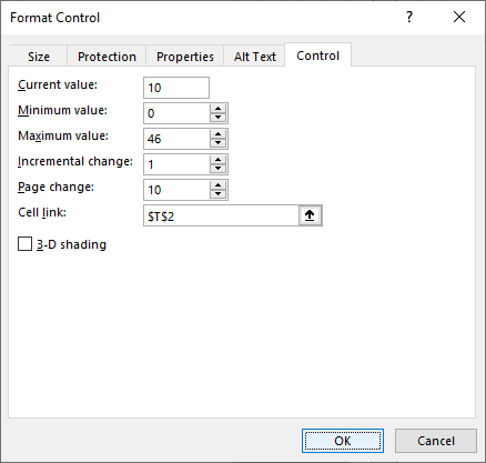
Draw the scrollbar where you want it like any other shape. Right-click on the scrollbar, choose Format Control, and apply these settings:
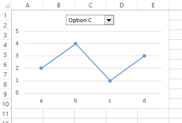
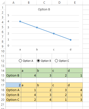
You can now select any square either by dragging the scrollbar or by directly entering a value into cell T2 (the gold-shaded cell). The magic of these Form Controls is that they work bidirectionally: changing the scrollbar changes the cell, and changing the cell changes the scrollbar.
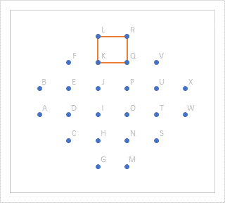
Here is what the data looks like when the current square is number zero. Square Zero uses point Z for all corners, and all of its X-Y coordinates are #N/A, so nothing is plotted for Square Zero. We could add the data to the chart now, but it’s more satisfying when there is actually data to plot.
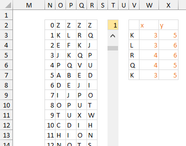
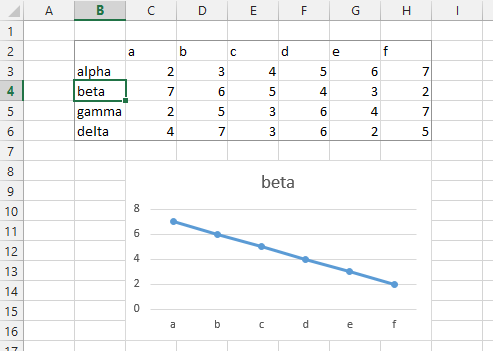
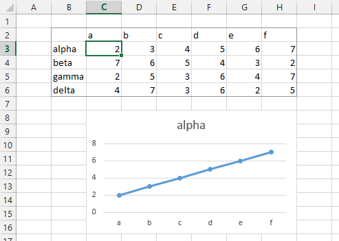
When the current square is number 1, here is our data. The lookups in column V have identified nodes K, L, R, Q, and K again, and the lookups in W:X have found the appropriate X and Y values for these nodes.
Plotting the Squares
Let’s plot the data now. Copy W2:X7. If your version of Excel is among the latest builds released (as of this writing), right-click on the chart area (the outer margin of the chart) and choose Paste Special from the pop-up menu. Microsoft recently added Paste Special to this menu item after I kept bugging them.
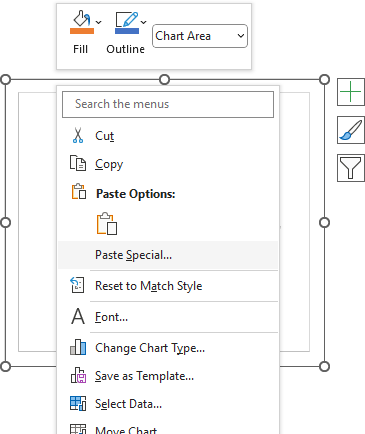
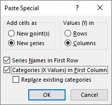
If you don’t see the Paste Special menu item, then after copying the date, select the chart, go to Home > Paste > Paste Special, or use the Ctrl+Alt+V shortcut. Any of these will bring up the Paste Special dialog, and you should select these options: Add Cells As New Series, Series Names in First Row, Categories (X Values) In First Column.
Our original XY Scatter Chart used markers only, so our square one data is added as markers only. The color is Excel’s default orange color for the second series.
No problem, just format the series so it uses the default (automatic) lines. But where did the markers go?
Excel is funny about this. There is a well-defined order in which chart series are drawn. First all Area Chart series, primary then secondary axis, then all Column and Bar Chart series, primary then secondary, then all Line chart series, then all XY Scatter series. But within all of the XY Scatter series, it plots series with lines and markers first, then series with markers only, on primary then secondary axes. So the blue circles are actually plotted on top of the orange ones, apparently out of logical order, but in Excel order.
We need to take one more step and assign the new series to the secondary axis. Excel adds a secondary Y axis, but we can delete that and all points will use the primary axes. Now we get the expected chart.
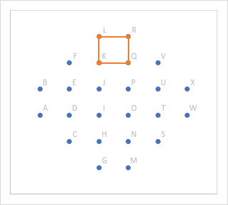
Now if we select another square number, say 10, we get that square’s nodes listed in column V and their X and Y values in columns W and X…
… and this square is now shown in the chart.
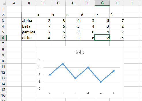
Here’s square 22. Now we have a truly interactive chart, driven by the scrollbar.
Interactive Charts
This chart is an example of an Interactive Chart. The scrollbar allows a user to easily interact with the chart to show what the user wants to see.
Automated Charts
In How Many Squares? (2. Animated Chart), I show how to use VBA to automatically cycle through each of the individual squares that can be created using the dots in an Animated Chart.
Make an Animated GIF
How can I talk about animated charts without showing an animated image? How Many Squares? (3. Animated GIF) shows how easy it is to create an animated GIF that cycles through all of our squares.


 Construction