Recently Naomi Robbins, author of Creating More Effective Graphs
, and I discussed the difficulty of making Excel use appropriate axis tick spacing to chart binned data that has unequal bin widths. The example I’ll use here to describe the problem is taken from page 286 of Naomi’s book, under the heading Do not use equally spaced tick marks for uneven intervals on an arithmetic scale. I’ve optically digitized, that is, eyeballed, some data from her chart for the examples here.
Original Line Chart
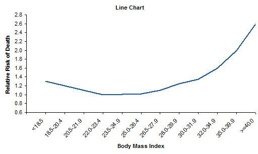
The original line chart looked very much like this, showing normalized mortality rates as a function of body mass index (BMI). This is how not to make your chart.
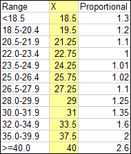
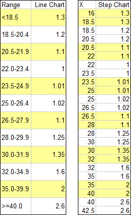
Data was reported as a single value for each range of BMI as in the table below.

Improving the Line Chart
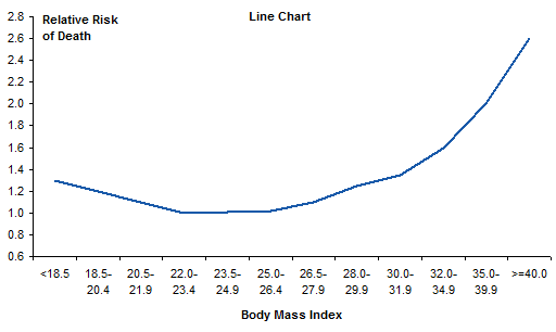
The first improvement we can make to the original chart is to rotate all labels into the horizontal orientation, so they are easier to read.
The next step is to change the horizontal spacing so that the separation between points is proportional to the difference in their X axis values. I’ve inserted the yellow column into the data, and in this column I’ve entered the midpoint of each bin range.
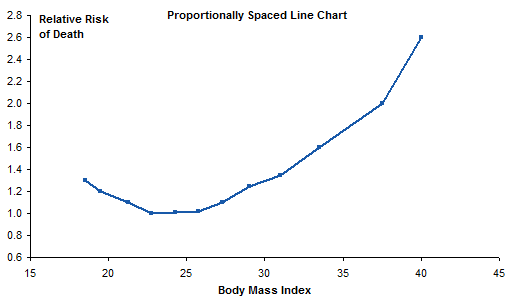
I plotted the mortality values against this new BMI column, and converted the chart to an XY Scatter chart so the new X values are recognized as numeric values and not equally spaced text labels. I added markers to show the actual points, but made the markers small so they aren’t emphasized with respect to the connecting lines.
Pretty good, but we have lost the bin range labels. No problem, let’s just add data labels to the series. You can add any type of labels (series name, Y values, whatever) and change the text of the labels manually, or you can use Rob Bovey’s Chart Labeler to do it automatically.
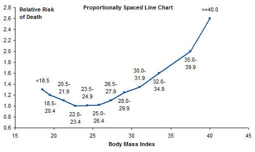
Yuck, that’s too cluttered. It was even worse when I initially had all labels below their respective points.
Let’s keep the points and their proportional spacing, but put the labels along the horizontal axis, as in the original chart. We can’t do that with built-in axis labels, but we can add a second series to the chart, with data labels. I added a column to hold the Y values for the added series; the Y values are equal to the axis minimum of 0.6.

Here I’ve highlighted the new series, and used the Chart Labeler (see link above) to add the labels below the points.

I’ve hidden the dummy series.
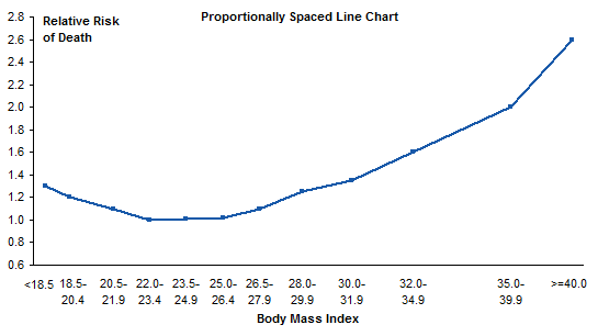
We’re still missing something: tick marks. Let’s add short vertical error bars to the dummy series. (See my article Custom Error Bars in Excel Charts for some helpful hints, and for a simply free utility I wrote to make it easier, even in Excel 2003 where it’s already pretty easy.) I placed a value in a cell, and used that cell as my custom error bar source range. My first value was way off, producing huge error bars. But by linking the error bars to the custom value in a cell, I made it easy to adjust the error bars until they looked appropriate, at a custom value of 0.04.

That’s quite an improvement over the original.
Alternative: Step Chart
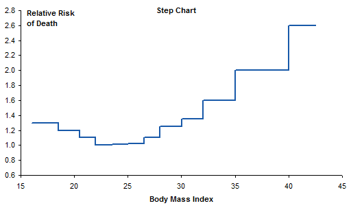
I decided to make a step chart, in which each horizontal line segment spans the bin range at the Y value for that bin. I split each data point from the original data into two points, one at either end of the bin range. I chose endpoints that extended a reasonable distance beyond their bin cutoffs.
And here’s the step chart. No need for bin range labels, because you can see where the bin edges are along the X axis. And it makes clear that each bin’s value is constant across the bin. Well, it isn’t really constant, but the way that the data was presented implies that it is.
Alternative: Histogram
Another variation is to make a histogram with variable width bins. Can’t do this with a column chart in Excel: all those columns have to be the same width. This chart was made with the original line chart data, which leads to equal width bins for unequal bin ranges. I did not make the common mistake of starting the vertical axis at the same minimum (0.6) that was suitable for the line charts.
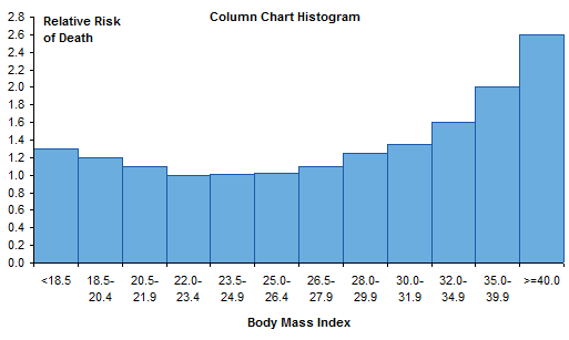
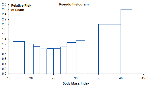
Instead of a column chart, we’ll use an XY chart and draw just the outlines of the columns. To do this we take the step chart data, and insert a row between each pair of duplicate X values. We copy in the X value from the cell above and assign a Y value of zero. This will produce a line from the end of one bin, straight down to the horizontal axis, then straight up to the start of the next bin.

Plot the data in an XY chart to get the pseudo-histogram. I left the endpoints at their Y values, not at zero, to indicate that these bins were not enclosed, but extended indefinitely. And again, I started the vertical axis at zero.
Summary
In her book, Naomi Robbins says Do not use equally spaced tick marks for uneven intervals on an arithmetic scale. Here I’ve demonstrated a few techniques to use proportionally spaced data points. Some are based on the “How Not To” line chart example in her book, and some are more intricate. Of all the options, I think I like the step chart best. It’s clean and uncluttered, and shows real values along both axes.


