High-low lines are a feature of Excel line charts that connect the high and low points at a given category. For example, in a stock chart the high-low lines connect the high and low value for each date in the chart.
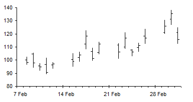
A high-low line connects the highest of the values for a given category to the lowest of the values at that same category. All that is needed is two or more series with a point at that category.
If there are line series on primary and secondary axes, then you can have high-low lines for the primary axis group of series, and an independent set of high-low lines for the secondary axis group.
Connecting Any Two Points With High-Low Lines
An Excel user emailed me with a question: How can I connect any two points with high-low lines?
The user did not provide context for this question, so I’ve invented my own context.
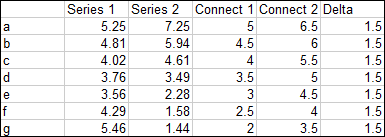
Suppose I have two sets of points I want to use for high-low lines, and I want to plot two other series to show how (or whether) they fit within the limits defined by these high-low lines. The following data shows data for the two lines to be connected (Connect 1 and 2) and the two series to be compared (Series 1 and 2).
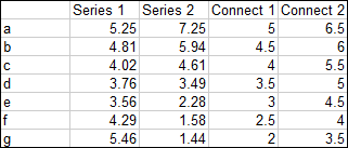
Here are these four series in a line chart:

When high-low lines are added, they do not automatically connect the two series we want connected. The high-low lines connect the highest and lowest points, just like the name implies.

Excel is nothing if not flexible, and there are at least three ways to accomplish the goal of connecting only the Connect 1 and 2 series with high-low lines.
Adding High-Low Lines to an Excel Chart
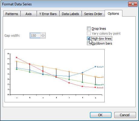
In Excel 2003 and earlier it is easy and straightforward to add high-low lines to a set of line chart series. Double click any of them to open the Format Series dialog. Click on the Options tab, and check the High-Low Lines box. The high-low lines are automatically assigned to all series in the same axis group.
In Excel 2007 adding high-low lines is a bit more obscure. Select the series, then go to the Chart Tools > Layout tab. Over towards the right, in the Analysis group, click Lines, then High-low Lines.

High-low lines can be formatted the same way as any other line elements in a chart.
Arbitrary High-Low Lines Using Secondary Axis
Move Series 1 and Series 2 to the secondary axis.

Delete the secondary Y axis (Excel usually doen’t give us a secondary X axis if the chart types are the same). This keeps the series in separate axis groups, but all series use the existing axis scales.
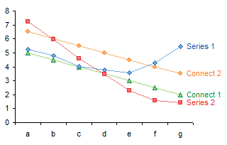
Add high-low lines to Connect 1 and 2 on the primary axis. These lines now ignore Series 1 and 2.
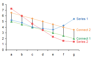
Format as desired. I’ve used the high-low lines to indicate a range within which Series 1 and 2 values might be expected to lie.
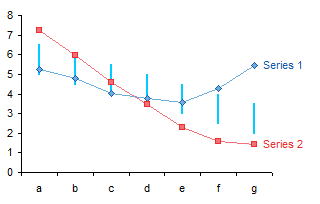
Arbitrary High-Low Lines Using XY Series
High-low lines only connect line chart series, while ignoring XY and other series. We exploit this behavior by changing Series 1 and 2 to XY chart type series.
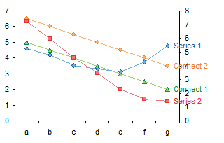
Delete the secondary axis, or better yet, move Series 1 and 2 to the primary axis.

Add high-low lines to Connect 1 and 2.

And format as required.

High-Low Lines Using Error Bars
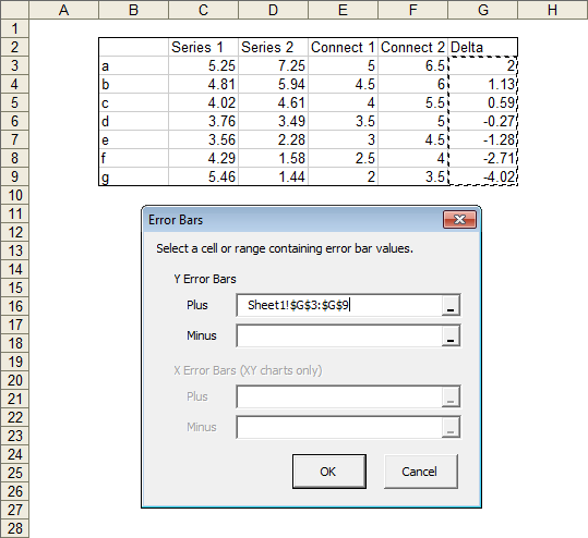
You can use Y error bars to simulate high-low lines. You need to add a column to the data table which has the difference between Connect 2 and Connect 1. This column will be used for custom error bar values.
No need to change any series chart types or move series between axes. Just add error bars to Connect 1 using the added Delta column above as positive Y custom values.
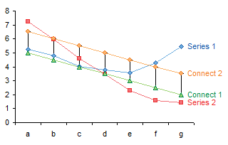
Hide Connect 1 and 2 (format with no markers and no lines). In fact, Connect 2 doesn’t even need to be in the chart.

Error bars can be formatted like any other line element, so format away.

Adding Error Bars to an Excel Chart
I’ve covered error bars in Error Bars in Excel 2007 Charts. It’s straightforward in Excel 2003 and earlier, but remarkably obscure in Excel 2007. Progress, eh?
I didn’t just describe the Excel 2007 error bar aggravation in the article above. I built an add-in to make error bars easier to create in 2007. The add-in works in Excel 2007 but also in earlier versions. You can download the add-in from a link near the end of the article.
High-Low Line Alternative Without Lines
I’m not sure why the user wanted high-low lines to apply to only some series in the chart. Possibly he was adding a data series to a stock chart, some kind of market index, and it was changing the high-low lines for his stock data. I covered this problem in Stock Charts in Excel 2007.
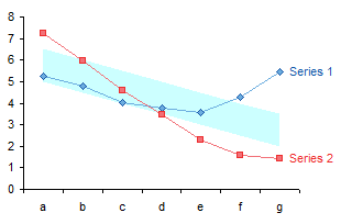
If the high-low lines are there to indicate for example an acceptable range for Series 1 and 2, keeping the Connect 1 and 2 lines might help delineate the limits defined by the high-low lines.

But all these lines are a distracting way to indicate a particular range on a chart. Why not build a shaded region to do this?
Change the data for Connect 2 so it uses the Delta column, then convert Connect 1 and 2 into stacked area chart type series.

If desired change the X axis so the Y axis crosses “between categories” (2003) or “between tick marks” (2007).

Format Connect 1 so it’s invisible (no border, no fill), then remove the border of Connect 2 and use a light shade for its fill.
Floating Columns/Bars
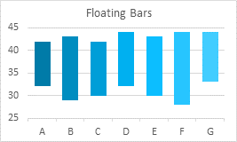
Floating bars or columns in a chart can be a good alternative to High-Low Lines. See Floating Bars in Excel Charts for a detailed discussion of all the ways to create floating bars in Excel charts.
