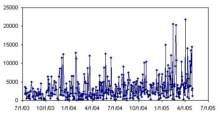
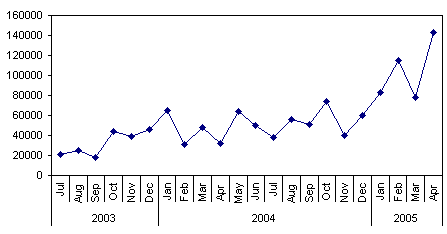
You can add flexibility to your data analysis by grouping variables. For example, you may have daily sales figures that fluctuate greatly in value, some days having no sales at all, some days with small values, and some with large values. A plot of this data is very noisy, and it’s hard to see any patterns.

In a pivot table, you can group dates by various measures ranging from seconds to years, to get a clearer view of the data. Plotting by month will smooth out the noise of a daily plot.

You can combine groupings, for example, to compare monthly sales by year.


