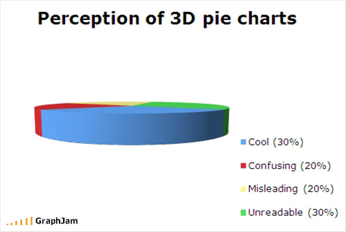
Federico gives us this excellent example of a 3D pie chart, thanks to GraphJam.

The only way I can think of to improve this chart is to explode the segments.

Oh yeah, and animate it. I’ve done just that in this zipped workbook.
GraphJam ought to be banned. After I came across the pie chart at the top of the page (I forget where I first saw it, but thanks somebody!), my daughter and I wasted spent an hour laughing at other graphs.
Before you think I’m completely against pie charts altogether, let me say that there are some pie charts, even in 3D and exploded varieties, which are acceptable and even welcome. This one came to me thanks to Nathan of Flowing Data. It is actually a commercial product by Mary and Matt.

I feel a Homer moment coming on.


