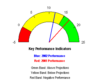
At least monthly I receive a request to design a speedometer graph, or to resurrect an old tutorial which once (dis)graced my web site. It’s as though I would change my mind about these gauges if someone asked nicely. Last week I received another nice request, and this post paraphrases my response.
Yes, I did once have a tutorial that showed how to make a speedometer chart. But there were a couple of reasons that prompted me to take it down. First, it was very complicated, requiring a good working knowledge of algebra and trigonometry, and I got lots of emails asking me to clarify the protocol. Second and more important, these charts are particularly ineffective in the display of information. I removed that tutorial from my web site, and it has also disappeared from the computers in my office. No use asking: it’s gone and I will not reconstruct it.

I know you were probably instructed by a supervisor to use pretty dials, and probably 3D charts as well, and pretty colors, and flashing lights, and maybe a buzzer or two. What the boss wants, in this case, is not what the boss should get.
Dials and Gauges
Here are a few articles written about how poor dials are for displaying data, and how the cockpit of a fighter jet or the dashboard of a Formula One racing car makes a poor metaphor for a business dashboard:
Be as provocative as you wish, but back your opinions with substance – Stephen Few
Down With Gauges! – Charley Kyd
Car Dashboards – A Broken Metaphor for Executive Dashboards – Jorge Camoes
The Ultimate Business Driving Machine – Zach Gemagnini
Speedometer Chart – this web site
Bullet Graphs
![]()
If you do want to use some kind of single-value indicator, you could use a bullet graph. Though it only shows one value against a background scale, a bullet graph takes up minimal space, so its use leads to greater data density. Bullet graphs are well suited for use in tables, because they can be as small as a cell in a row of data. Here are some sources about bullet graphs:
Bullet Graph Design Specification – Stephen Few
How to Create Bullet Graphs To Replace Gauges in Excel – Charley Kyd
How to Make Vertical Bullet Graphs in Excel – this blog
Better Alternatives
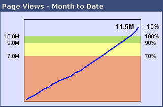
Line charts are a better choice than dials and bullets if you should be showing data over time, instead of a single value.
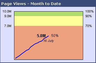
A column or bar chart with appropriate background shading can take the place of multiple bullet charts (see Horizontally Banded Chart Background and Horizontal Bands in the Background of an Excel 2007 Chart).


