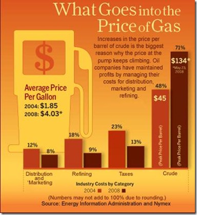
In Data Visualizations Related to Gas Prices, Tony Rose of Support Analytics Consulting shows a series of visualizations he’s culled from the web, all related to gasoline prices. One infographic stuck out, partly for its overuse of chart junk, and partly for Tony’s interpretation. Here is the original chart, which Tony took from www.thebiblog.com, followed by Tony’s comments, which I’ve condensed.

Here is a visual of what makes up the price for gas in 2004, when the average price was $1.85 per gallon versus 2008 where we are now paying roughly $4.03 per gallon on average. . . . One fact that I would have expected to see below is a dramatic increase in the distribution cost of gas between 2004 and 2008, which actually decreased. Seems like there should be an almost perfect correlation between distribution costs and the price of gas, right? Maybe the impact is hidden due to the category being both distribution and marketing.

