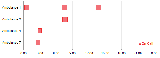
In a recent post, I showed a technique that allowed Repeated Tasks in an Excel Gantt Chart. An Excel Gantt chart consists of a bar chart series showing the duration of a task, stacked on a transparent bar that pushes the visible bar out to the start of the task. My technique added two more series for each repeated task, one for the gap between repeats, the other for the duration of the repeat.
Ever vigilant reader Derek pointed out that this approach necessitated multiple series, and if more instances of a task were added to the data, more pairs of series would have to be added to the chart. A maintenance headache. The simplification Derek suggested makes use of a characteristic of date scale axes in Excel line, column, area, and bar charts: Multiple data points for a given date are plotted in the middle of the slot for that date. Adding a repeated task means adding another row to the data and extending the chart source data to include this new row: Excel will align this repeated task with the others it belongs with. The only trick now is getting a date axis where the categories are text labels.
Gantt Charts in Excel
Gantt charts are made in Excel using stacked horizontal bar charts. The first series in the stack is hidden via formatting (no border and no fill), leaving the upper series to show the duration of each task, floating between its start and finish. I’ve written two tutorials about Gantt charts, Gantt Charts in Microsoft Excel and Advanced Gantt Charts in Microsoft Excel.
First Try
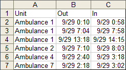
The data from the previous example showed times that ambulances were sent on calls and returned, with columns for the ambulance number, time out, and time in. We’ll add a single column showing the duration of the call, time out minus time in.
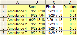
We can use the yellow shaded region and make a stacked bar chart, which results in the following Gantt chart. I’ve already fixed up the chart, hiding the “Start” series, reversing the categories on the vertical axis, and so forth.
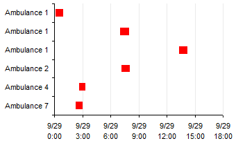
Now we convert the vertical (category) axis to a date-scale axis. Excel 2003: Chart menu > Chart Options > Axes tab, change Category (X) Axis from Automatic to Time Scale. Excel 2007: Right click axis > Format Axis > Main tab, change Axis Type to Date Axis.

Well, the repeats don’t line up, so that’s not going to do it. Since the category labels are text, Excel assigns them a numerical value of zero, and replaces them in the chart with the counting numbers 1, 2, 3, etc. We need to use actual numbers for category axis data.
I’ll admit, I knew this would happen, but I had to justify the steps taken to get a useful category axis below.
Second Try
For the category axis labels, I’ll need a dummy series using the data in A9:B13. I’ve also inserted a column with numbers that I’ll use for the X values in the chart. This is column B, and it uses a lookup formula to assign a number to each ambulance label in column A. The formula in cell B2 is =MATCH(A2,$A$10:$A$13,0), and this is filled down through B7. The formula simply inserts the row within the list below where the label is found.
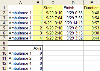
Starting from scratch, I made a stacked bar chart from the yellow highlighted region. So far I’ve only applied changes to the lines and fills. I’ll wait until later to make the “Start” series invisible.
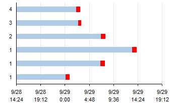
Here I’ve reversed the order of categories on the vertical (category) axis, and set my horizontal (value) axis scale parameters.
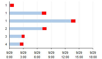
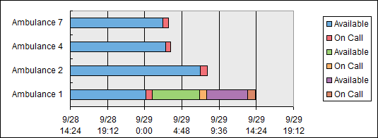
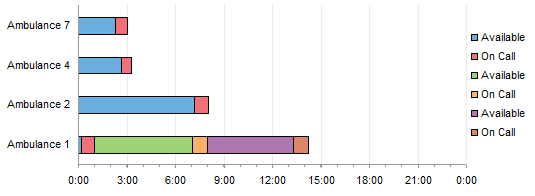
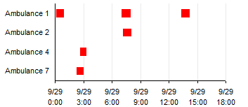
Here’s the trick. I convert the vertical (category) axis to a date-scale axis, and all items with a category value of 1 are plotted in the same line. (Thanks, Derek!) The nice wrapping of the axis labels between the date and time comes naturally in Excel 2003; I don’t know how to achieve it in Excel 2007.

Now we just need to add the informative vertical axis labels.
I copied the data in the lookup table data in A9:B13, selected the chart, and used Paste Special to add the data as a new series, series names in first row, category labels in first column. It looks the same as above (zero value bars stacked on other bars just don’t appear). But when I assign this new series to the secondary axis, the secondary value axis along the top of the chart appears. In Excel 2007, the bottom axis seems to disappear, but it really has just shifted below the bottom edge of the chart area. Select the plot area and drag up the bottom edge, and it will reappear. No such wackiness in Excel 2003.
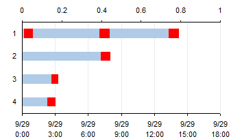
Now we need to add the secondary category axis. Excel 2003: Chart menu > Chart Options > Axes tab, check the box for Secondary Category Axis, and the Automatic type is fine. Excel 2007: Chart Tools > Layout tab > Axes > Secondary Vertical Axis > More Secondary Vertical Axis Options, which adds the default axis and brings up the Format Axis dialog; Check Categories in Reverse Order, and it should be fine.

The right axis is ordered top to bottom automatically in Excel 2003, I assume because Excel applied the same categories in reverse order setting as in the primary vertical axis on the left. In Excel 2007, going through the dialog as described reverses the labels. If you didn’t go through the Format Axis dialog, you need to do so to reorder the labels.
Now the vertical axes need to switch positions. Format the bottom horizontal axis so the category axis crosses at the maximum value, then format the top horizontal axis so the category axis does not cross at the maximum value.
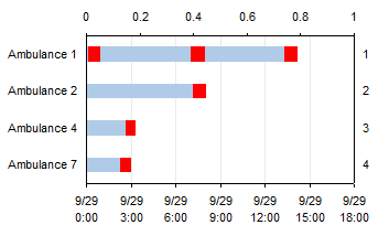
Finally, hide the top and right axes (don’t delete them). Format them so they have no line, no tick marks, and no tick labels.

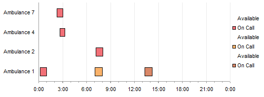
And here it is with the “Start” series hidden.
Thanks, Derek. That will be much easier to maintain.


