Floating Bars and Gantt Charts
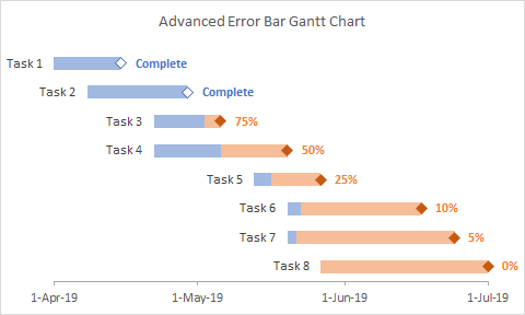
Gantt charts are a special kind of floating bar chart used in scheduling and program management. A list of tasks or activities is plotted along the left hand axis, and dates along the bottom axis. Floating horizontal bars indicate when tasks begin and end, and which tasks are in progress at any given time.
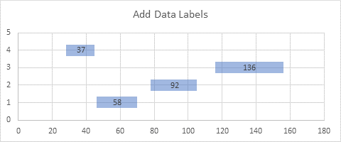
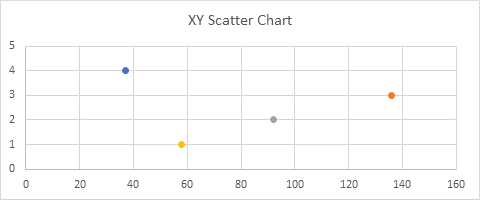
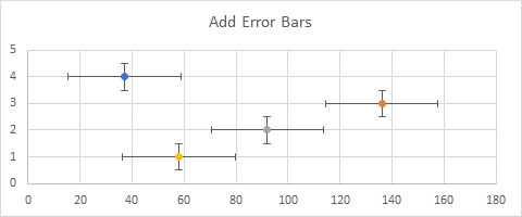
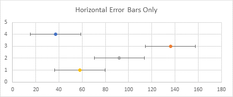
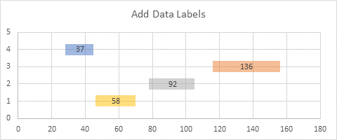
In Floating Bars in Excel Charts I showed several ways to produce vertical or horizontal floating bars in Excel charts, including stacked bar and column charts, XY Scatter chart line segments formatted with thick lines, and error bars formatted with thick lines.
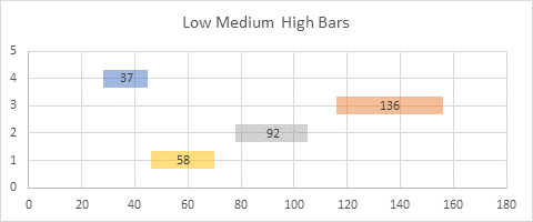
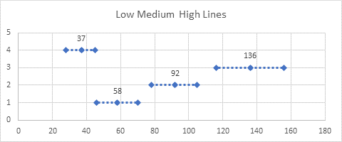
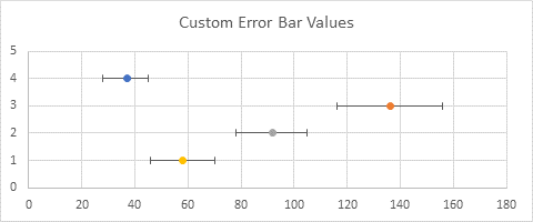
My article Custom Error Bars in Excel describes how to customize error bar values, and I’ve used the error bar-floating bar technique in many ways, such as the recent article that showcased Low-Medium-High charts.
In Gantt Charts in Microsoft Excel, I shared a couple ways to make Gantt charts, including the use of Conditional Formatting to shade cells in the worksheet (which doesn’t actually produce a chart), and the use of floating bar charts to produce the timeline bars.
This tutorial will show how to use custom error bars to create a Gantt chart in Microsoft Excel. It’s also a case study of features in Excel charts, and how to go about designing your own non-native chart in Excel. You’ll see me encounter a few false starts, not unusual as I zero in on a working protocol.
XY Scatter Error Bar Gantt Chart
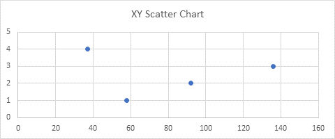
My first approach with almost any non-native custom chart starts with an XY Scatter chart, and make adjustments from there. My plan is to use XY points as the endpoints of the timeline bars, applying negative horizontal error bars to the points, and adding data labels with task names to the right of the points.
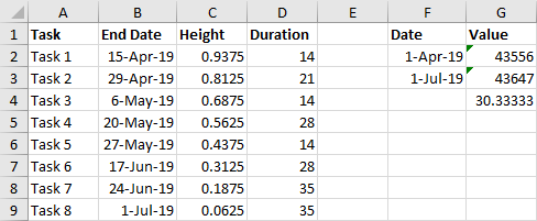
Below is the minimal data needed for the chart I envisioned, in A1:D9. I need columns for Task (a label), End Date (the X values of my points), Height (the Y values of my points), and Duration (the lengths of the timeline bars). I have eight tasks, which I want vertically distributed evenly in the chart. This formula in cell C2, copied into C3:C9, does the trick:
=1-(ROW()-0.5-ROW(E$1))/COUNTA($A$2:$A$9)
I have included a small satellite data region in F1:G4, with two dates in column F (the desired endpoints of my horizontal axis), and the same dates in column G formatted as General. Cell G4 shows the difference between the axis endpoints divided by 3, which I’ll use as the tick spacing of the horizontal axis. You need to know the numeric values of any dates if you want to manually scale an axis, because XY charts don’t accept dates in the Format Axis task pane.
I selected the End Date and Height data (B1:C9) and inserted an XY Scatter chart (below left). I have already added the error bars to the XY Chart series. You can see that the dates are a mess, with the labels so close that they overlap. The vertical axis scale was selected to show tick marks and labels between the horizontal error bars.
The chart below right shows the following improvements (I’ll share the exact steps later, when I’ve developed a protocol I like):
- Deleted vertical error bars
- Added custom negative values only to horizontal error bars
- Formatted the horizontal error bars as thick semitransparent lines
- Added Task labels to XY Scatter points
- Formatted the minimum, maximum, and major unit of the horizontal date axis, using the satellite data I calculated in G2:G4, above.

I haven’t finished cleaning up the chart, but you can easily see the problem. Using an XY chart, I can’t get a nice axis scale with a tick mark and label at the first of each month: my axis has 31-May instead of 1-June. In fact, I recently wrote a tutorial, Gantt Chart with Nice Date Axis, which presented an intricate adjustment to my original Gantt chart that avoids this issue.
Let’s try using a Line chart directly, with a nice date scale axis which inherently provides a nice axis scale.
Line Chart Error Bar Gantt Chart
I applied the same data as above to a Line chart. I did not need the extra “satellite” data, because I can enter dates into a Line chart’s Format Axis task pane.
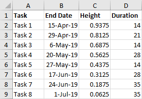
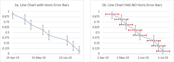
I selected the End Date and Height data (B1:C9) and inserted a Line chart (below left). I have already added the error bars to the Line chart series. The dates only include the End Dates from the table, not the starting date of 1-Apr. As above, the vertical axis scale shows tick marks and labels between the horizontal error bars.
I’ve applied the desired minimum date to the chart below right. I’ve also highlighted why I can’t use this as my error bar Gantt chart: a Line chart series can only have vertical, not horizontal, error bars.
Let’s use a combination chart, with a Line chart for the date axis scale and an XY Scatter chart for the horizontal error bars.
Combination Error Bar Gantt Chart
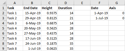
Here is the data range for a combination chart. The XY data is in A1:D9, and the Line chart data is in F1:G3. I selected this Line chart data and inserted a Line chart, below left. The date axis spans the two dates in the data range.
I copied the End Date and Height data (B1:C9), selected the chart, and used Paste Special to add the data to the chart as a new series by columns, using the first row for series names and the first column for X values (below right).
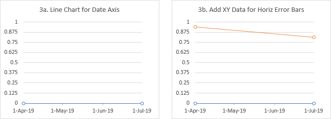
The XY series only shows two points, but that’s okay, because it’s still a Line chart series, and uses the X values for the existing Line series, which only has two points. I converted the added series to an XY Chart type, then added and formatted the horizontal error bars (below left).
Oh yeah, then I moved the added series, now XY Chart type, back to the primary axis (below right). The XY Chart series is plotted at the intended dates, but again, it is reduced to two points.
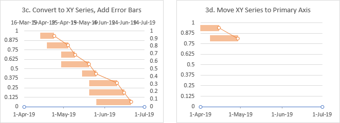
So the problem is that even if the second series doesn’t use the same dates as the first Line chart series, it is limited to having no more points than the first series.

So let’s see if we can pad the Line chart series with extra points.
Simple Combination Error Bar Gantt Chart That Works
You can safely use the following protocol to make a simple Gantt chart. I’ve included all the little steps that you need to follow.
Here is the adjusted data range for a combination chart. The XY data
(Task Name, End Date, Height, and Duration) is in A1:D9, and the Line chart data is in F1:G11. Notice the line chart data in column F now has ten dates, more than needed to plot the endpoints, and more than the number of XY points we will have. The dates between Start and End are evenly spaced.

Select the Line chart data in F1:G11 and insert a Line chart, below left. The date axis spans the two dates in the data range, and the points are uniformly spaced.
Copy the End Date and Height data (B1:C9), select the chart, and use Paste Special (go to the Home tab of Excel’s ribbon, click the Paste button dropdown, select the last item on the menu) to add the data to the chart as a new series by columns, using the first row for series names and the first column for X values (below right).
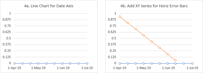
All of the XY points are there, but spaced according to the Line chart dates from the first series, since the new series is not yet converted to an XY Scatter type. Easy enough, right click on the added series, choose Change Series Chart Type from the dropdown, and select an XY Scatter type (below left).
In the same Change Series Chart Type dialog, or in the Format Series task pane, reassign the XY series to the primary axis (below right). Now the points follow the End Date data.
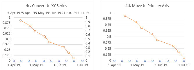
Select the added series, click the plus icon next to the chart, and check Error Bars (below left).
Select the vertical error bars, and press Delete. Then select the horizontal error bars, press Ctrl+1, and in the Format Error Bars task pane, under Error Amount, select Custom and click the Specify Value button. Enter 0 (zero) for Positive, and select the Duration range (D2:D9) for Negative (below right).
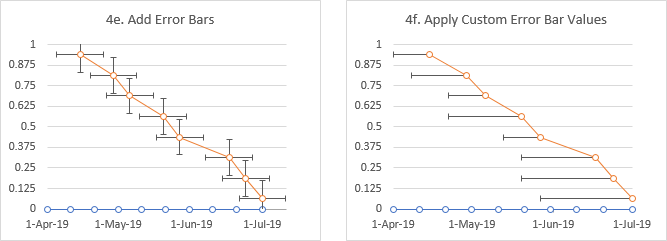
Format the error bar lines. Choose No Cap, then under the paint can, choose a line color and thickness (below left). I used the same orange color as the data points use, with 50% transparency, and with a thickness of 9 points.
Add data labels to the right of the XY markers. I used the Value from Cells option, selecting the Task names in A2:A9 (below right).
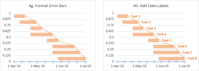
Format the Line and XY series to show no markers and no lines, select None for the vertical axis labels, and remove the gridlines, and the error bar Gantt chart is finished.
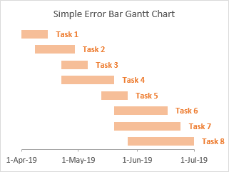
Label Variation in Above Gantt Chart
You want the Task labels before the bars, not after them? You can use the same protocol, replacing Start dates for End dates, and switching the positions of the error bars and data labels.
The adjusted data range for a combination chart is shown below. The XY data (Task Name, Start Date, Height, and Duration) is in A1:D9, and the Line chart data is in F1:G11. Notice the line chart data now has ten dates, more than needed to plot the endpoints, and more than the number of XY points we will have. The dates between Start and End are evenly spaced.
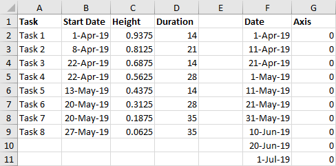
Select the Line chart data in F1:G11 and insert a Line chart, below left. The date axis spans the two dates in the data range, and the points are uniformly spaced.
Copy the Start Date and Height data (B1:C9), select the chart, and use Paste Special to add the data to the chart as a new series by columns, using the first row for series names and the first column for X values (below right).

Right click on the added series, choose Change Series Chart Type from the dropdown, and select an XY Scatter type (below left). In the same dialog, or from the Format Series task pane, reassign the XY series to the primary axis (below right).

Select the added series, click the plus icon next to the chart, and check Error Bars (below left). Select the vertical error bars, and press Delete. Then select the horizontal error bars, press Ctrl+1, and in the Format Error Bars task pane, under Error Amount, select Custom then click the Specify Value button. Select the Duration range (D2:D9) for Positive, and enter 0 (zero) for Negative.
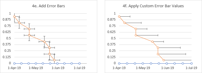
Choose No Cap for the error bars, then under the paint can, choose a line color and thickness (below left). I used the same orange color as the data points use, with 50% transparency, and with a line thickness of 9 points.
Add data labels to the left of the XY markers. I used the Value from Cells option, selecting the Task names in A2:A9 (below right).
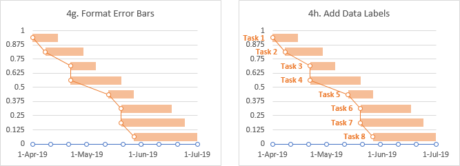
A little clean-up, and your simple error bar Gantt chart is done.

Advanced Combination Error Bar Gantt Chart
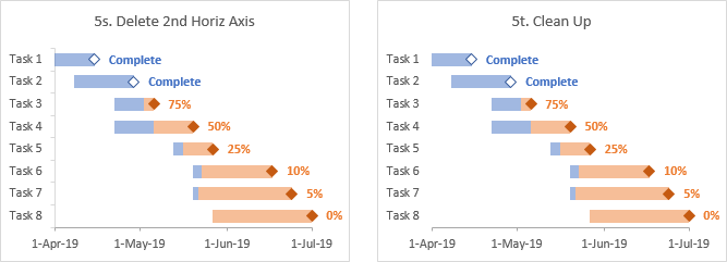
Let’s extend out Gantt Chart methodology to show more of our project data. We’ll indicate percent complete for each task with a data label, we’ll split each horizontal bar into a completed portion in blue and an incomplete portion in orange, and we’ll use distinct milestone markers for completed and incomplete tasks.
Our advanced Gantt chart data range is much larger than either simple range above. Task names are in column A. The next three columns are Start Date, Duration, and End Date, related to each other by addition or subtraction. Percent Complete is in column E. The next two columns are the Done and Not Done portions of Duration, defined by these formulas:
=E2*C2
=(1-E2)*C2
Then come the Complete and Incomplete End Dates, defined by
=IF(E2=1,D2,NA())
=IF(E2<1,D2,NA())
Finally we have Height in column J, defined as before:
=1-(ROW()-0.5-ROW(J$1))/COUNTA($A$2:$A$9)
In a separate range we have data for the Line chart in L1:M11.

Select the Date and Axis data in L1:M11, and insert a line chart (below left).
Select the Start Date data (B1:B9), then hold Ctrl while you select the Height data (J1:J9), press Ctrl+C to copy, then select the chart, and use Paste Special to add the data as a new series in columns, series names in first row, categories (X values) in first column (below right). I’ve added a legend temporarily, to help keep track of all the series we’re adding; I’ve also changed the series name from cell J1 to cell B1.

Right click on the added series, choose Change Series Chart Type from the dropdown, and select an XY Scatter type (below left). In the same dialog, or from the Format Series task pane, reassign the XY series to the primary axis (below right).
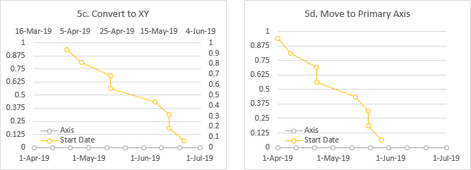
Select the Complete dates (H1:H9), then hold Ctrl while you select the Height data (J1:J9), press Ctrl+C to copy, then select the chart, and use Paste Special to add the data as a new series in columns, series names in first row, categories (X values) in first column (below left). I’ve changed the series name from cell J1 to cell H1.
Select the Incomplete dates (I1:I9), then hold Ctrl while you select the Height data (J1:J9), press Ctrl+C to copy, then select the chart, and use Paste Special to add the data as a new series in columns, series names in first row, categories (X values) in first column (below right). I’ve changed the series name from cell J1 to cell I1.
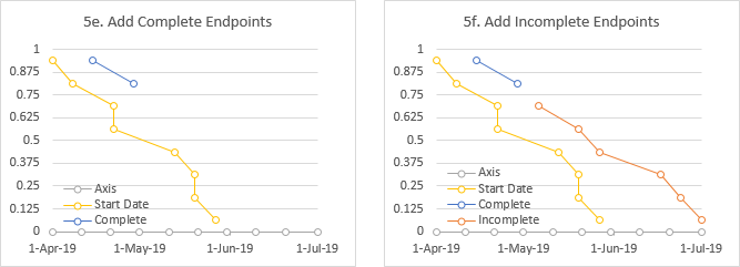
Eventually the markers for Complete and Incomplete will become our milestone markers. We will label the Complete markers “Complete” (conveniently the series name), and the Incomplete markers with the percent complete. We will extend the blue Done timeline bars from Start Date towards the right (positive error bars), and the orange Not Done timeline bars from Incomplete to the left (negative error bars). Then we’ll label the Tasks in one of two ways.
Select the Start Date series, click the plus icon next to the chart, and check Error Bars. Repeat for the Incomplete series. I have already colored the error bar lines blue and orange (below left).
Select the vertical error bars for Start Date, and press Delete. Repeat for Incomplete (below right).
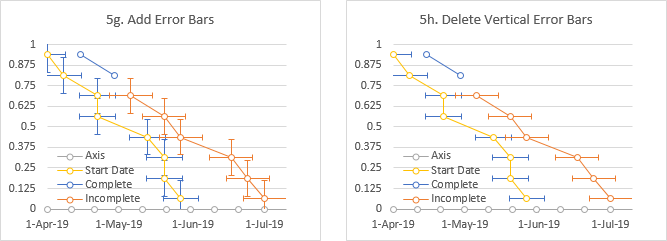
Select the horizontal error bars for Start Date, press Ctrl+1, and in the Format Error Bars task pane, under Error Amount, select Custom and click the Specify Value button. Select the Done range (F2:F9) for Positive, and enter 0 (zero) for Negative. Repeat with the horizontal error bars for Incomplete, entering 0 for Positive and the Not Done range (G2:G9) for Negative (below left).
Format the lines for both sets of horizontal error bars. I used Blue for the Start Date error bars and orange for Incomplete, with 50% transparency for both colors, and a line thickness of 9 points for both (below right).
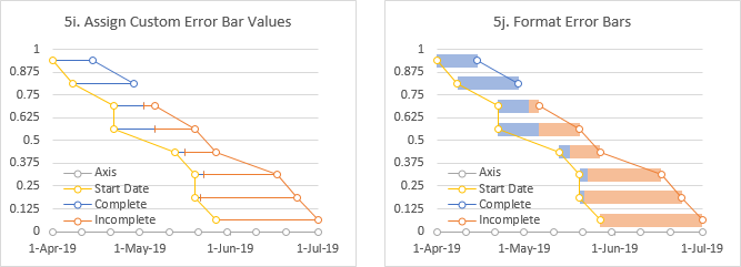
Time to perform a little clean-up. Format each series too use no lines. Format Axis and Start Date to use no markers. Format the milestone markers for Complete and Incomplete as desired. Format the vertical axis, and choose None for the labels. Delete the gridlines (below left).
Add data labels to the Complete series, and choose the option Label Contains Series Name. Add data labels to the Incomplete series, and choose the Label Contains Value From Cells, and select the % Complete range (E2:E9) as the source for the labels. I’ve used a font color to match the bar and marker color scheme (below right).

Now decide if you want the Task labels at the start of each bar (below left) or along the vertical axis at the left hand edge of the chart (below right)
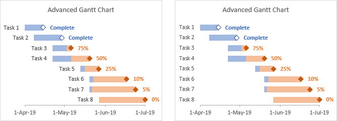
Task labels at the beginning of the bars require only one additional step. Add data labels to the left of the Start Date points (the markers are no longer visible, but you can point and click at the beginning of the bars to select them). Use Label Contains Value From Cells, selecting the Task names in A2:A9 (below left).
Task labels along the left edge of the chart requires several more steps. First, select the Task Names (and header) in A1:A9, hold Ctrl while selecting most of the last Axis column (M1:M9), press Ctrl+C to copy, select the chart and use Paste Special to add the data as a new series in columns, etc. The points don’t appear, but they do exist (below right)

Right click on any series, select Change Series Chart Type, find the last added series, and change it to a Bar chart. The points still don’t appear, but you should see a secondary horizontal axis along the top of the chart (below left). Click the plus icon next to the chart, click the right-pointing triangle next to Axes, and check Secondary Vertical Axis. The new axis appears along the right edge of the chart, with Task 1 through Task 8 going bottom to top instead of top to bottom. The added bars now appear as thinner blue bars across the chart (below right).
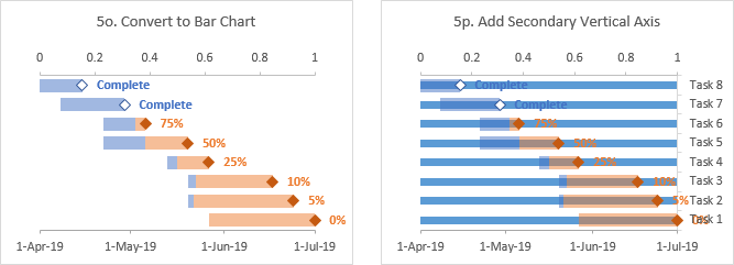
Format the secondary vertical axis, and choose Categories in Reverse Order (below left).
Format the secondary horizontal axis (the numeric axis, not the date axis), and select Vertical Axis Crosses Automatic (below right).
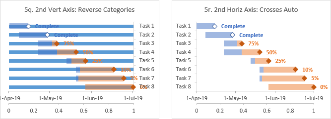
Select the secondary horizontal axis and click Delete (below left). Perform any additional clean-up, such as using no line for the vertical axis (below right).
