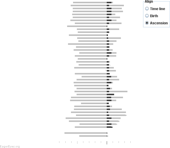
Robert Kosara of EagerEyes.org compares popular vote to electoral college vote in The Electoral College and Second Terms. He came up with a very clever and rather effective bar chart to display his data. I’ve included a mere excerpt of Robert’s chart below, enough to show the visual appearance of the chart. The two series he compares overlap, such that the shorter bar is in front and the longer bar extends further along the axis scale.

Robert liked the way the chart displayed the data, but noted that he had to use a stacked type of chart with numerous additional columns of data to support the required series. I thought about it for a moment, and realized he could use a clustered chart type with full overlap, and only one additional worksheet column and one extra chart series.
I’ll demonstrate the technique on the following dummy data. There are two sets of numbers (“One” and “Two”) for a half dozen categories.

A simple clustered bar chart shows all of the data, but there’s too much back and forth of the two series to allow clear analysis.

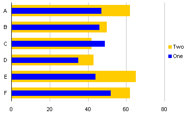
When the two series are overlapped, we only see series “One” where it is greater than series “Two”, in category C.
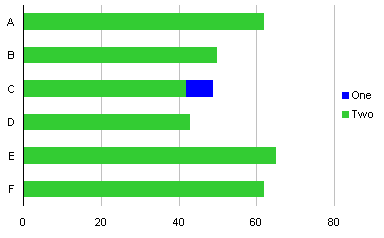
We can address this by adding another column to the data, called “One-A” in the table below. This column has a data value matching that of series “One” if that value is less than the corresponding value of series “Two”; otherwise the value is zero. This results in a second set of series “One” values that will plot in front of series “Two” when overlapped.
The formula in cell D2 (which is copied into D3:D7) is:
=IF(B2<C2,B2,0)

A clustered bar chart now has three series.
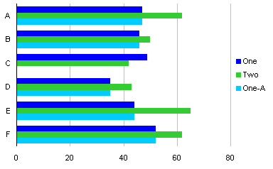
The extra series “One-A” is formatted to match series “One”.

When the series are overlapped 100%, we get the effect Robert worked so hard to achieve, but with a minimum of fuss.

Incidentally, I didn’t care for the gray background below 50% in Robert’s chart. I found that the darker background selectively lightened the foreground bar colors, making it difficult to assess values close to 50%. For Robert’s chart, showing election results, I’d limit my vertical gridlines to 50% and 100%.
Update: October 13, 2008
Robert Kosara has followed up his original post with Popular vs. Electoral Votes Using Stacked Bar Charts, in which he describes the mechanics of his stacked bar approach. The data range looks like this:
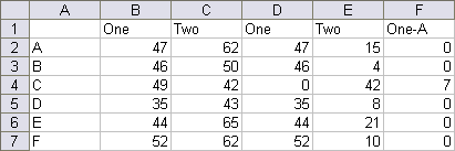
Cells D2, E2 and F2 have the following formulas, which are copied into the rows below.
D2:   =IF(B2<C2,B2,0)
E2:   =C2-D2
F2:   =MAX(0,B2-C2)
Select A1:A7, then hold Ctrl while selecting D1:F7, and create a stacked column chart. Format series One and One-A the same, then remove the One-A legend entry by clicking once to select the legend, then again to select the One-A legend label, then press Delete. The result is visually indistinguishable from the chart just above this update.
Update: October 10, 2008
Reader Stag Lee commented that Robert’s chart type was not intuitive, and suggested a slight modification, as shown here:
The protocol to create this chart is presented in Overlapped Bar Chart – Thinner Bars in Front.


