My friend Jimmy of Code for Excel and Outlook twittered about a chart on TechCrunch that showed the general online assessment of the Olympic coverage by NBC. How We Hate NBC’s Olympics Coverage: A Statistical Breakdown shows an analysis of nearly 20,000 tweets and 5,700 blog posts. The highlight of this analysis is the following chart:
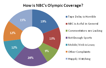
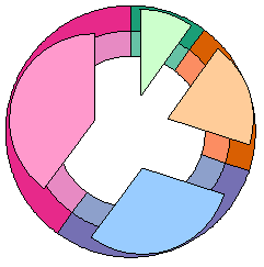
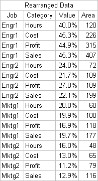
Actually, this isn’t the original chart, theirs was substantially larger. Since theirs was obviously constructed in Excel 2007, I transcribed their data and built my own. Though smaller, this chart lacks none of the features of the original.
Jimmy made some remark in his tweet about the “worst chart ever”, but I have to say, this chart is not even close to the worst ever. It may be in the bottom quartile, but we’re talking about a long, long tail.
So what’s wrong with the chart, anyway?
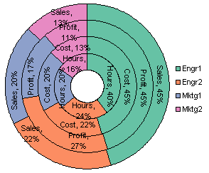
We’ve heard many times about how people just aren’t very good at judging angles or areas, and that makes pies ineffective for all but the simplest parts-of-a-whole displays. Donuts take this one step further, cutting out the central bit of the pie, so we’re relying on areas alone, without any help from the angles where all the wedges meet.
Of course, the donut resembles the big fat zero most viewers would give NBC as their grade.
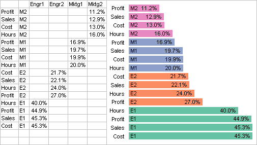
Let’s improve this chart in steps. First, if we sort the data points, we only have to try comparing adjacent points. This also puts the most biting criticism of a sports event, “Not Enough Sports”, right up front.

Now we can put the munchkin back into the donut. We have the angles to help us judge the areas, which may or may not help.

Finally, we can convert the pie pieces into candy bars.
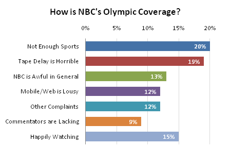
Now the labels are right next to the data points, not off in some distant legend, and the bars are easily ranked by length. The above chart may cause confusion with its multicolored bars, and we don’t want any viewers hunting around for the key to find meaning in the bar colors where none exists, so we use a single color for the bars. Or in this case, two colors. I’ve highlighted “Happily Watching” in a distinct color to set this category off from all the negative ones.
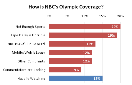
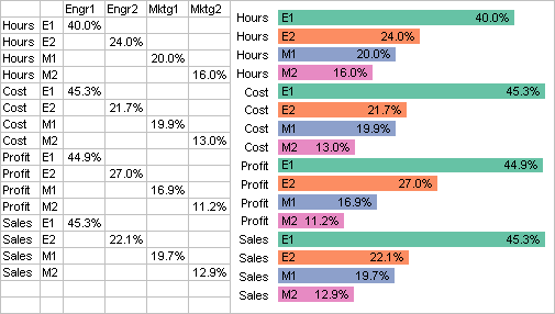
The above chart has two sets of labels. There is the horizontal axis at the top of the chart and the labels at the end of each bar. Is it redundant to have both in the same chart?
We can choose to leave data labels off the points and rely solely on the axis labels.

Or we can keep the data labels on the points, remove the axis, and close up the space between the chart and the title.

Which labeling option to you prefer? Axis labels, data labels, or both?
UPDATE 3 March 2010
Steve Fleming suggested in a comment below that I move all of the data labels between the category labels and the category axis. Good idea.
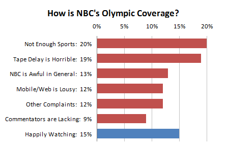
Similarly, the labels can be moved from the ends to the bases of the bars.


