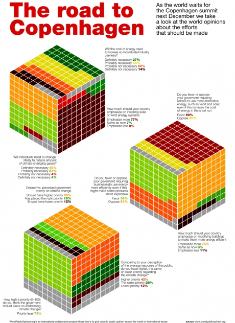
Dustin Smith’s World Opinions on Climate Change article in Chart Porn blog pointed me to an attractive but ultimately ineffective graphic. The road to Copenhagen Summit on Whatype blog presents results of a 2007 World Public Opinion survey of worldwide public sentiment over global warming-related issues. The graphic is reproduced in small size below; click on the image for a full size view.
It’s eye-catching. It also is difficult to read, because of the use of irregularly-shaped polygonal areas to encode values. In fact, the graphic sticks several square pie charts together to make cubical square pies. I addressed square pie charts in Ineffective Chart – Partition Chart Revisited (Defragged), where I noted:
The defragged partition chart reminds me of the “square pie” we first read about in Eager Eyes (Women in IT – Squaring the Pie?), and which was taken up by Juice Analytics (Squaring the Pie), Dashboards by Example (The Square Pie Chart), Anil Dash (Pixels Are The New Pies), Info Clarity (A square pie), Bella Consults (Square pies taste bad), and others.
The square pie chart was all the rage for a while. Consensus seemed to be split between “they’re wicked cool” and they’re even less effective than round pie charts. My own opinion is that they are ineffective: the awkward shapes imposed by rows and columns of filled squares make comparison of areas even more difficult than comparing areas of rectangles with unequal lengths and widths or comparing areas of rotationally misaligned wedges in a pie chart.
As with so many ill-advised charts, a more effective replacement is a bar chart. Here is the Chart Busters version:

I suppose if you felt you had to, you could apply similar colors to those of the cubical square pie chart.

The colors may add to the chart’s ability to get attention, but they may actually detract from its ability to convey information.


