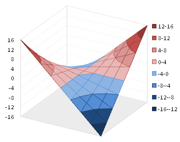
Some time ago I wrote about Surface and Contour Charts in Microsoft Excel in Dian Chapman’s now defunct TechTrax Ezine. In that article I outlined the data requirements for surface and contour charts, and described some of the formatting idiosyncrasies of these charts. That article was valid for Excel versions 97 through 2003, but like so many other aspects of charting, Excel 2007 changed all that.
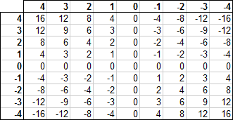
For these examples, let’s use this simple dataset. Each value in the grid is the product of the corresponding row and column headers.
Excel 2003 Contour and Surface Charts
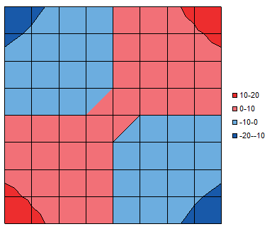
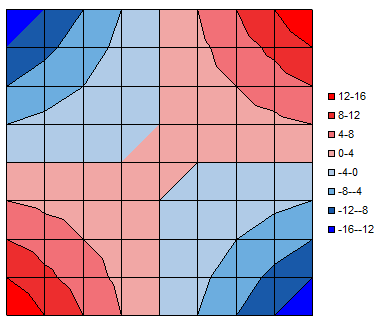
Select the data and insert a contour chart, and you will get something like this. I have removed the horizontal and vertical axis features (actually, the “category” and “series” axes), and selected a simple color scheme for the data bands. To format the bands, you format the legend key for that band, the small square in front of the label.
Scale
That scale is a bit coarse, and symmetrical features like the saddle point and the shapes of the colored bands in the corners are not symmetrically rendered. You can’t do much about the asymmetry; I used to insert rows and columns in the source data, and interpolate values, to double the resolution. This didn’t cure the strange rendering, but at least improved it a bit.
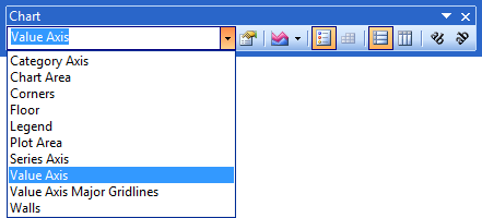
To change the scale of the bands, format the legend. The Format Legend dialog has a Scale tab just like in a typical Format Axis dialog. You can’t see the “value” axis, but you can select it in the Chart toolbar’s Chart Element dropdown, and format its scale directly.
Here is the contour chart with a finer scale and more shades of blue and red.
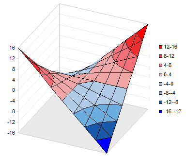
Below is the corresponding surface chart. The value axis is now evident, and the saddle-like shape of the surface is perhaps easier to envision than in the contour plot. The downside is that part of the surface, the far dark blue corner, drops far enough that it is obscured by the saddle point in the middle of the chart.
Orientation
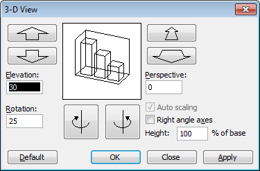
You can adjust the orientation of the surface chart using the 3-D View dialog, available by right-clicking on the chart.
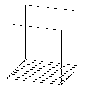
In Excel 2003, you can also click on a corner of the box enclosing the chart…
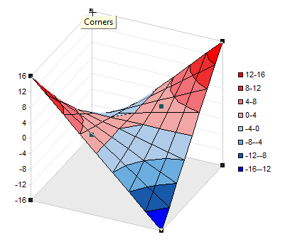
… and drag the corner to reorient the chart. While dragging, just the outline of the box is visible, showing how the orientation is changing.
Excel 2007 Contour and Surface Charts
To make a contour chart in Excel 2007, like 2003, you select the data, and insert the chart.
Scale
You can’t format the legend to adjust the scale of the colored bands, but you can select the value axis using the dropdown on the Chart Tools > Layout or Format tab.
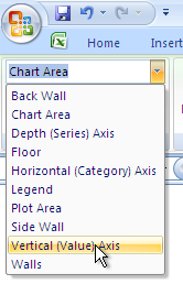
To change the colors of each band, select the legend entry (the legend keys in 2007 cannot be selected) and open the formatting dialog. The tabs for fill and border color refer to the formats of the legend key and the corresponding band.
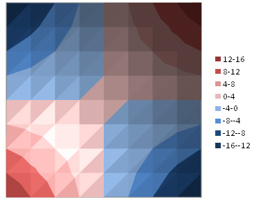
Here is the contour plot with the same scale as the 2003 example above.
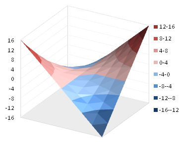
And the corresponding surface chart. Asymmetric rendering of the saddle point and other features has not changed since Excel 2003.
Orientation
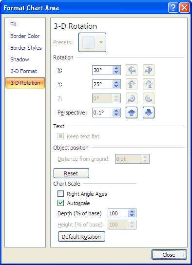
The Format Chart Area dialog in Excel 2007 includes a 3-D Rotation pane to allow adjustment of the surface chart’s orientation. Like many 2007 dialogs, it is much larger than the corresponding 2003 dialog without much difference in actual function.
You can also select the corners in the Excel 2007 surface chart, but you cannot drag them to adjust the orientation of the chart.
Formatting
Like much other formatting in Excel 2007, especially in Excel 2007 charts, the shading of the contour and surface charts is rather over-the-top. The charts have excessive color gradients, apparently to represent the reflections and the brighter and darker illumination caused by a light source located at some oblique angle.
The gradients are not too severe in a surface chart, but in a contour chart, they interfere with interpretation of the values in the bands. You’d think since the contour chart is “flat” it would not be affected by an offset light source. But the contour plot is really just a top view of the surface chart, so all shading appears in both charts.
The variations in color would not be half bad if there were a way to tone down the differences. I searched for a while, though, and could find no way to reduce the variation within a color band. Nor could I find any kind of texture or other feature that improved the appearance of the charts.
It is possible to remove the light and dark regions in the 2007 charts, rendering them with flat colors as in their 2003 counterparts. You have to dig pretty deep to find the trick, so I am pleased to share it with you here.
You need to format the band of color. To do this, click once on the legend, then click once on the label of the band you want to format. Then right click on this label and choose Format Band from the pop-up menu.
In the Format Band dialog, click on 3-D Format, then click on Material, and under Special Effect, select the Flat option.
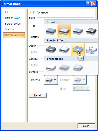
This removes all of the textures within the band. Repeat for every band in the contour plot…

… or surface chart.
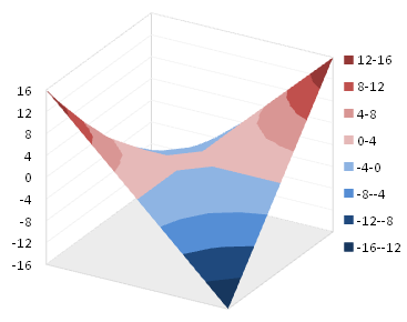
While the default texture with all of the shading and gradients was excessive, it provided a bit of detail missing in the flat-colored charts. In 2003, this detail was provided by borders on the bands. Add a border using the Format Bands dialog.
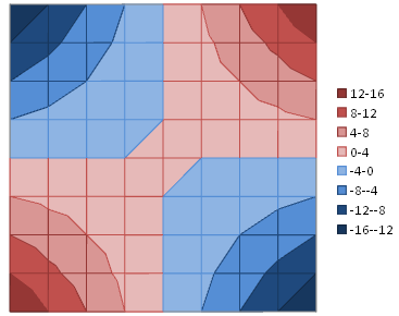
The border seems to help the surface chart more than the contour plot.
