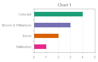
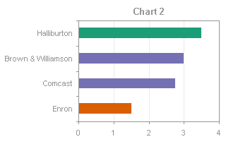
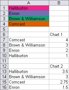
It’s relatively easy to apply conditional formatting in an Excel worksheet. It’s a built-in feature on the Home tab of the Excel ribbon, and there many resources on the web to get help (see for example what Debra Dalgleish and Chip Pearson have to say). Conditional formatting of charts is a different story. People often ask how to conditionally format a chart, that is, how to change the formatting of a chart’s plotted points (markers, bar fill color, etc.) based on the values of the points. This can be done using VBA to change the individual chart elements (for example, VBA Conditional Formatting of Charts by Value), but the code must be run whenever the data changes to maintain the formatting. The following technique works very well without resorting to macros, with the added advantage that you don’t have to muck about in VBA.
Unformatted Charts
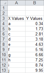
Here is the simple data for our conditional chart formatting example.
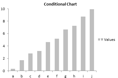
The data makes a simple unformatted bar chart. . .
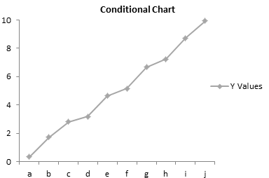
. . . or a simple unformatted line chart.
We want our charts to show different colored points depending on the points’ values. Except for some simple built-in formats, conditional formatting of worksheet ranges requires formulas to determine which cells should take on the formatting. In the same way, we will use formulas to define the formatting of series in the charts. We will replace the original plotted data in the line and bar charts with several series, one for each set of conditions of interest. Our data ranges from 0 to 10, and we will create series for each of the ranges 0-2, 2-4, 4-6, 6-8, and 8-10.
Conditional Formatted Bar Chart
The data for the conditionally formatted bar chart is shown below. The formatting limits are inserted into rows 1 and 2. The header formula in cell C3, which is copied into D3:G3, is
=C1&"<Y<="&C2The formula is cell C4 is
=IF(AND(C$1<$B4,$B4<=C$2),$B4,"")The formula shows the value in column B if it falls between the limits in rows 1 and 2; otherwise it shows an apparent blank. The formula is filled into the range C4:G13.
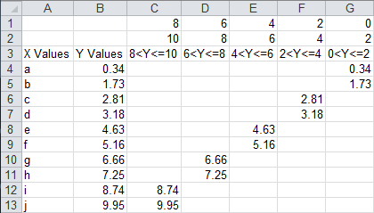
When the bar chart is selected, the chart’s source data is highlighted as shown.

We need to change the source data, removing column B and adding columns C:G. This is easily done by dragging and resizing the colored highlights.

The chart now shows five sets of colored bars, one for each data range of interest. It’s not quite right, though, since it’s a clustered bar chart, and each visible bar is clustered with four blank values.
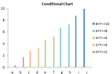
This is easily corrected by formatting any one of the bars, and changing the Overlap property to 100%. This makes the visible bars overlap with the blank bars.
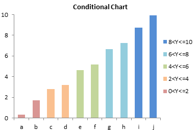
Conditionally Formatted Line Chart
The data for the conditionally formatted bar chart is shown below. The formatting limits are inserted into rows 1 and 2. The header formula in cell C3, which is copied into D3:G3, is
=C1&"<Y<="&C2The formula is cell C4 is
=IF(AND(C$1<$B4,$B4<=C$2),$B4,NA())The formula shows the value in column B if it falls between the limits in rows 1 and 2; otherwise it shows an error, #N/A, which will not be plotted in a line chart. The formula is filled into the range C4:G13.

When the line chart is selected, the chart’s source data is highlighted as shown.
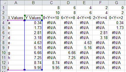
We need to expand the source data, keeping column B as a line connecting all points and adding columns C:G for the separately formatted series. This is easily done by resizing the colored highlights.
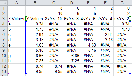
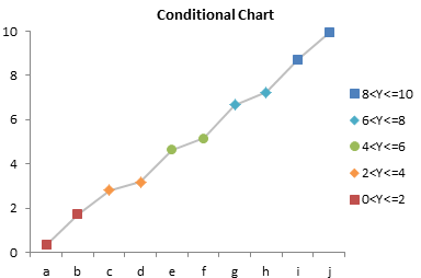
The chart now shows five sets of colored markers and line segments, one for each data range of interest.
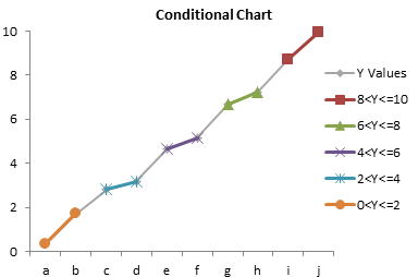
A little formatting cleans it up. Remove the markers from the original series, remove the lines from the other series, and apply distinct marker formats to the added series.

Remove the unneeded legend entry (for the gray line) by clicking once to select the legend, clicking again to select the label, and clicking Delete.
Conditional Formatting Flexibility
This simple example has formatting formulas defined based on the Y values in the chart. It is possible to define formatting based on Y values, X values, or values in another column which is not even plotted. As in worksheet conditional formatting, the only limit is your own ability to construct formulas. This technique works on most useful Excel chart types, including bar and line charts shown here, and XY charts as shown in Conditional XY Charts Without VBA.
Peltier Tech Articles About Conditional Formatting of Excel Charts
- Conditional Formatting of Excel Charts
- Conditional XY Charts Without VBA
- Invert if Negative Formatting in Excel Charts
- Conditional Donut Chart
- Highlight Min and Max Data Points in an Excel Chart
- Split Data Range into Multiple Chart Series without VBA
- Conditional Formatting of Lines in an Excel Line Chart Using VBA
- VBA Conditional Formatting of Charts by Value and Label
- VBA Conditional Formatting of Charts by Series Name
- VBA Conditional Formatting of Charts by Value
- VBA Conditional Formatting of Charts by Category Label


