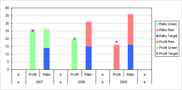
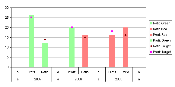
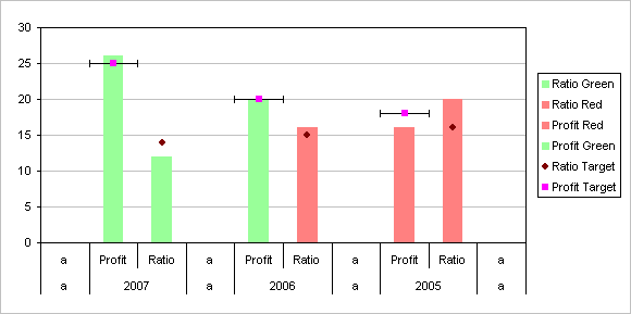
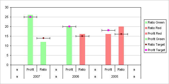
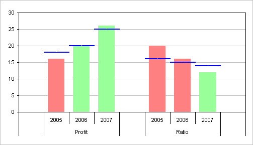
I’ve got a number of tutorials on this blog that deal with conditionally formatted charts. The trick is to set up ranges containing formulas for each of the conditions, so that if the condition for that range is met, the range contains the value to plot, otherwise it contains #N/A, which isn’t plotted in a line or XY chart, or just a blank or zero, which is plotted as a zero-thickness bar or column in a bar or column chart.
As with conditional formatting in the worksheet, the formatting you can achieve is limited only by your ability to construct formulas. Of course, in the chart, you are not limited to three conditional formats as you are in the worksheet (in Excel 2003 at least; the conditional formatting enhancements in Excel 2007 are mind-boggling).
Although I prefer to use the formulaic approach above, sometimes it makes more sense to use VBA to apply formats. Suppose you have a column chart, and the values may be in any order. However, you want to color a column according to its value, so that small values always are colored red and large values are always green.
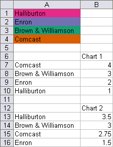
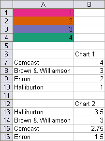
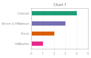
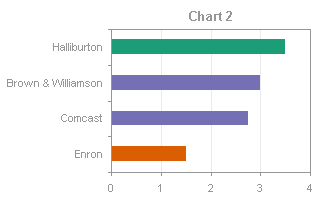
The following protocol allows you to color the points in a series according to colors you’ve reserved for certain values. The range below illustrates the data: range A1:A4 contains a list of the categories, with each cell filled with the desired color for that value in a chart; actually, the procedure will use the color in the cell with the smallest value greater than or equal to the point’s value. A6:B10 contains data for Chart 1, and A12:B16 contains data for Chart 2. (The colors in A1:A4 were defined using the Color Brewer utility described in my earlier post, Using Colors in Excel Charts.)
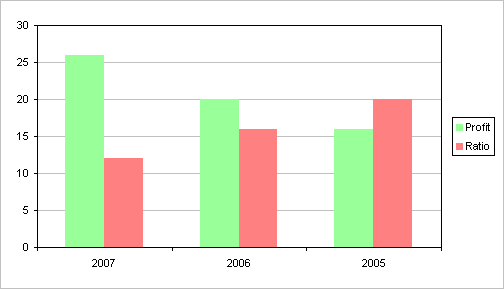
The charts made from the two ranges are not remarkable.
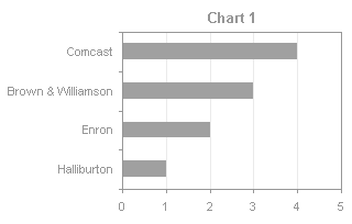
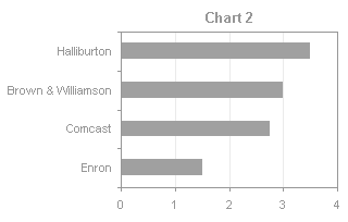
There is a simple VBA procedure that will apply the colors from the designated range to the appropriate points, based on their categories.
Excel 2003 and earlier:
Sub ColorByValue()
  Dim rPatterns As Range
  Dim iPattern As Long
  Dim vPatterns As Variant
  Dim iPoint As Long
  Dim vValues As Variant
  Dim rValue As Range

  Set rPatterns = ActiveSheet.Range("A1:A4")
  vPatterns = rPatterns.Value
  With ActiveChart.SeriesCollection(1)
    vValues = .Values
    For iPoint = 1 To UBound(vValues)
      For iPattern = 1 To UBound(vPatterns)
        If vValues(iPoint) <= vPatterns(iPattern, 1) Then
          .Points(iPoint).Interior.ColorIndex = _
              rPatterns.Cells(iPattern, 1).Interior.ColorIndex
          Exit For
        End If
      Next
    Next
  End With
End Sub
Excel 2007 and later:
Sub ColorByValue()
  Dim rPatterns As Range
  Dim iPattern As Long
  Dim vPatterns As Variant
  Dim iPoint As Long
  Dim vValues As Variant
  Dim rValue As Range

  Set rPatterns = ActiveSheet.Range("A1:A4")
  vPatterns = rPatterns.Value
  With ActiveChart.SeriesCollection(1)
    vValues = .Values
    For iPoint = 1 To UBound(vValues)
      For iPattern = 1 To UBound(vPatterns)
        If vValues(iPoint) <= vPatterns(iPattern, 1) Then
          .Points(iPoint).Format.Fill.ForeColor.RGB = _
              rPatterns.Cells(iPattern, 1).Interior.Color
          Exit For
        End If
      Next
    Next
  End With
End Sub
Select a chart, and run the procedure above (press Alt+F8 to bring up the macro dialog, select the procedure, and click Run). The bars will change color according to their values and the colored table in A1:A4.
Related Articles about VBA Conditional Formatting of Charts
- VBA Conditional Formatting of Charts by Series Name
- VBA Conditional Formatting of Charts by Category Label
- VBA Conditional Formatting of Charts by Value and Label
- Conditional Formatting of Lines in an Excel Line Chart Using VBA


