You may want to highlight certain ranges of values in a chart, to make it easier to judge the values in the chart. For example, you may want to highlight “good” values with green or blue, and “bad” values with red. Or you may want to highlight the standard deviation bands in a control chart. This banding is not a native feature of Excel, but you can use standard chart elements (i.e., stacked columns or in this case stacked areas) to achieve this effect. Read on to learn how.

This technique works with XY (Scatter), Column, and Line charts, and all of the chart triptychs in this tutorial show these chart types in that left to right order. Download the annotated workbook HorizontalBandWorksheet.xlsx if you want to follow along in an existing workbook.
Original Charts and Data
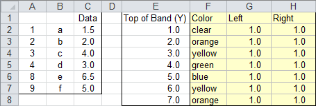
This screenshot shows the data used in this exercise. Column A has the X values for the XY (Scatter) charts, column B has the X labels for the Column and Line charts, and column C has the Y values for all charts. Column E lists the values at the tops of the bands, from the bottom up, starting with the top of the blank area below the lowest band. Column F has a label for these bands, which I’ve simply filled with the intended colors of the bands. Columns G and H have the same values, G2:H2 containing the lowest value from F2 (=F2), and the rest of the cells containing the band heights (e.g., =F3-F2). These heights will be used to populate the values of stacked area charts, which will serve as our bands.
Here are the XY (Scatter), Column, and Line charts of our original data.

You can start with a chart containing your original data, and add the bands, or you can follow a somewhat easier approach which starts from scratch, building a banded chart, then adding the original data. I’ll start the tutorial with the second approach. Skip ahead to Adding Bands to Existing Chart if you are not starting from scratch.
Starting From Scratch
Select the data for the bands (the shaded range F1:H8) and create a stacked area chart (not stacked 100% area), with series data in rows. The charts all look the same for a few steps, until we actually have a series that has either XY, Column, or Line type.

This is as good a time as any to apply your fill colors to the bands. It is best to use light shades, so the bands do not overwhelm the original data.

Copy the original data, select your chart, and use paste special to add the data as a new series. Paste Special is found at the bottom of the dropdown menu on the Paste button, which is on the Home tab of the Excel ribbon. It is added as another stacked area series.

Right-click on the added series, choose Change Series Chart Type from the pop-up menu, and change the series to the desired chart type (XY Scatter, Column, or Line). Now the charts assume their unique appearances.

Format the new series and assign it to the secondary axis. This was already done in the first chart when the added series was converted to XY type.

Add a secondary horizontal axis to the chart. This was also done in the first chart when the added series was converted to XY type.

The rest of the protocol is the same as for the case where you start with your original chart and add the bands. Skip the next section, and follow the instructions in Finishing the Chart below.
Adding Bands to Existing Chart
Copy the range with the band data (F1:H8 in our example), select the chart, and use Paste Special to add the data as new series, with data in rows. Paste Special is found at the bottom of the dropdown menu on the Paste button, which is on the Home tab of the Excel ribbon.

One by one, right-click each added series, select Change Series Chart Type, and change each series to stacked column (not stacked 100% column). This is the step that is so tedious, you’ll wish you had started from scratch (the above protocol).

Apply your fill colors to the bands. It is best to use light shades, so the bands do not overwhelm the original data.

Format the original series, and assign it to the secondary axis.

Add a secondary horizontal axis to the chart.

Finishing the Chart
Format the primary (bottom) horizontal axis so the crossing axis is positioned on tick marks.

The next four steps switch the axes left and right, top and bottom.
Format the primary (left) vertical axis so the crossing axis crosses at the maximum value.

Format the secondary (right) vertical axis so the crossing axis crosses at the automatic position.

Format the primary (top) horizontal axis so the crossing axis crosses at the maximum category.

Format the secondary (bottom) horizontal axis so the crossing axis crosses at the automatic position.

Hide the primary (top) horizontal axis by formatting it so it has no line, no axis ticks, and no tick mark labels. Select the primary (right) vertical axis and press Delete.

You were either done in that last step, or you can add a fill color outside (above and below) the bands by formatting the plot area with the desired fill color.

Negative Data and Charts
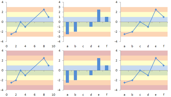
What makes this technique more flexible than that in my original tutorial is that stacked areas can span the horizontal axis without the strange behavior of stacked column charts. To illustrate, here is the same data as above, offset so it spans the horizontal axis.

Here are the corresponding charts without (top row) and with (bottom row) formatting the plot area to shade above and below the bands.
Arbitrary Data and Charts
In the examples above, the bands are uniform in width, and each band touches the bands on either side without gaps. This isn’t necessary, of course. The bands can be any width, and there can be gaps between adjacent bands (the gaps being transparent bands). The worksheet below has the same original data as above, but the bands have arbitrary top and bottom values, and there are a couple gaps.

The chart doesn’t care what the band values are or how we format them.


