I’ve reviewed a colorful yet ineffective graphic in Wow! Heat Map Donut Chart!. One of the features that makes this graphic ineffective is its use of colors. While unfriendly to those with normal color vision, the colors used are particularly unfriendly to the 8% of men and 0.4% of women with color vision deficiencies.
Color Vision
In the normal human retina, their are four types of photoreceptors, neurons that detect light. One type, called rods, respond to low light levels, producing monochromatic vision in near darkness. In brighter light, three types of cones respond to incoming blue, red, and green light. The mechanisms of color vision are fascinating and miles beyond the scope of this article. For this discussion it is enough to know that our perception of color is a function of how these color receptors, other retina neurons, and the visual cortex of our brains process the signals from these cones.
Color blindness occurs when one of the three types of cones are partially or totally disabled. The most common color vision deficiencies are deuteranomaly and deuteranopia, respectively partial and total loss of function of the green photoreceptors. Protanomaly and protanopia are the partial and total deficiency of the red sensing neurons. Much less common than either of these conditions are tritanomaly and tritanopia, partial and total loss of activity of the blue cones.
Deficiencies in either the red or the green photoreceptors leads to difficulties distinguishing red and green. Ironically, the most common pair of colors used to indicate good and bad are red and green. Think of traffic lights with red and green lights indicating stop and go, and innumerable bad dashboards with arrays of red and green symbols. Better combinations would be read and blue, or orange and cyan (which must be familiar from the hundreds of Tableau graphics we’ve seen over the last few years).
Most mammals only have two types of photoreceptors, and have the type of color vision that protanopes and deuteranopes experience. Early during primate evolution, a mutation split one of these receptors into the green and red cones that provide richer color vision. Some reptiles, birds, and fish may have four, five, or even more types of cones, extending into the ultraviolet and infrared ranges of the spectrum we can only imagine.
Testing Images for Color Vision Issues
There are numerous programs and web sites that simulate the effects of color vision deficiencies on your images. One popular and easy-to-use site is Vischeck, which allows you to upload images, and uses various algorithms to convert them into representations of how they would look under various types of color blindness. The simulations here were generated using Vischeck.
Comparison of Heat Map Donut Chart Images
Here is the original heat map donut chart, in all of its visual glory.
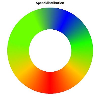
This is how deuteranopia (green cone deficiency) renders the donut.
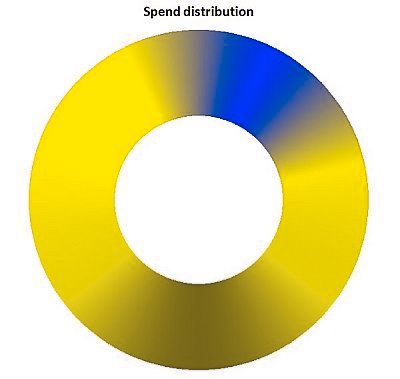
This is how protanopia (red cone deficiency) renders the donut.

These two conditions result in similar images: a blob of blue in the top right, and a smear of yellowish brown elsewhere. The red-orange-yellow-green gradients are mostly eradicated, rendering the heat map nearly useless.
Comparison of Pie Chart Images
Here is my depiction of the heat map donut data, in a properly sorted pie chart, using the default Excel 2007/2010 color palette. In full color:

Here is the pie as seen by a deuteranope (simulated).

Here is the pie as seen by a protanope (simulated).
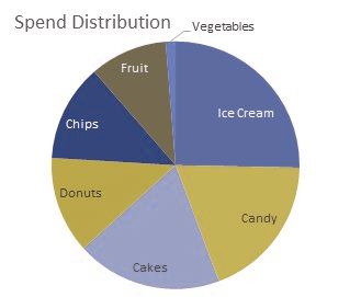
As above, the two color vision deficiencies result in similar simulations. Without a gradient, though, the wedge colors are much more readily distinguished. Labeling the wedges themselves does help greatly, as some color pairs are very close; a legend would not be so helpful.
It turns out that the default Excel 2007/2010 color theme is relatively friendly to viewers with color vision deficiencies.
Comparison of Bar Chart and Dot Plot Images
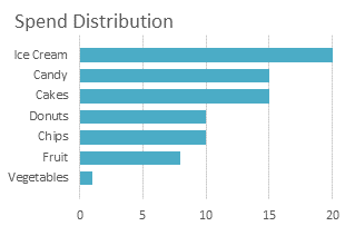
Here is a bar chart of the same data, shown in regular color vision and simulated deuteranopia (protanopia was omitted because it is less common and the effects are similar).

Here is a dot plot of the same data, shown in regular color vision and simulated deuteranopia (protanopia was omitted because it is less common and the effects are similar).

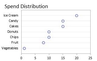
We can see that color vision deficiencies have no effect on the readability of bar charts and dot plots, because neither rely on color to encode quantitative information.
Recommendations
Graph types such as bar charts and dot plots again prove their superiority over pie and donut charts, in this case by not relying on colors to depict numerical data.
Gradients are particularly problematic when combined with color vision issues. In general, the guidelines for gradients are that they should proceed from a dark shade of a color to a light shade of the same color, or from a dark shade of a color through a light shade (close to white) to a dark shade of a distinct second color. The gradient used in the heat map example proceeded through highly saturated chades of several colors.
Colorbrewer is an online tool designed to help select good color schemes for maps and other graphics. You can select from among different styles of color schemes, and you can choose to generate only color-vision-friendly schemes. In conjunction with a colov-vision-deficiency simulator like Vischeck, you have no excuse for producing hostile graphics like the donut heat map.

