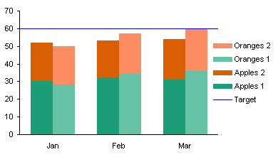
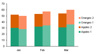
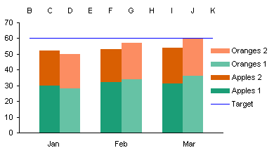
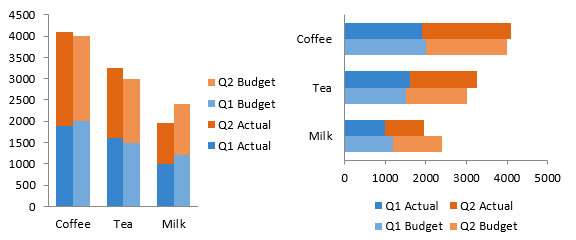
Excel has built-in chart types for clustered columns and bars, and for stacked columns and bars. One of the commonest charting questions in online Excel forums is, “How do I make a chart that is both clustered and stacked?”
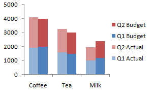
This article demonstrates a protocol for building clustered-stacked column and bar charts in both modern versions of Excel, that is, Excel 2003 and earlier and Excel 2007 and later. The technique is a bit convoluted, and it requires an expanded data layout to get the appropriate appearance. And there’s an additional degree of complexity to get the category labels to line up neatly under or beside the clusters.
For those who need to produce many of these charts, and who don’t have 15 minutes to spend on each one, I have created the Peltier Tech Charts for Excel, a commercial Excel add-in that does the heavy lifting at the click of a button.

Built-In Column and Bar Charts
Let’s start with this simple data set, which compares budget and actual values for three commodities for two quarters of the year. We want to have clusters for each commodity, with stacked actual values next to stacked budget values within each cluster.

Without any effort or thought we can easily create clustered column or bar charts from this data.

Stacked column and bar charts are just as easy.

It’s not obvious how to combine the chart types. The protocol involves inserting blank rows and cells into the data range of a stacked column or bar chart, and values only appear in some of the places in the chart. The proper arrangement will cluster stacks of values with stacks of zeros separating the clusters.
Starting the Chart
I’ll leave the original data alone (always a good practice) and create a staging data region which is linked to the original data. The easiest way to do this is to copy the original data, then use Paste Special Link to start building the staging area. We’ll make our chart first, then explore how modifying the data layout changes the chart. In practice, we’ll modify the data first and then make the chart, knowing the effects of data layout on chart appearance.
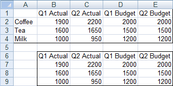
The first step is to make a stacked column or bar chart from the data in B6:E9. There are no categories selected (i.e., the commodities are not part of the initial chart), so Excel just uses the counting numbers 1, 2, 3.

Since categories always start from the origin, the bar chart’s category labels go from the bottom up, instead of top down as in the sheet. So the vertical axis has to be formatted to make the categories go in reverse order. Also the value (horizontal) axis has to cross at the maximum category, which is at the bottom now, since the order of categories was reversed.

Adjusting the Data
So that’s only stacked. Let’s adjust the data by inserting some rows.
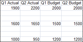
The stacks of columns/bars are now spread out. Not yet what we want.

But lets stagger the budget data by a row, to move the budget data points off the actual data and onto blank slots in the chart.
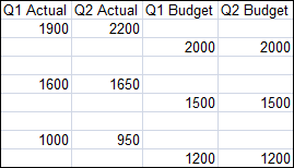
Unfortunately the staggering doesn’t happen automatically, so we have to go back and tell Excel what data range to use for the chart. Right click on the chart, then select Select Data or Source Data (the command is version-specific). Click in the Chart Data Range box, and select this whole data range.

One more adjustment to the data. Let’s insert a row at the beginning and end so there’s a space outside of the first and last cluster.
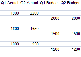
Again, we have to explicitly tell the chart about the updated data range. This is almost what we want.

Reduce the gap between columns/bars to give the chart a clustered appearance: select one series of columns, press Ctrl+1 (numeral one) to open the formatting dialog, and in the first screen you see (“Series Options”) change the entry for Gap Width to zero. Color code the data series to make it clearer which data series are associated.

In practice, it is not necessary to create a chart using the compact data and adjust it after every modification to the data. The correct protocol is to adjust the data, and then make the chart shown here, and proceed with adding labels, below.
Adding the Labels
Almost done. We need to add the category (cluster) labels. We’ll do this by adding a “dummy” series to the secondary axis, and the secondary axis will have the category labels we want. Add a column to the original data range for the dummy axis series (column F in our example).
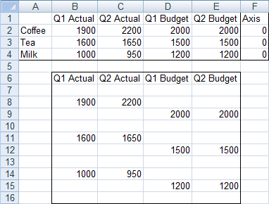
Select this added data (F1:F4), and hold Ctrl while selecting the column with our labels (A1:A4), so that both areas are highlighted. Make sure you include the blank top cell in the first column. Copy the range, select the chart, and use paste special (Home tab of the ribbon > Paste dropdown > Paste Special) to add this data to the chart as a new series, in columns, with series name in the first row and category labels in the first column. In other words, use these settings:
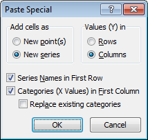
In Excel 2003 and earlier, the original labels (1, 2, 3, etc.) remain along the axis, but in 2007, the new labels take their place, even if we hadn’t checked “Replace Existing Categories”.

Since zero value bars have zero height or width, they don’t appear in the chart. Just to show where this new series is added, I’ve temporarily replaced the zeroes in column F with values of 500. The series spans only the first three categories.

If you’re making a stacked-clustered column chart, convert this new series to a line chart type. Sometimes Excel 2007 doesn’t expand the legend enough to show the legend entry for Axis, so I’ve stretched it in this chart.

Manipulating the Axes
Now format the Axis series to place it onto the secondary axis. To do this, select the Axis series. If you can’t see the Axis series, click the dropdown in the top left of the Chart Tools > Layout or Format tab, and choose the Axis series. Then press Ctrl+1 (numeral one) to open the Format Series dialog. On the first tab, choose Secondary Axis.

Now add the secondary category axis, which is secondary horizontal in 2007 column charts and secondary vertical in 2007 bar charts. This command in on the Chart Tools > Layout tab.

We need to reverse the bar chart’s secondary vertical axis (like we did the primary when we first made the bar chart), and at the same time, make the horizontal axis cross in the automatic position, which generally means at zero or at the minimum.

Now we have to switch the position of the category labels. In the column chart, format the left hand vertical axis so the horizontal axis cross at the maximum, and format the right hand vertical axis so the horizontal axis crosses at the automatic (minimum) position.
In the bar chart, format the bottom horizontal axis so the vertical axis cross at the maximum, and format the top horizontal axis so the vertical axis crosses at the automatic (minimum) position.

Important – Axis Label Alignment
We want only half a slot on the outside of the first and last clusters, not the full slot shown above, to center each cluster on the commodity category labels. Format the top horizontal axis of the column chart, or the right vertical axis of the bar chart, so the crossing axis is positioned on tick marks. The bottom horizontal axis or the left vertical axis of the chart, which contains the labels we just worked so hard to add, should have the crossing axis positioned between tick marks.

Select the secondary value axis, which is scaled from 0 to 1 (the right vertical axis of the column chart, or the top horizontal axis of the bar chart), and delete it.
Format the primary category axis, which is scaled from 1 to 10 (the top horizontal axis of the column chart, or the right vertical axis of the bar chart), and format it so it has no tick marks or tick labels, and no line type.

Finally, select the Axis legend entry. In Excel 2003 be sure to select the text label, not the legend key (the marker and line). Press Delete. In the column chart, format the Axis series to be invisible (no marker, no line).

That wasn’t so hard, was it? Though it did take a very long time.
Adding a Line to a Clustered-Stacked Column Chart
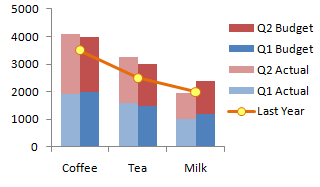
It’s relatively easy to overlay a line chart series onto the clustered-stacked column chart. Instead of the column of zeros we used to generate our commodity axis labels, put in the values you want to plot, and add a meaningful column header.
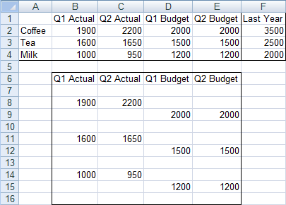
When you go through the process above to add your labels and manipulate the axes, you will end up with data points where you want them. Just don’t bother hiding the series at the end of the process. If you want to show the line on a secondary axis, despite my warnings to the contrary, don’t delete the axis, simply scale it appropriately to your data.
Adding a line to a cluster-stack bar chart is much more complicated, so I will not cover it here.
Clustered-Stacked Charts in Peltier Tech Charts for Excel
This tutorial shows how to create Clustered-Stacked Charts, including the specialized data layout needed, and the detailed combination of chart series and chart types required. This manual process takes time, is prone to error, and becomes tedious.
I have created Peltier Tech Charts for Excel to create Clustered-Stacked Charts (and many other custom charts) automatically from raw data. This utility, a standard Excel add-in, lays out data in the required layout, then constructs a chart with the right combination of chart types. Charts can be made using data in a wide variety of arrangements, in either vertical or horizontal orientation.
This is a commercial product, tested on thousands of machines in a wide variety of configurations, Windows and Mac, which saves time and aggravation.
Please visit the Peltier Tech Charts for Excel page for more information.


