Stacked charts are commonly used to compare proportions within a whole. In this post I will concentrate on stacked and clustered vertical column charts, but the arguments hold true for horizontal bar charts, and to some extent for area charts. This table shows some make-believe sales figures for an imaginary company, by quarter and by sales region.

Stacked Charts
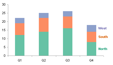
In the chart below, we see quarter by quarter sales by North, South, and West sales regions. The total height of a stacked bar shows total sales, consisting of the sum of the heights (sales) for the individual regions.
We get a similar stacked chart if we plot the data by row instead of by column. Each stacked bar shows the total sales for all four quarters for a given region.

What are stacked charts good for? In the two examples above, we can easily see trends in the total sales by category (by quarter or by region). We can also judge the trends in the lowest series of the stack.
What are the problems with the stacked charts? In these two examples, we cannot follow trends in the upper series in each stack, because only the bottom series has a flat baseline. In the top chart, I cannot tell whether the South and West regions vary at all from quarter to quarter. We can see the decrease by region in the bottom chart, but only because it is almost too large an effect to miss. We cannot easily compare the different blocks in the South region or in the West region, because they are stacked upon each other, rather than laid out side by side.
Clustered Charts
How can we preserve the ability to judge trends in all series in the stacked chart? Easy: unstack the series. This clustered column chart makes it easy to compare the values of any of the regions for any of the quarters. There are in fact noticeable trends in the South and West regions, in addition to the more obvious North region.
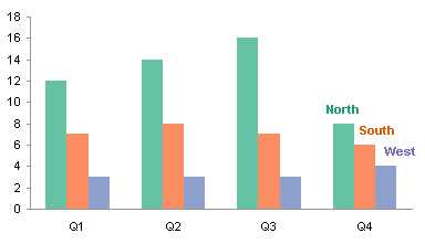
I’ve seen people fancy up their clustered charts by playing with the overlap. This works okay if the taller bars are behind the shorter ones, but the width of the bars in back is partially obscured, which may lead to unintentional misjudgment of the bars’ values. It’s probably best not to risk distorting the data.

Here’s the clustered chart with series plotted by rows. The trends in the data are much more evident than in the stacked chart.
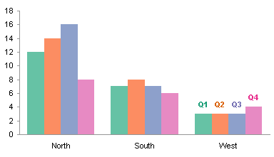
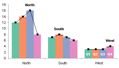
In fact, each cluster shows the trend by quarter, highlighted by the lines and markers below.
Line Charts
This leads to an alternative to stacked and to clustered columns: line charts. In general, time series (data plotted with time along the X axis) are better plotted with lines than columns. The markers show the discrete data values, and the connecting lines help to show the trends.
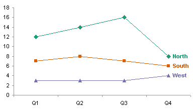
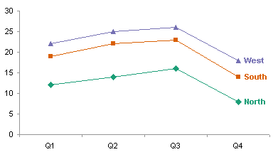
Excel offers a stacked line chart option. These should be avoided because the stacked nature of the data is not evident; in stacked column charts, the points have visible heights that can be added by stacking. In the chart below, a casual glance makes it seem that West is the region with highest sales.
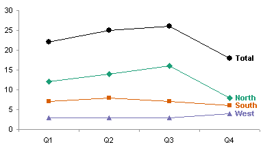
A weakness of the clustered column chart, and of the line chart above, is that the chart no longer indicates the total sales by category. This could be addressed by adding another column series in the clustered chart, but I think this is somewhat confusing. The total should not be in a color that may make it seem like a regular series, but if too dark a shade of gray is used, the total series will overwhelm the chart.

If the total values are not too large relative to the individual values, adding a line series to the line chart is a natural way to show the totals.
A line chart plotted by rows instead of columns makes less sense. It seems okay at first, but there is no natural X axis flow from region to region as there is from one quarter to the next.
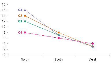
The chart above makes it look like things are getting worse, but simply rearranging the categories makes it look like there was a peak in sales.

The columns in a column chart emphasize the values, not the trends between values. The lines in a line chart emphasize the trends, and lead to interpolation between points. Since one can’t interpolate between non-numerical categories, a line chart should only be used for data with date/time or numerical X values. This is especially true if the categories can be arbitrarily ordered.
In summary
Although stacked charts display parts of a whole, only trends in the bottom series and in the total of all series can be accurately assessed.
Clustered charts allow all data points to be compared because there is a single baseline. Clustered charts show data at greater resolution because axis is tied to largest single point, not largest total. Totals are not usually included, so proportions are not as easy to judge.
Point-to-point trends are displayed more clearly in line charts, with markers showing values and connecting lines showing the transitions between points. If the horizontal axis is based on dates or on numerical values, line charts should be used rather than column charts. If the horizontal axis is categorical, the lines may give an erroneous impression that there is a somewhat continuous transition between categories.
For most purposes, clustered charts are preferred over stacked charts. Clustered charts should be used for non-numerical categories. Line charts should be used if the category (X) data is time based or numerical. Stacked line charts should be avoided, because the stacked nature of the data is not evident.


