Stacked column charts in Excel offer a feature called “Series Lines”. These are lines between the stacks, connecting the tops and bottoms of corresponding blocks in adjacent stacks.
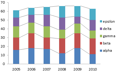
At first glance, these lines seem useful, because the lines will converge or diverge depending on changes in value of a series from stack to stack.
Unfortunately, the differences in slope is not really observable unless it is substantial. There are better ways to display this data.
The Data
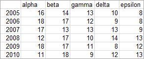
Here is the data used in this example.
Standard Charts
Let’s start with the simple stacked column chart below. We can readily see how the total varies from year to year: a steady increase from 2005 through 2008, a plateau between 2008 and 2009, and a drop in 2010. We can also judge variation in series “alpha”, because this series starts at the base of the chart.

Series “beta” is harder to judge, because its blocks are added to the staggered baseline formed by the tops of the alpha blocks, and the baseline is staggered further. Comparisons between points in different series is also made difficult by the lack of a single baseline for the bars.
We can add the series lines to connect endpoints of corresponding points. These lines may help judge changes in a series from year to year if the changes are large enough, but they don’t reset any staggered baseline to a straight line. They also do not help at all with comparisons of different series. In fact, the lines may guide your eyes away from the comparisons you are interested in.

Series lines add useless elements to the chart. This is the definition of chart junk.
Feeble Improvement Attempts
Let’s give the data a common baseline by unstacking the points. Now we’ll have an easier time comparing lengths of the bars, because the different lengths only move the tops, not the bottoms, of the bars.
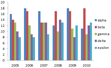
There is a problem with this display: it is too cluttered to read easily. We can easily compare the bars within a given year, but when we compare from year to year, the bars in between interfere with the comparison. This is especially problematic with the shorter bars.
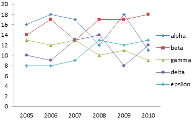
If we convert the bar chart to a line chart, we’ll remove the vertical rectangles of ink that interfere with our comparisons. Now there is a different problem. The overlapping of points makes it difficult to trace a series from left to right. Even the different colors don’t help a lot, and if you are looking at a photocopy, you’re lost.
A Better Approach
Well, we don’t need to overlap all of the data. We can plot each series in its own stretch of horizontal space, so each series occupies its own panel. Yes, it’s a panel chart, even if we don’t have lines between all of the panels. It’s also similar to a type of chart known as a cycle chart.
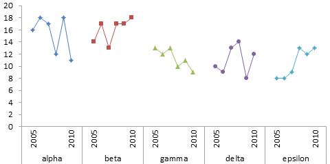
We can see immediately that gamma has an overall downward trend and epsilon a similar upward trend. This was not at all visible in the earlier charts. We can also clearly see that the general amplitudes of alpha and beta are similar, as are those of gamma, delta, and epsilon. We could have seen this in the stacked charts, if we’d squinted long and hard enough. That’s too much work; the panel chart is so much easier.
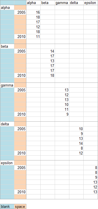
The panel chart is not too hard to create. It’s really a simple line chart. What’s complicated is the data layout, shown below. The data is spread out vertically so the blocks of data do not overlap. Each blue shaded cell is completely blank (not a formula returning a null string, but a completely empty cell). The tan shaded cells contain space characters.
The two blank cells in the top left tell Excel that the top row should be used for series names and the left two columns should be used for category axis labels. The blank cells between series names in the first column tell Excel to center the labels across the blank ranges. The space characters keep the year labels from moving out of place. I hid all but the first and last year labels, since these two were sufficient to describe the data.
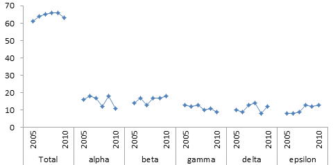
We actually don’t need different formatting for the different series, since they are separated in the chart. We can use a single column to define our data range (keeping the same category axis data, with its blank cells and space-containing cells).

The resulting chart shows our data as clearly as the previous one. Adhering to a single format makes the chart a bit cleaner.

Obviously this chart does not include the totals for each year. We could include them in this chart, but that has the undesirable effect of shrinking the individual series, reducing the resolution.
There’s a radical approach to showing both the individual series and the totals. It doesn’t involve mucking around with dual axes, which cause more confusion than anything else. It doesn’t involve any kind of tricks to force all the data into the same chart. What is the radical approach?
Two charts.
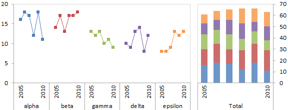
The first chart shows the individual values, in the panel style chart above. The second chart shows the total values, I used a stacked bar, but you could have used a line chart of the totals without its constituents. I’ve revived the colors for the line chart on the left, so the lines can serve as a legend for the colored blocks on the right.
What do you think of this approach?


