This article about Microsoft’s new Waterfall Chart in Excel 2016 was written by Kasper Langmann, co-founder with Mikkel Sciegienny of Spreadsheeto, a relative newcomer to the Excel blogosphere. Kasper and Mikkel are very enthusiastic about Excel, they have written a number of tutorials on the Spreadsheeto Blog, and they offer a comprehensive seven-part free training course on Excel. Mikkel approached me to write about the new charts that Microsoft introduced in Excel 2016, and he agreed that we should write some posts together.
In the first half of this post, Spreadsheeto will specifically talk about Microsoft’s new Waterfall Chart. I will follow up with a discussion of the extensive and flexible waterfall charts in Peltier Tech’s software.
The Waterfall Chart in Excel 2016
In 2015, Microsoft released six new charts in an update for Excel 2016. This release was a direct response to user feedback and one of those new charts was the waterfall chart. The waterfall chart is a bar chart in which the bars are placed along the vertical axis at different levels according to whether they are an increase or decrease.
Then totals are shown as bars of height from zero as they are affected by the increases and decreases.
This is often useful for visualizing things like financial data where revenue can be shown as bars that shift upward vertically and expenses can be shown as bars that shift downward by contrast.
As we dive into the details of how to create a waterfall chart, note that we will work with an example scenario in Excel 2016 for Windows.
Getting Started with a Waterfall Chart – Get the Data Right
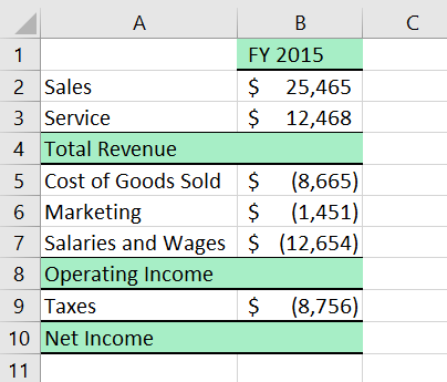
The first and foremost objective when setting out to create a waterfall chart is to make sure our data is in the correct format. Let’s take a look at a simple example of income statement data.
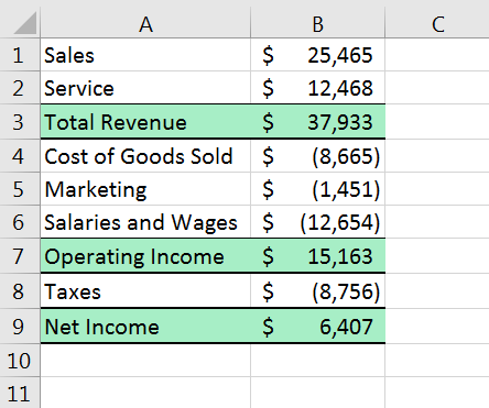
It is important that our data is in this form where increases (income) and decreases (expenses) will be shown in the waterfall chart from left to right according to the data points from top to bottom in our table. Also, any totals (Total Revenue, Operating Income, and Net Income) will be shown in the chart as they appear in sequence in our data table.
Note that Total Revenue, Operating Income, and Net Income are subtotals along the way that will be shown as cumulative totals in our waterfall chart. This is set up to be a very intuitive progression as the chart presents revenue and expenses in the same logical fashion as our data table.
This is an instrumental point for setting up our data. You get out of the waterfall chart what you put into it and this means knowing how to set up our data before creating the chart.
Inserting the Waterfall Chart
Once our data table fits this layout, simply highlight the entire table (or one cell within the table), click on the ‘Waterfall and Stock Charts’ dropdown button…
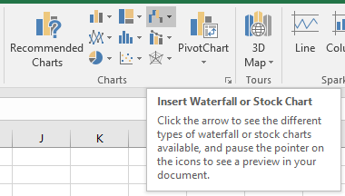
Then select ‘Waterfall’ in the menu.
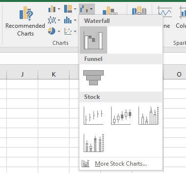
Alternatively, click on the ‘See All Charts’ button at the bottom right of the Insert > Charts group…
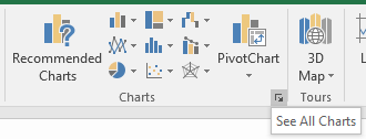
Then find ‘Waterfall’ in the list of available charts and click OK.
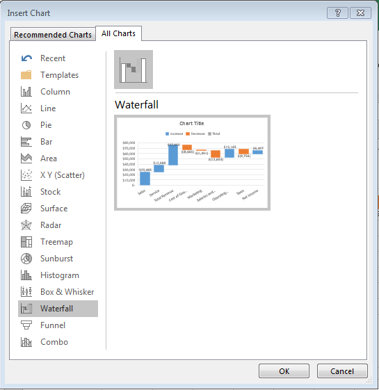
Identifying the Totals
Initially, our new waterfall chart will be a bit unorganized and will need some specific tweaks from before it will begin to take shape and be a better visual representation of our data. Note in the legend that there are three classifications of the data bars: ‘Increase’, ‘Decrease’, and ‘Total’.
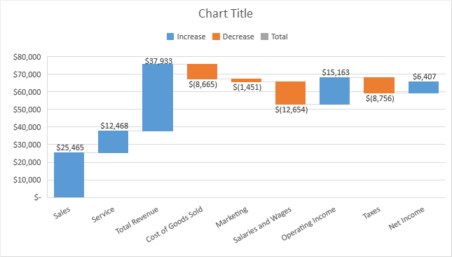
Notice how ‘Increase’ bars rise in cascading fashion and ‘Decrease’ bars fall in the same way along the vertical axis according to the cumulative effect each has on the running total. Right now our Total Revenue, Operating Income, and Net Income totals are each shown as an ‘Increase’. We need to change them to each to a ‘Total’.
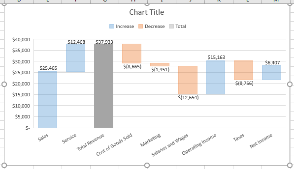
To do this, let’s first click on the Total Revenue bar and then right click.

Select ‘Set as Total’ and two things will happen. First, the color of the bar will change to match the legend as a ‘Total’ and second, the bottom of the bar will be anchored at zero. That way, the bar will be a visualization of the cumulative total income after increases due to Sales and Service income. Notice now how the top of the ‘Total Revenue’ bar is the exact same height as both the ‘Sales’ and ‘Service’ bars put together.
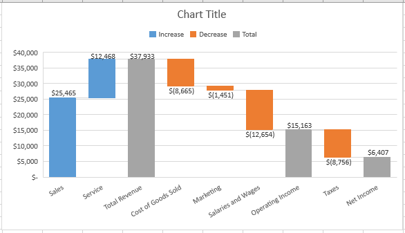
Now we just need to repeat this step for ‘Operating Income’ and ‘Net Income’. This results in the chart we ultimately want. Increases (income) are show as rising bars in blue while decreases (expenses) are shown as falling orange bars. Note the cascading visual effect of the rising and falling bars that give the waterfall chart its name.
Now we can make any formatting changes we want just as we would with any other chart in Excel. Then it’s ready to disseminate across your organization, to your stakeholders, or for a presentation.
Summary
The waterfall chart is a really nice addition to the family of charts offered in Excel 2016. As we have seen here, it provides a cascading visualization of data that includes increases and decreases while allowing us to see the cumulative effects on the running total in a very intuitive fashion. For the right kind of data, the waterfall chart can really bring things to life by providing an at-a-glance representation that anyone can appreciate.
The new charts in Excel 2016 can be used in a variety of scenarios. To learn more about all of them check out our guide here.
Before you begin your charting adventure, you should definitely read this comprehensive piece on what to do and what not to do when creating charts.
This article is written by Kasper Langmann from Spreadsheeto. If you like it, you should check out his free Excel training.
Peltier Tech Charts for Excel Waterfall Charts
Many years ago, Peltier Tech introduced a tutorial that showed you how to make your own waterfall charts in Excel, the slow hard way. You can even read the latest edition of the Excel Waterfall Charts (Bridge Charts), which is only a few years old.
Peltier Tech came out with a demo Waterfall Chart utility a decade ago, because even though it’s possible to build your own waterfall chart by hand, it’s much easier to select your data and click a button than to follow a long protocol with many easy-to-omit steps.
Peltier Tech has had a commercial Waterfall Chart utility on the market since 2008. Over the years it has been upgraded to run in newer versions of Excel, and to run in Excel for Mac. It has been continually enhanced, several varieties of waterfall charts have been introduced beside it, and thousands of users now depend on it. The newest edition, released to coincide with Excel 2016 for Windows and Mac, is called Peltier Tech Charts for Excel 3.0.
When Microsoft finally came out with their own Waterfall Chart, Peltier Tech said, “Nice going, that’s a pretty good start.”
Regular Waterfall
The data for the Peltier Tech Waterfall Chart is like that for Microsoft’s version, except the totals are left blank. When the program encounters a blank in the data column, it knows to calculate a total for that category. (If the totals in your input data are wrong, the chart Microsoft creates is also wrong.)
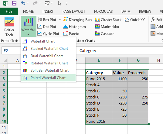
Select the data, then click the Waterfall dropdown button on the Peltier Tech tab > Custom Charts group of the ribbon, and click Waterfall.
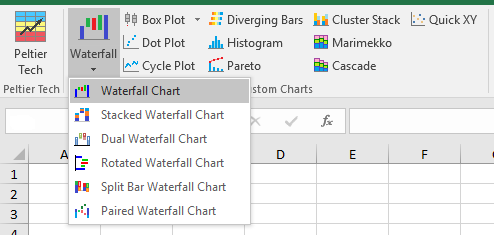
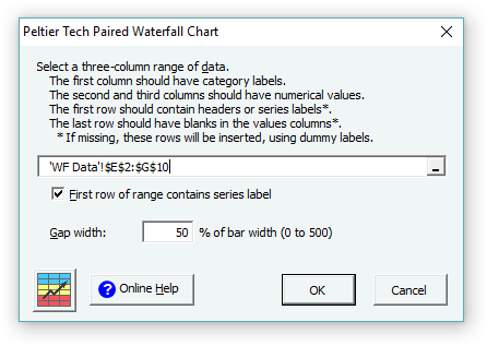
You get a dialog that lets you select from a number of options.

When you click OK, the program inserts a worksheet with links to the data as well as columns of formulas that make sure the plot comes out right, plus a chart. Alternatively, you could have the program construct these formulas in the original worksheet. There is a checkbox and list box next to the output range, so that you can modify some of the options selected in the dialog.
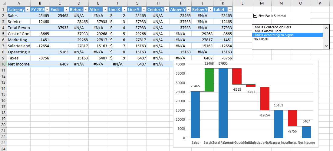
The waterfall chart looks like on of the charts below. The waterfall treats the first value in the input data as a subtotal, for example, as a starting value that you are tracing through a set of intermediate operations to get a final value.

The second waterfall chart treats the first value in the input data as a change in value, in this case, as the first increase in revenue, coming from sales.
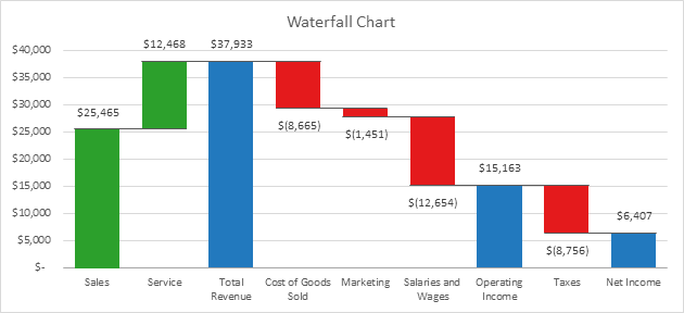
These charts are regular Excel charts, so you can reformat them, resize them, copy and paste them wherever you want. You need to be careful, however, because if you format away some of the hidden magic that makes them work as waterfall charts, you may break them and have to rebuild them.
The Microsoft waterfall charts are still not 100% user editable, depending on which build of Excel 2016 you use. On my main laptop I have the non-Office-365 version of Excel 2016, so it isn’t updated monthly with new features. I can format the colors of the Microsoft waterfall chart, and I can change the maximum and minimum of the vertical axis, but I am unable to modify the major tick spacing of the vertical axis. I also cannot modify the orientation of the horizontal axis labels. I’m sure that before long Microsoft will enable formatting of all of the elements of its waterfall charts, but for now, as I said, it’s still just a “good start”.
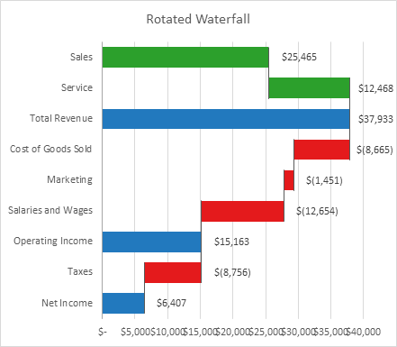
Rotated Waterfall
So what are some of Peltier Tech’s other waterfall charts? One of them is a Rotated Waterfall Chart. It uses the same data as the “Regular” Waterfall Chart, but it uses horizontal bars instead of vertical ones. Most people prefer the regular orientation, but some customers asked for a rotated version, so here it is. Here is the “First Item is a Starting Total” version…
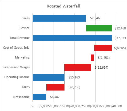
And here is the “First Item is a Change in Value” version.
Stacked Waterfall
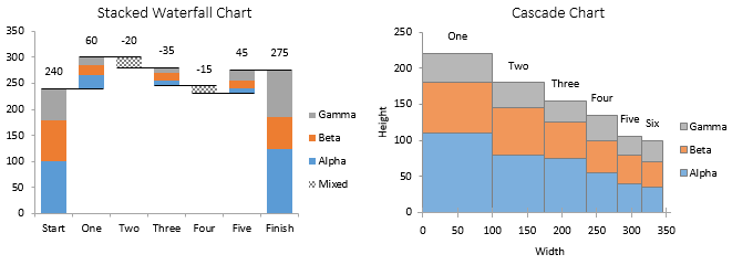
There is also a Stacked Waterfall chart. which breaks down each bar into smaller components. For example, you may want to see how several divisions contribute to your company’s performance.
The data is the same as for the “Regular” Waterfall Chart, except that there are two or more columns of values, one for each division.

Each division appears in the chart with its own color, so you can track it across the chart.
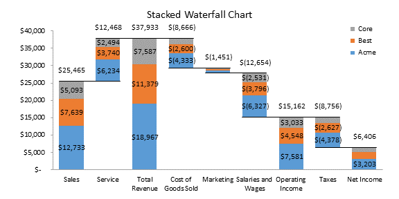
Note that it’s impossible to stack negative and positive values in a stacked bar chart. The Stacked Waterfall handles this situation by replacing a multicolored stacked bar with a single bar that merely shows the net for that category. There is a Split Bar Waterfall Chart in Peltier Tech Charts for Excel (not shown here) that takes this into account, splitting each bar vertically, to stack positive values in the left half of the bar and negative values in the right.
Dual Waterfall
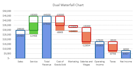
Another type of waterfall is the Dual Waterfall Chart, which allows you to compare two sets of data. The data set below shows the same data for two years.
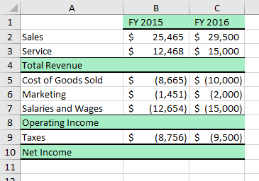
The Dual Waterfall shows one set of data as filled bars, the other as transparent bars with a thick outline, so you can compare performance item by item across two sets of data.
Paired Waterfall Chart
I wrote about the Paired Waterfall Chart recently in the Peltier Tech Blog. This is yet another way to track the cumulative effects of intermediate factors on a value or set of values.
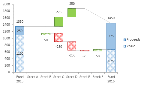
I’m sure there are numerous additional Waterfall Charts that people could show you, but this extensive set is all that I’ve got.
Peltier Tech Charts for Excel
All of these Waterfall Charts, and several other handy chart types, are included in Peltier Tech Charts for Excel.


