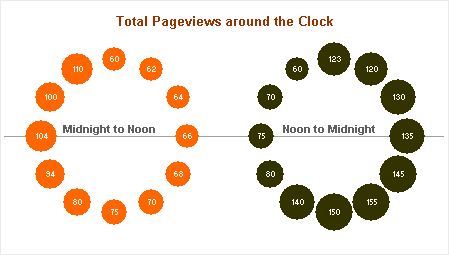
My friend Chandoo proposed a chart to show website traffic vs. time of day in Plot your data around the clock [Excel charting idea]. He thought he’d use the analogy of a 12-hour analog chart, and put a bubble at each hour, where the size of the bubble is related to the pageviews during that hour. Well there’s 24 hours in a day and 12 hours in a clockface, so he had to make a pair of charts. Here’s the result:

Well, this probably seemed like a good idea at the time, and I like the fact that Chandoo keeps trying new ideas and shares them with his readers. But this dual chart has some shortcomings. The chart reminds me of a pair of Elton John glasses with jewels all around the frame, or maybe if I draw a few lines, it looks like a bicycle. And Dubble Bubble is a brand of chewing gum, not an Excel chart type. [Read more…] about Rock Around The Clock


