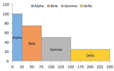
Reader Joe left a comment on the Clustered-Stacked Column Charts article asking how to make column charts with variable width columns. Stacked versions of these charts are often used in marketing where the horizontal axis is divided up into the segments of a market, with the width of each segment proportional to sales in that segment, and the vertical axis is divided into the competitors in each segment, with each block proportional to that competitor’s sales or share of the segment. I’ll provide my normal warning here, that using areas is not the most effective way to convey information. However, for people familiar with this chart type, it is an effective and customary chart.
Variable Width Column Chart (Cascade Chart)
Laying Out the Data For this simple example, we’ll use four entities, each with their own widths and heights.
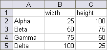
Like most non-standard charts, we have to use a special layout for our chart source data. Here is how the above data is set up. The first column, the X values, comprise a cumulative total of the series widths: 0, 25, 75 (25+50), 150 (25+50+75), and 250 (25+50+75+100). Each of these values is listed twice. In between each of these values, I’ve inserted another row with the average of the values above and below, with orange text. These orange values correspond to dummy data which will provide labels later in this protocol. Each series has mostly zero values or blanks. The X values for series Alpha range from 0 to 25: at X=0 the first Y value for Alpha is zero and the second is 100, the height for Alpha; at X=25, the first Y value is 100, and the second is zero. This provides the step up from 0 to 100 and the step down from 100 to 0. At the in-between point where X=12.5, Y is also 100. Data for other series is laid out in the same way. The column labeled “dummy” holds Y values for a dummy series that will provide the labels in the column marked “Labels”. I’ve colored this text orange to indicate labeling helper data, corresponding with the inserted orange rows above.

Creating the Chart Select the data in columns E through J and create a stacked area chart.
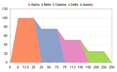
Select the “dummy” series (select the “Delta” area and press the up arrow) and change its chart type to a line chart.
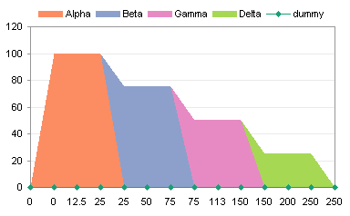
All the X values in column E are treated as text labels, equally spaced without regard to their numerical value. In Classic Excel (2003 and earlier) go to the Chart menu > Chart Options > Axes tab.
The Primary Category axis is listed as Automatic.
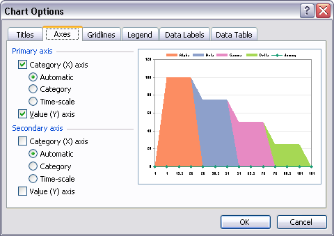
Change this setting to Time-Scale. This is somewhat misleading, as Excel time-scale axes only consider dates and ignore times.
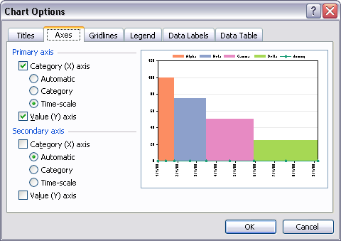
The result is that all Y values for equal X values are vertically aligned, as if in an XY chart. Of course, Excel has helpfully converted the values into dates, spaced one month apart.
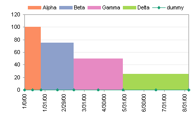
First change the spacing to 25 (or another value that makes sense with your widths).
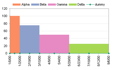
Then change the number format of the axis labels to General (or to another format that makes sense with your widths).
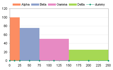
Add Labels to the Variable Width Column Chart If you didn’t need labels, you could have ignored the “dummy” series and the rows with orange X values. But usually you want labels. To do this, I use Rob Bovey‘s free Chart Labeler utility. This utility adds a menu item called “XY Chart Labels” to the Tools menu. It works on any chart type that accommodates chart labels, not just XY charts.
Using the utility, assign the labels in the “Labels” column to the “dummy” series. The labels here have been positioned below the points.
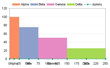
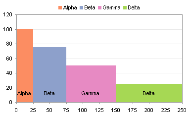
These labels overlap with the axis labels, but there are a few ways to avoid this. You could position the labels above the points. (In this chart, I’ve removed the dummy series from the legend, and formatted it without lines or markers to hide it.) The legend itself could now be removed, because it’s redundant.
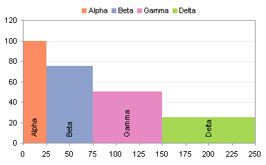
If the labels are crowded (the Alpha label barely fits within its column), you could rotate the text, but this makes it more difficult to read.
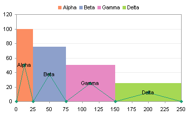
Depending on the purpose of the chart, you could hide the axis labels, and leave the “dummy” series labels below the chart.

There are a couple of alternative sets of data you could use for the “dummy” series, instead of the zero values that correspond to the bottom of the columns. The table below shows data that produces points which are located at the top of the columns, or at the mid-height of the columns.

Position the “dummy” labels above the points located at the tops of the columns.

Here is the chart again after hiding the dummy series.

Center the “dummy” labels on the points located at the mid-heights of the columns.
Once more without the “dummy” series.

You may be interested in Marimekko Charts, which are 100% stacked variable-width column charts.
Cascade Charts in Peltier Tech Charts for Excel
This tutorial shows how to create Cascade Charts, including the specialized data layout needed, and the detailed combination of chart series and chart types required. This manual process takes time, is prone to error, and becomes tedious. I have created Peltier Tech Charts for Excel to create Cascade Charts (and many other custom charts) automatically from raw data. This utility, a standard Excel add-in, lays out data in the required layout, then constructs a chart with the right combination of chart types. This is a commercial product, tested on thousands of machines in a wide variety of configurations, Windows and Mac, which saves time and aggravation.
Please visit the Peltier Tech Charts for Excel page for more information.


