Mark Newman, of the Department of Physics and Center for the Study of Complex Systems, at the University of Michigan, shares some interesting views of the recent US presidential election results in Maps of the 2008 US presidential election results.
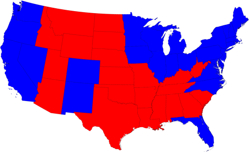
The states won by Republican candidate John McCain seems to dominate the regular map, even though Democratic candidate and president-elect Barack Obama controlled the Electoral College results.

But the map above is based on area, not on the amount of voters. The Northeast and California have relatively high population densities, while many of the rectangular states in the middle of the country are less densely populated. Mark creates “cartograms” which distort readjust the areas of geographical units to reflect other quantities besides land mass area (“distort” is such an ugly word, normally reserved here for 3D charts).
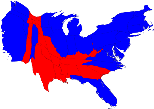
The cartogram below adjusts the areas of the states so each is proportional to the population of that state. Notice how most of the red states in the middle of the map have shrunk, particuarly in the northern plains. The Northeastern stats and to a lesser extent California have expanded, and the colors on the map match the election results. My boyhood state of Rhode Island is larger than Wyoming (even DC is larger than Wyoming), the Dakotas, and Montana. If Alaska were on this map, it would also be dwarfed by Rhode Island.

Pretty cool. The shapes of the redrawn geographical units are still recognizable, and you come away with a better sense for distribution of votes. On his web site, Mark shows more views of the results of this and previous elections, as well as cartograms based on other measures.


