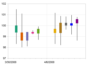
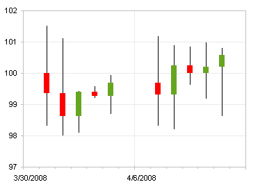
A candlestick chart is used to show stock price performance, typically daily; a bar shows the daily change from the opening to closing price, with different colors for gaining and losing changes, and lines extend from the bar to the daily high and low.
I was recently asked how to apply different arbitrary colors to individual up-down bars in a candlestick chart.
As I showed in Stock Charts and Other Line Chart Tricks, a candlestick chart can easily be fashioned from a run-of-the-mill line chart in Excel. (The web page just cited and this blog post were written about Excel 2003. Excel 2007 faithfully follows most of this discussion, but not all, as the charting capabilities in Excel 2003 are more advanced and more consistent.) Below is a line chart of the same stock data as in the candlestick chart above.
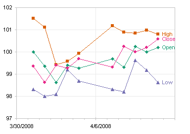
The data is shown below, or you can click here for a CSV file. I’ve added columns F:J for use later in this discussion.

You can select any of the line chart series and open the Format Series dialog. On the Options tab, select the High-Low Lines and Up-Down Bars options. The High-Low Lines option draws a line from the highest to the lowest of all line chart series plotted in the axis group (primary or secondary) of the selected series, no matter what order the series are in, as long as there are two or more line chart series.
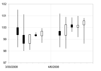
The Up-Down Bars option draws a bar from the first line series to the last line series in the axis group (primary or secondary) of the selected series. The bars representing an increase from first to last are in a different formatting group (Up Bars) than those representing a decrease (Down Bars). Therefore, although it doesn’t matter how many line chart series you have (as long as it is a minimum of two), the order of series is very important: Open should always be first and Close should always be last. By default, Up Bars are filled white and Down Bars are filled black. The chart below is a line chart with High-Low Lines and up-Down Bars. To produce the candlestick chart at the top of this post, the line series themselves are formatted to show no markers and no lines.
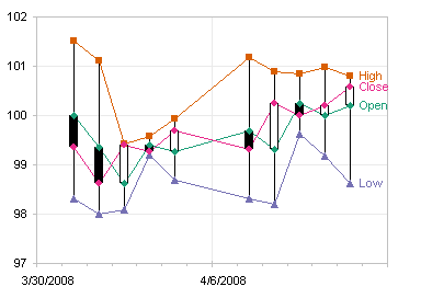
You can right click on a set of bars, choose the Format item in the pop-up menu, and format the bars. I sometimes forget whether the up or down bars are black and white in the default color scheme, so I color gains green and losses red. You can pick any color scheme you want, but all up bars get one scheme and all down bars get another. You cannot selectively color any individual bars with distinctive colors.
I’ll describe the alternate approach you need to follow to enable formatting individual up-down bars, but first I’ll show a stock chart appearance which is very common in financial sources. Instead of the up-down bars, this chart shows a left tick for an opening price and a right tick for a closing price. Excel offers a variation that has a right tick for closing prices, but no left tick option. I rely on smoke, mirrors, and error bars to get this effect, as described in Stock Charts and Other Line Chart Tricks.

We know from changing the up-down bar colors to red and green (above) that we can format a group of up or down bars, but we cannot individually format one up or down bar. We do know that we can format an individual point in a column chart series, so let’s reconstruct the up-down bars using a stacked column chart to generate floating columns. In the table above, I have used simple formulas to calculate the heights of the Float, Down, and Up columns:
Float (cell F3)
=MIN(B3,E3)
Down (cell G3)
=IF(B3>E3,B3-E3,0)
Up (cell H3)
=IF(B3<E3,E3-B3,0)
Create a stacked column chart using this data:
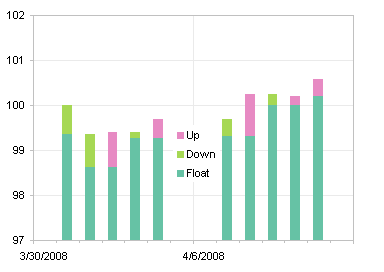
Then format the Float series to be invisible (no border and no fill) and the Up and Down series to be the colors you want (I used the same green and red color scheme I’d used for the Up-Down Bars in the earlier chart).
Although individual bars can be formatted separately, I kept separate series of Up and Down Bars, so that I could format each series in one step, rather than formatting several individual bars the same way.

As stated above, you can get High-Low lines with a pair of line chart series. The steps are: add series for High and Low, change the chart type of these series to line chart, add High-Low Lines, and hide markers and connecting lines. I didn’t go through the protocol in detail, because the results are not what we want: The High-Low Lines lie in front of the Up-Down Bars. This is simply the way Excel draws these chart elements, and we cannot change that.
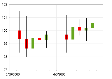
All is not lost, however. There is more than one way to skin a cat, or in this case, to draw vertical lines on a chart. We’ll use error bars. I used formulas in the Max and Min columns in the data to calculate error bar values:
Max (cell I3)
=C3-MAX(B3,E3)
Min (cell J3)
=MIN(B3,E3)-D3
Select the Float series (use the chart element selector dropdown on the Chart toolbar, since the series is invisible), press Ctrl+1 (numeral one) to bring up the Format Series dialog, and on the Y Error Bars tab, click in the Custom (-) box, and select the range containing the Min values (J3:J12 in my table). Select the High series, press Ctrl+1, and on the Y Error Bars tab, click in the Custom (+) box, and select the range containing the Max values (I3:I12 in my table).

Double click on one set of error bars, and choose the style that has no end cap. Repeat for the other set of error bars.
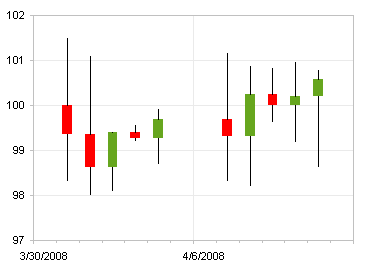
Now you can individually format any of the pseudo Up-Down Bars. Click on the bar to select the series of bars, then click on it again to select it by itself, then press Ctrl+1 to open the Format Point dialog, and select any colors you like.
