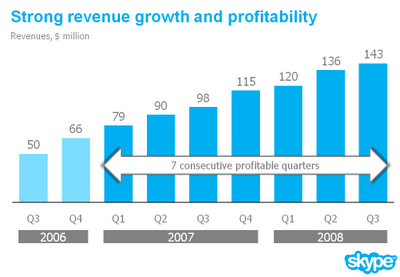
Jan Schultink shows that effective charting practices work in PowerPoint as well, in his Chart make-over example on Slides that Stick. He gives an example taken from some financial data from Skype.
Here is the original slide:

Here is all that Jan had to do, in his own words:
- I reduced the template to a logo at the bottom right of the page, eliminating all other distracting elements. I really like white space.
- I rigorously applied the Skype corporate colors and fonts.
- I changed to a simple column chart without 3D.
- I replaced the vertical axis with data labels.
- I re-wrote the headline.
- I replaced the yellow star to give the text more connection to the numbers (still it would have been better to show the actual profit numbers).
Where have we heard these steps before? I guess charting best practices are platform independent. They work as well in PowerPoint as in Excel.
As proof, check out the “after” slide:

The subtitle of Jan’s blog is Better PowerPoint Presentations. If you follow advice like his, it can only improve your own presentations.


