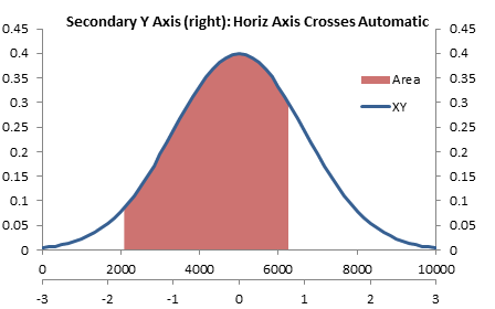
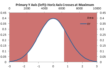
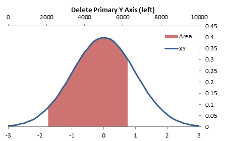
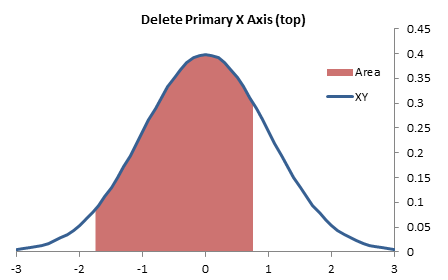
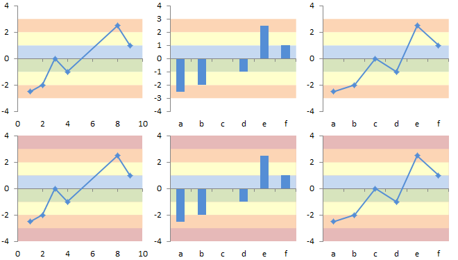
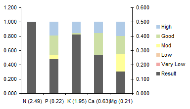
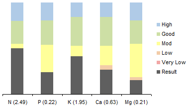
Shading between plotted lines with a light color can enhance some charts. The shading may help to indicate a target range for the data.
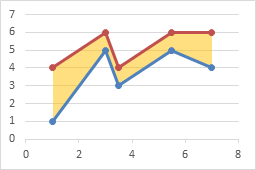
I’ve written earlier tutorials about this topic, but I have had to change sequences of steps in the protocol because more recent versions of Excel were not as flexible with order of operations as Excel 2003 (RIP).
XY-Area Combination Charts
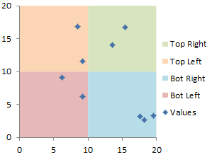
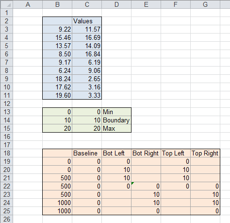
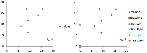
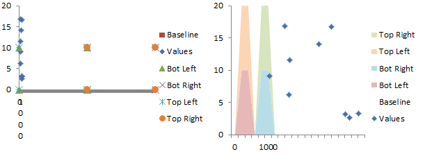
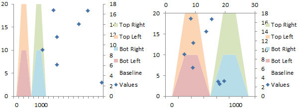
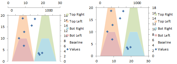
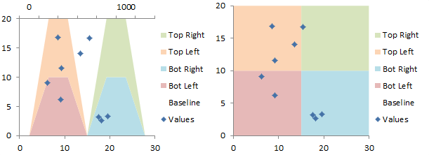
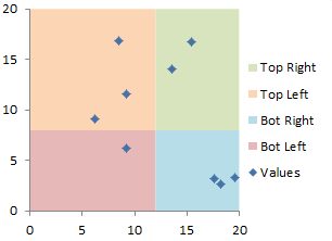
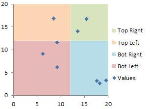
Recently in Shaded Quadrant Background for Excel XY Scatter Chart I showed how to generate a background grid of colored rectangles.
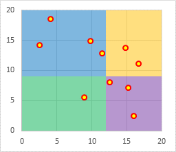
This technique plotted the XY chart data on the primary axes and the Area chart data on the secondary axes. It also took advantage of a trick using the category axis of an area (or line or column) chart: when used as a date axis, points that have the same date are plotted on the same vertical line, which allows adjacent colored areas to be separated by vertical as well as horizontal lines.
To fill under or between XY series, we’ll make use of this same approach: XY data on primary axes, Area data on secondary axes, with a secondary date axis.
Fill Under One XY Series
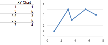
Let’s start with the simple case of filling color below an XY plot. Simple data, simple chart of type Scatter With Straight Lines and Markers.
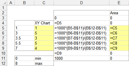
We need to do some calculations to produce data for the area chart series (see below). The min and max X for the XY chart’s X axis are entered in B11 and B12 (these are Excel’s automatic scale limits in the XY chart above). To provide reasonable resolution, we’ll scale the area chart’s X data from 0 to 1000. The formulas for the area chart’s X values in column D are simple interpolation formulas to properly rescale the data.
The X values are extended so that the first calculated X value in D5 is repeated in D4, and a zero is placed in D3; also the last calculated X value in D9 is repeated in D10, and the X max of 1000 is entered into D11. These duplicate X values will provide the vertical edges of the shaded region.
The formulas for the area chart’s Y values in column E provide the same Y values for both chart series. The Y values are extended by two cells above and below the calculations, which contain zeros.
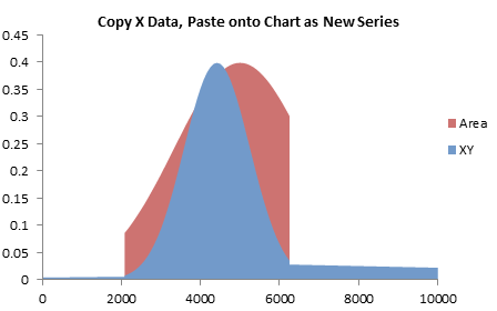
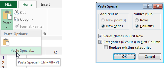
The chart already contained the XY data in the first two columns of the data range (B4:C9). Copy the next two columns (D2:E11) , select the chart, then click on the Paste dropdown on the Home tab and choose Paste Special (below left). The Paste Special dialog will appear; make sure the same settings are selected as shown below right.
Here is the computed data and the chart. The added series is an XY chart type, like the first. Don’t change it yet.

Select the newly added series, press Ctrl+1 (numeral one) to open the Format Series Task Pane (Excel 2013) or the Format Series Dialog (2010 or 2007), and under Series Options, select Secondary Axis (below left). Excel adds a secondary vertical axis along the right edge of the chart (below right).
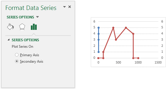
Excel adds a secondary vertical axis along the right edge of the chart.
In Excel 2013, click the plus icon beside the chart, click on the right-facing arrow beside Axes, and check the Secondary Horizontal box. In Excel 2010 or 2007, you’ll have to trudge up the the Chart Tools > Layout tab, click on the Axes dropdown, click Secondary Horizontal, and finally click Show Left to Right Axis.
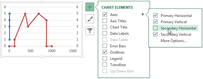
Now all axes are present and accounted for.

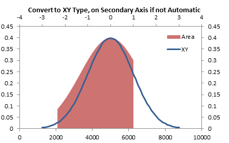
Right click on the “Area” series (which is still of type XY), and choose Change Series Chart Type. In Excel 2013, the Change Chart Type dialog appears. Click the Chart type dropdown in the Area series row, and select Area or Stacked Area (doesn’t matter which in this case, since there’s only one area series). You actually could have switched the area series to the secondary axis in this dialog (as long as you do it before changing the chart type), but I usually forget that it’s become this simple.
In Excel 2007 and 2010, select Area or Stacked Area from the pop-up window.

The series has now been converted to an area series.

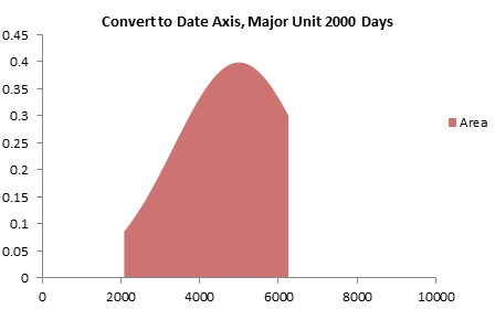
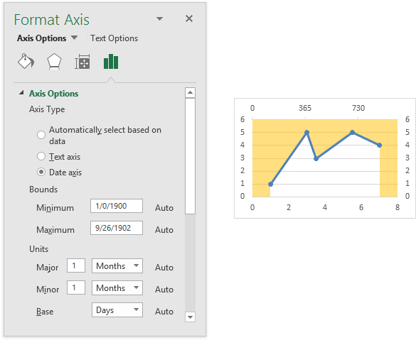
Select the secondary horizontal axis (top of chart) and press Ctrl+1 to open the Format Axis Task Pane or the Format Axis Dialog. Under Axis Type, select Date Axis (below left). You may also have to change the Base Unit of the axis to Days.
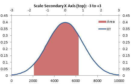
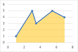
The area chart series is now perfectly aligned with the XY series. Since it’s plotted on the secondary axis, the area series fills the space between the secondary horizontal axis at the top of the chart and the data points. So it’s above the data, not below. But we’re clever enough not to panic.
Delete the secondary vertical axis (right edge of chart) and the secondary horizontal axis (top of chart). The fill moves into position below the XY plot.
Fill Between Two XY Series
The protocol for filling between two plotted lines is pretty much the same as above. We start with two XY scatter chart series, one above and one below the filled area. We will also need two stacked area chart series, one for the clear region below the lower XY line, and one stacked on top to fill between the XY lines.
Here is the data and the initial chart for the two XY curves. It takes up space, but I’ll leave the legend there until the end to help us keep track of which series is which.

The formulas to calculate the area chart X and Y values are like those used in the simpler example above. Note that the Bottom Area data is the same as the Bottom Line data, while the Delta Fill data is the difference between the Top Line and Bottom Line data.

Copy the area chart data (E2:G11) , select the chart, then click on the Paste dropdown on the Home tab, choose Paste Special, then make sure the settings are correct. The new data is added as additional XY series, which is fine.

Select one of the Area data series (still plotted as XY), press Ctrl+1 to open the Format Series Task Pane or Dialog, and choose Secondary Axis. Excel gives us the secondary vertical axis along the right edge of the chart. Repeat for the other Area data series.
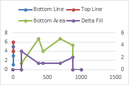
In Excel 2013, click the plus icon beside the chart, click on the right-facing arrow beside Axes, and check the Secondary Horizontal box. In Excel 2010 or 2007, you’ll have to trudge up the the Chart Tools > Layout tab, click on the Axes dropdown, click Secondary Horizontal, and finally click Draw Left to Right Axis.

Right click on the “Area” series (which is still of type XY), and choose Change Series Chart Type. In Excel 2013, the Change Chart Type dialog appears. Click the Chart type dropdown in each of the Area series rows, and select Stacked Area. You could have switched the area series to the secondary axis in this dialog (as long as you do it before changing the chart type).
In Excel 2007 and 2010, select Area or Stacked Area from the pop-up window. The chart probably looks like it’s broken right about now, but don’t panic. Right click on the other area series, choose Change Series Chart Type, and again select Stacked Area.

Select the secondary horizontal axis (top of chart) and press Ctrl+1 to open the Format Axis Task Pane or the Format Axis Dialog. Under Axis Type, select Date Axis. The area chart series are now perfectly aligned with the XY series. Since they’re plotted on the secondary axis, the Bottom Area series fills the space between the secondary horizontal axis at the top of the chart and the Bottom Line data points. So it’s above the data, not below. The Delta Fill area has filled the space between the XY lines.
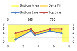
Delete the secondary horizontal and vertical axes. The Bottom Area now fills below the Bottom Line, while the Delta Fill fills between Bottom Line and Top Line.
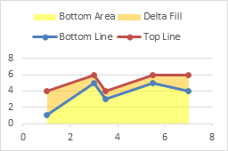
Format the Bottom Area series so it has no fill.
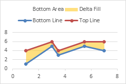
Finally, delete the legend.

Fill Between Overlapping Regions
It is possible to extend this approach even further. Suppose we want to fill between two pairs of lines. The following simple data has four series, min and max for set A and min and max for set B. We want to fill between Amin and Amax, and between Bmin and Bmax. If these areas overlap, we’d like to see both.
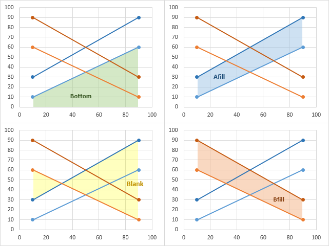
We can set up the area chart data below, where we have an area below Amin (“Bottom”), one between Amax and Amin (“Afill”), one between Bmin and Amax (“Blank”), and one between Bmax and Bmin (“Bfill”). The “Blank” area between Bmin and Amax extends from Bmin down to Amax, if Bmin is greater, or from Bmin UP to Amax, if Bmin is smaller.

I won’t go through the whole procedure, because it’s really the same as filling between two lines, above. The lines are shown on the left, A in blue, B in orange. The finished overlapping filled regions are shown on the right, again A in blue and B in orange. I’ve used a transparency setting of 50% so we can see gridlines and other data behind the area fills.
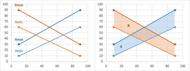
The four charts below show each area in turn with the others hidden. First, “Bottom” fills from the axis up to Amin, then “Afill” fills from Amin up to Amax, “Blank” fills from Amax up (or down) to Bmin, and finally “Bfill” fills from Bmin up to Bmax.
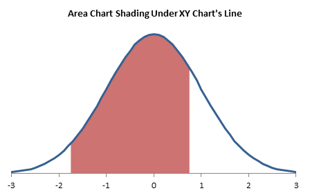
Fill Under a Plotted Line: The Standard Normal Curve
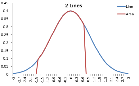
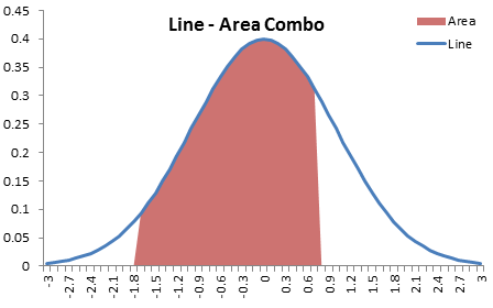
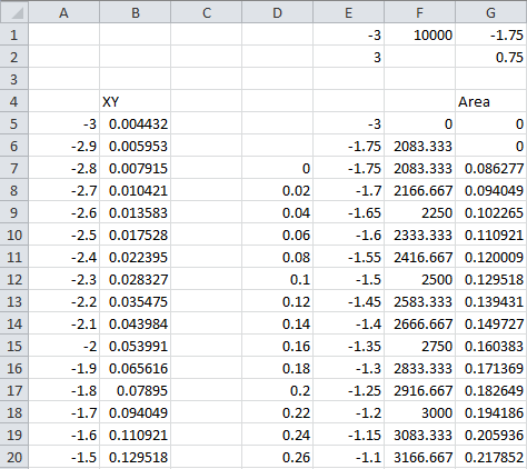
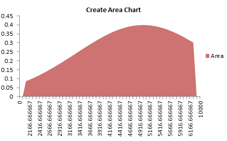
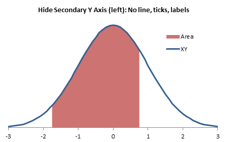
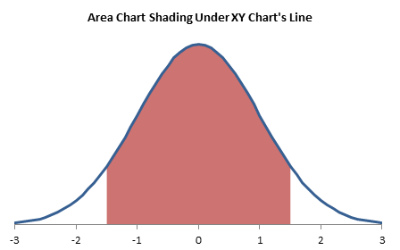
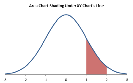
For an example of this technique, see another tutorial I’ve written, Fill Under a Plotted Line: The Standard Normal Curve.
More Combination Chart Articles on the Peltier Tech Blog
- Pareto Charts in Excel
- Clustered Column and Line Combination Chart
- Precision Positioning of XY Data Points
- Add a Horizontal Line to an Excel Chart
- Horizontal Line Behind Columns in an Excel Chart
- Bar-Line (XY) Combination Chart in Excel
- Salary Chart: Plot Markers on Floating Bars
- Fill Under a Plotted Line: The Standard Normal Curve
- Excel Chart With Colored Quadrant Background
