In The Increasing Patriotism of Iraqis (actually just a comment on the labeling of years on x-axes of graphs), Andrew Gelman showed the following chart from The Increasing Patriotism of Iraqis. The chart came from a paper by the author of The Monkey Cage blog.
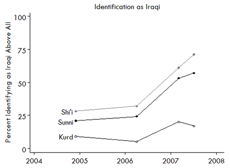
Andrew commented that the X axis should have years centered between the tickmarks, since a year is a span of time, not an event.
I decided to demonstrate how to produce a date scale axis with centered year labels in Excel. Using the following simplified data, I reconstructed the chart of Elkins and Sides as an Excel line chart.

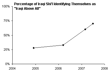
The year labels have a number format of “YYYY” so only the four-digit year is shown. If the months and days are also shown, we see that the year labels actually appear at the start of each year (which is evident if we examine the data).
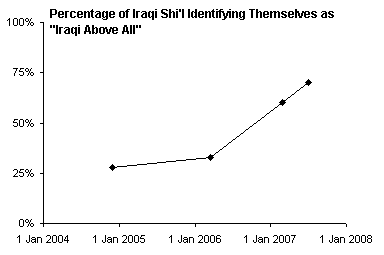
To “fix” the labels, I will add a second line chart series, move the original series to the secondary axis, and only display the primary axis year labels. Below is the data used for this second series, as well as the chart with this series added. Although the X values (category labels) are different for this second series, in a line chart, all series in each axis group use the same labels as the first series in the axis group.

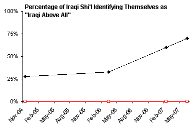
Move the original series to the secondary axis (secondary axis group) by choosing Secondary in the Format Series dialog. Note that both series now use the X labels of the second series.
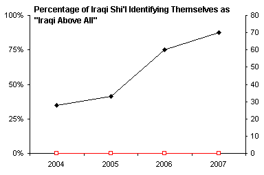
When you move a series to the secondary axis group, Excel usually provides a secondary value (Y) axis but not a secondary category (X) axis. Delete the secondary Y axis and add a secondary X axis. This axis appears at the top of the chart, overlapping with the title.

Adjust the scale of the secondary date axis, so it starts at the beginning of 2004 (i.e., January 1) and ends at the start of 2008.
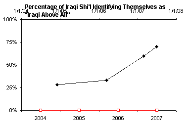
Finally, hide the secondary category axis by changing all of its formatting properties to None. Also hide the second series by chaning its line and marker properties to None.

Without too much muss and fuss, we’ve created a nicer date scale axis, with the year labels centered within the corresponding years, rather than at the start of each year.

