The Issue
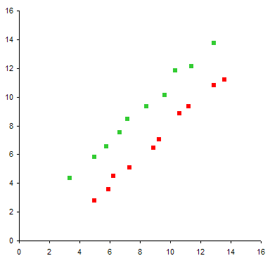
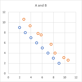
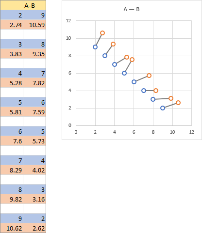
If you have XY data from two different times, or under two different sets of conditions, you can connect points of one series (one time or condition) to another (another time or condition), to help show how the data evolves. For example, here are two series of data that I might want to connect together.

Several years ago I wrote Connect Two XY Series, which showed how to connect the points of one series to the corresponding points of another series. This approach used a third series with data from Series A and Series B, interwoven with blank cells.

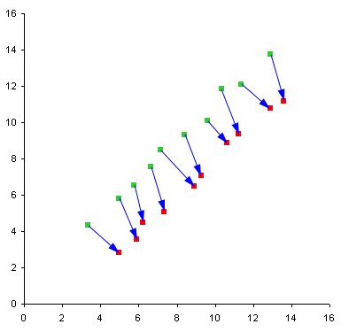
I followed this up with Connect Two XY Series with Arrows (VBA), which showed how to connect the two series with arrows. In Excel 2003 and earlier, you had to use VBA to draw the arrows, and this article provided the VBA (and it’s reproduced below).
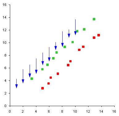
This works nicely enough, but the arrows are not tied to the points, but only to the original positions of the points within the chart. So if you change the axes in the chart …

… or change the size or shape of the chart …
… the arrows no longer match up to the points.
You could always delete the misaligned arrows and rerun the VBA procedure, but what a pain.
I hinted in this second article that you could connect the points with arrows in Excel 2007, without using VBA but instead by formatting the third series that connected the first two series. But I never explained how. This article fills the gap.
Connect Two Series with Arrows, Without VBA
You need to keep the original Series A and B data in place, so you can still easily plot the original points. You need to get data into a new range, interweaving Series A with Series B.
Set Up The Data – Approach 1
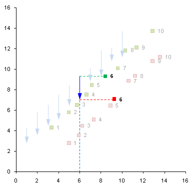
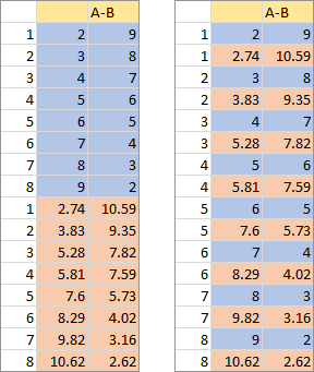
To get the data into this alternating arrangement, start by pasting the data from Series A into a new range, then paste the data from Series B below it. Enter a set of index numbers into a column adjacent to this combined data, from 1 to the number of points in Series A, and from 1 to the number of points in Series B (which should be the same number of points). This is the first data block below.
Select the data, and sort by the column of digits you just entered. The data now has alternating Series A and B data (below right).
Select the data and create a chart, or add it as a new series to the chart of Series A and Series B.

Hmmm, that’s almost what I want. But there are too many line segments. We need to eliminate half of them, shown as dashed lines below.

We could format alternating line segments to be drawn with no line, but that’s mighty tedious after the first or second segment. Speaking from experience, because I had to format the dashed lines in the chart above, segment by segment.
As I’ve written about in Mind the Gap – Charting Empty Cells, the way we get a gap between points in a chart is to have a gap in the data, that is, blank cells between the points.
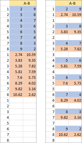
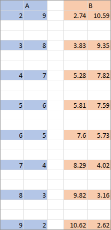
So let’s alter our protocol above, so that we start with the Series A data, then the Series B data below that, then an equal number of blank rows at the bottom, and include our index column (below left).
Sort by the index column, to get Series A and B data pairs, separated by blanks (below right).
Now when we plot this data, we connect appropriate pairs of points, with gaps between points we do not want to connect.

Set Up The Data – Approach 2
Above we produced our data range by copying the data into a new range, and sorting the data appropriately. We could instead have stretched out the data first, then copied and pasted using the Skip Blanks option.
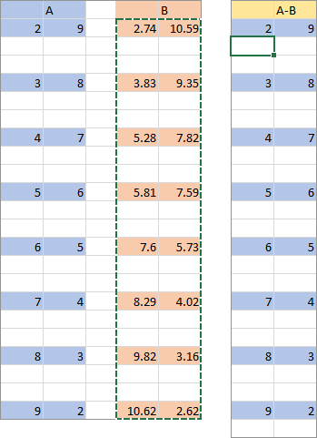
Here’s a copy of the Series A and B data, with two rows inserted between each point.
Copy the expanded Series A data, select the first cell of a new range, …

… then paste.

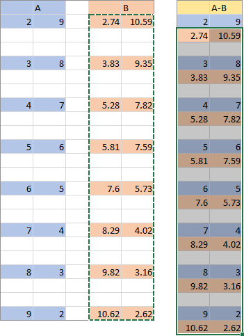
Now copy the Series B data, select the cell below the first Series A point, …
… and use Paste Special, and check the Skip Blanks option near the bottom of the dialog. Skip Blanks prevents blanks in the copied range from being pasted over data in the target range, so the Series A data is preserved.
Now the data is ready to plot.
Make the Chart
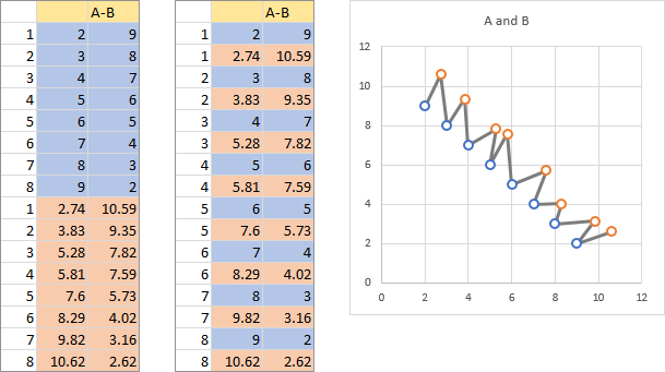
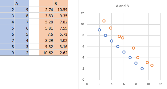
Select the Series A data (shaded blue below), and create an XY Scatter chart. Then copy the Series B data (shaded orange), select the chart, and use Paste Special to add the data as a new series, with series in columns, Y values in the first column, series names in the first row. The resulting chart is shown below right.
Now copy the A-B Interwoven data (below left), select the chart, and again use Paste Special to add this data as a new series, with series in columns, Y values in the first column, series names in the first row, to produce the chart shown below right. (You may have to format the new series to show lines and no markers)
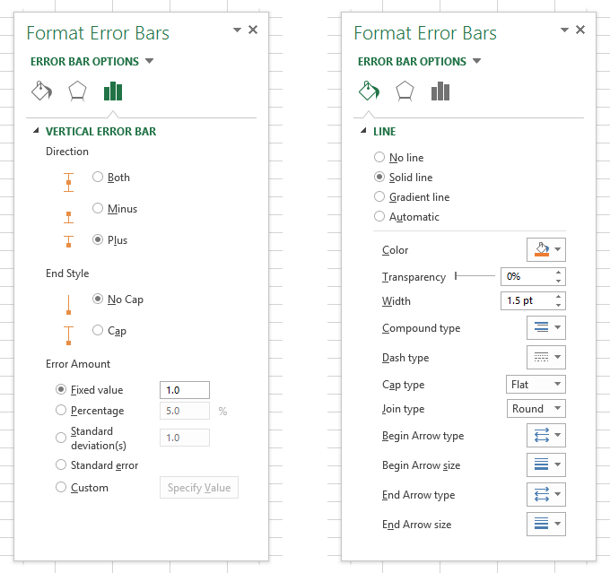
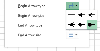
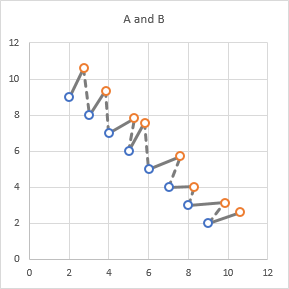
Now you need to format the line segments of the new series. Select the series and press Ctrl+1 (numeral one) to open the Format Data Series task pane or dialog. Click the End Arrow Type dropdown, and select the desired arrow type. The options include three arrowheads, a circle, a diamond, and a plain line.
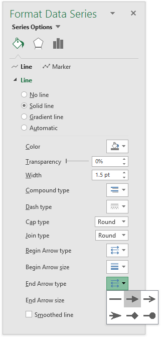
Now click the End Arrow Size dropdown, and choose an appropriate size for the arrowhead. There are combinations of three arrowhead lengths and widths.

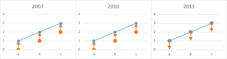
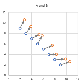
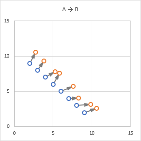
Now the line segments have been transformed into arrows.

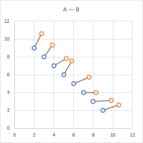
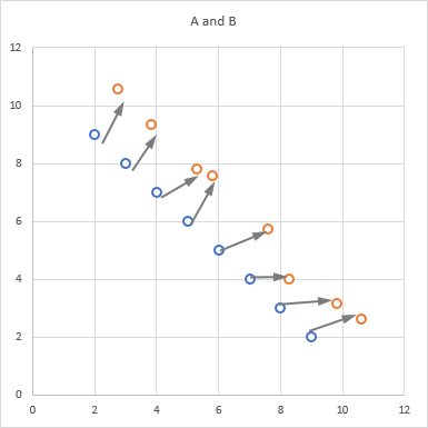
Unlike the VBA approach of the old tutorial, the arrows are tied to the points in Series A and Series B. So if you change the axes in the chart …
… or change the size or shape of the chart …
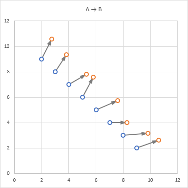
… the arrows still match up to the points.

The VBA
You don’t need to use VBA to connect points with arrows, but it is a good sample application of VBA to your charts. Just so you don’t have to go back to the earlier post, here is the VBA Procedure that connects the points with line segments with arrowheads.
Sub ConnectTwoXYSeriesWithArrows()
  Dim myCht As Chart
  Dim mySrs1 As Series
  Dim mySrs2 As Series
  Dim nPts As Long, iPts As Long
  Dim myBuilder As FreeformBuilder
  Dim myShape As Shape
  Dim iShp As Long
  Dim Xnode1 As Double, Ynode1 As Double
  Dim Xnode2 As Double, Ynode2 As Double
  Dim Xmin As Double, Xmax As Double
  Dim Ymin As Double, Ymax As Double
  Dim Xleft As Double, Ytop As Double
  Dim Xwidth As Double, Yheight As Double

  ' a chart with at least two series must be selected
  If ActiveChart Is Nothing Then
    GoTo ExitSub
  End If
  If ActiveChart.SeriesCollection.Count < 2 Then
    GoTo ExitSub
  End If

  Set myCht = ActiveChart
  Set mySrs1 = myCht.SeriesCollection(1)
  Set mySrs2 = myCht.SeriesCollection(2)
  nPts = mySrs1.Points.Count

  ' two series must have matching numbers of points
  If mySrs2.Points.Count <> nPts Then
    GoTo ExitSub
  End If

  ' remove any old connecting arrows
  For iShp = myCht.Shapes.Count To 1 Step -1
    If Left(myCht.Shapes(iShp).Name, 12) = "ArrowSegment" Then
      myCht.Shapes(iShp).Delete
    End If
  Next

  Xleft = myCht.PlotArea.InsideLeft
  Xwidth = myCht.PlotArea.InsideWidth
  Ytop = myCht.PlotArea.InsideTop
  Yheight = myCht.PlotArea.InsideHeight
  Xmin = myCht.Axes(xlCategory).MinimumScale
  Xmax = myCht.Axes(xlCategory).MaximumScale
  Ymin = myCht.Axes(xlValue).MinimumScale
  Ymax = myCht.Axes(xlValue).MaximumScale

  For iPts = 1 To nPts
    ' first point
    Xnode1 = Xleft + (mySrs1.XValues(iPts) - Xmin) * Xwidth / (Xmax - Xmin)
    Ynode1 = Ytop + (Ymax - mySrs1.Values(iPts)) * Yheight / (Ymax - Ymin)

    ' second point
    Xnode2 = Xleft + (mySrs2.XValues(iPts) - Xmin) * Xwidth / (Xmax - Xmin)
    Ynode2 = Ytop + (Ymax - mySrs2.Values(iPts)) * Yheight / (Ymax - Ymin)

    ' draw connecting line
    Set myShape = myCht.Shapes.AddLine(Xnode1, Ynode1, Xnode2, Ynode2)

    ' name and format shape as arrowhead
    With myShape
      .Name = "ArrowSegment" & CStr(iPts)
      With .Line
        ' USE YOUR FAVORITE FORMATS HERE
        .ForeColor.ObjectThemeColor = msoThemeAccent3
        .ForeColor.Brightness = -0.25
        .Weight = 1.5
        .EndArrowheadLength = msoArrowheadLong
        .EndArrowheadWidth = msoArrowheadWidthMedium
        .EndArrowheadStyle = msoArrowheadTriangle
      End With
    End With

  Next

ExitSub:

End Sub