I replied to a question in SuperUser the other day, Switching X and Y values for every series in scatter chart. Good question; so good that I upvoted it. Than I solved it with a little bit of code.
When you are able, it’s best to always arrange your data so the X values are in the first column (or row) and your Y values are in columns further to the right (or in lower rows), so Excel correctly assigns the ranges to X and Y in your chart. But you don’t alway have this option, if the workbook came from somewhere else. Even harder to do if there is one column of Y values and multiple columns of X values.
The Problem
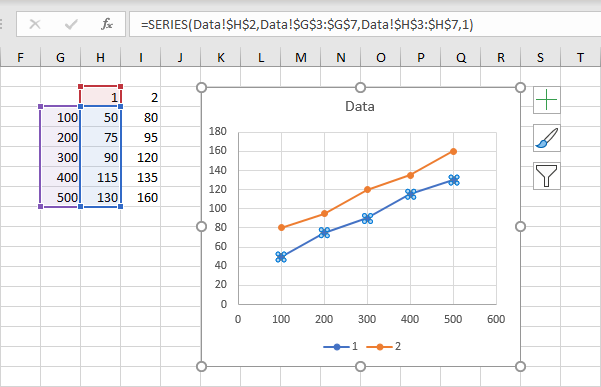
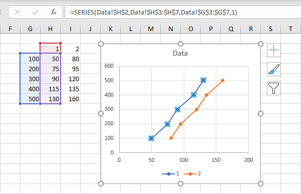
I’ll illustrate with some simple data. Here is the original chart with two series. Series 1 is selected below to show the highlighted data in the worksheet. Currently the series name is in H2, the X values are in G3:G7, and the Y values are in H3:H7.
Well, this is easy, you say, Excel lets me switch rows and columns! Right click the chart, choose Select Data from the pop-up menu, and then click the Switch Row/Column button right there in the middle.
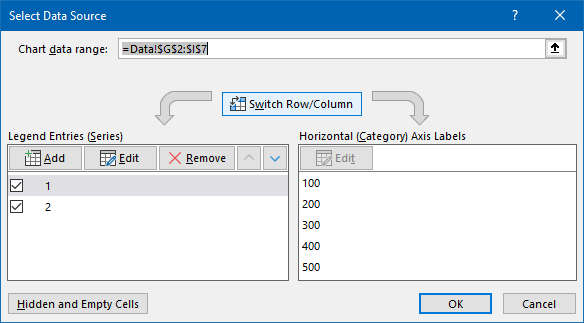
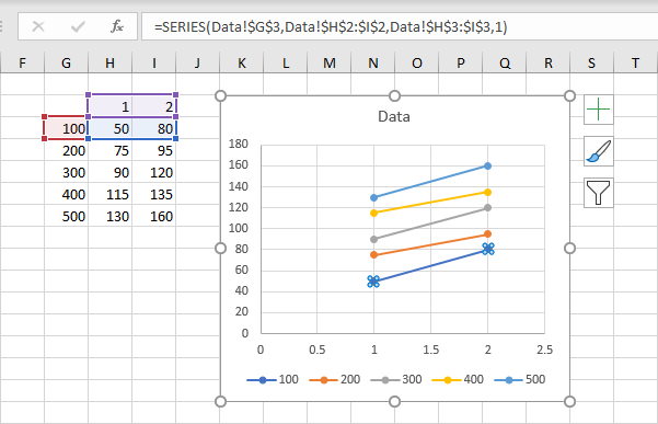
And when Excel switches rows and columns, the series names switched from the first row to the first column, the X values switched from the first column to the first row, and the Y values switched from the other columns to the other rows. Our chart went from two series with five points each, to five series with two points each.
The SERIES Formula
Let’s return to the original chart. Note the SERIES formula that appears in the Formula Bar when you select a chart series.

The SERIES formula says:
=SERIES(Data0!$H$2,Data0!$G$3:$G$7,Data0!$H$3:$H$7,1)The syntax is:
=SERIES(series name,X values,Y values,series number)What we need to do is switch the references in the SERIES formula, so for the first series, the X values go from G3:G7 to H3:H7, and the Y values do the reverse, switching from H3:H7 to G3:G7.
You can do this in several ways. If you don’t have many to do, you can simply select each series, and edit its SERIES formula in the Formula Bar. That doesn’t sound tedious at all!
Alternatively, you can open the Select Data Source dialog (right click the chart, click Select Data), select the series from the list, and click the Edit button to open the Edit Series dialog. You can then edit the items in the dialog. Which sounds worse than simply editing the SERIES formulas.
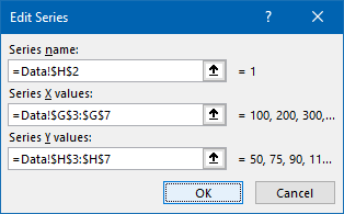
The third option is to write a bit of VBA. My code below follows a simple routine. It loops through all of the series in the chart. It starts with the SERIES formula of a series, then uses the Split function to separate it at each comma into an array of elements. The routine switches the second element (the X values) with the third (the Y values), then uses the Join function to put the array elements back into a SERIES formula. Finally it reassigns the corrected formula to the series, then loops to the next series.
Sub SwitchXY()
  If Not ActiveChart Is Nothing Then
    Dim srs As Series
    For Each srs In ActiveChart.SeriesCollection
      Dim SrsFmla As String
      SrsFmla = srs.Formula
      '' =SERIES(name,xvalues,yvalues,number)

      Dim vFmla As Variant
      vFmla = Split(SrsFmla, ",")
      '' array {"=SERIES(name","xvalues","yvalues","number)"}

      Dim temp As String
      temp = vFmla(LBound(vFmla) + 1) ' xvalues
      vFmla(LBound(vFmla) + 1) = vFmla(LBound(vFmla) + 2)
      vFmla(LBound(vFmla) + 2) = temp
      '' array {"=SERIES(name","former yvalues","former xvalues","number)"}

      SrsFmla = Join(vFmla, ",")
      '' =SERIES(name,former yvalues,former xvalues,number)

      srs.Formula = SrsFmla
    Next
  End If
End Sub
Here’s the original chart with X and Y switched. Note the addresses for X and Y have switched places in the formula, and the highlighted regions for X and Y in the worksheet have changed places, and the axes of the chart have exchanged minimum and maximum values.
Complicated Series Formulas
This simple VBA procedure works fine for simple series source data ranges; in fact, it’s probably good for over 95% of chart series. But there may be times when the code will fail.
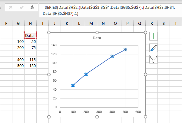
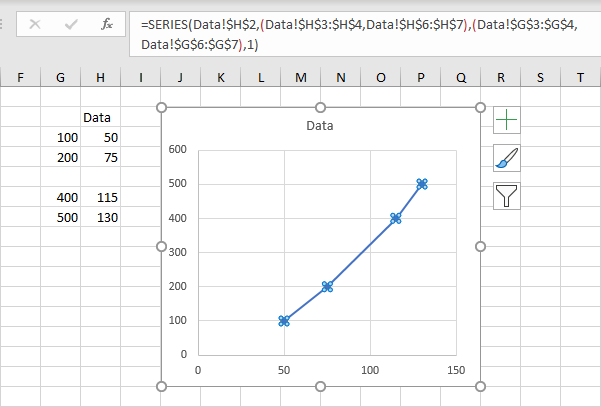
For example, what if the X and Y ranges are not simple contiguous ranges. The chart below has an X range with two areas and a Y range also with two areas. This happens if the chart was constructed using the range G2:H4, then the range G6:H7 was copied and pasted into the chart as new points. Excel plots the data happily, but the series formula now has two X ranges and two Y ranges, separated by commas and enclosed in parentheses. Those extra commas will break our routine that splits the SERIES formula into array elements at each comma.
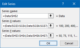
Here’s the Edit Series dialog for the series in the chart above.
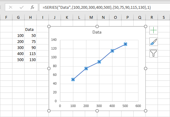
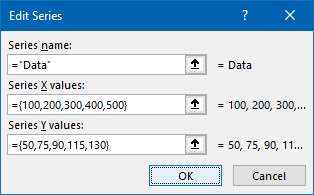
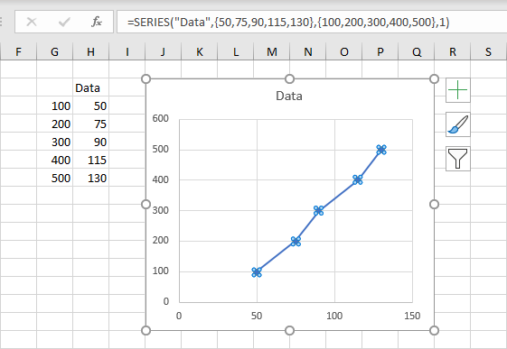
For another example, what if the data is not linked to the worksheet at all. You can create a chart using the range G2:H7, then put your cursor at the end of the SERIES formula and press the F9 function key. Pressing F9 evaluates the formula, and in this case, turns the series name from Data!$H$2 to “Data”, the X values from Data!$G$3:$G$7 into the array {100,200,300,400,500}, and the Y values from Data!$H$3:$H$7 into the array {50,75,90,115,130}. These arrays contain many commas, which will break our simple algorithm.
Here’s the Edit Series dialog for this chart:
A New Algorithm
I will use a similar approach, but I can’t split the formula at every comma. If the chart has compound ranges, I want to ignore commas that appear within the parentheses that enclose X or Y values. If the chart has arrays, I want to ignore commas that appear within an array’s curly braces. I want to avoid commas, parentheses, and curly braces that appear within double quotes, because who knows what someone may type as a series name.
So I will check each character of the series formula. If it’s a comma where I want to split the formula, I will replace the comma with a pipe character, |, hoping that there will be no pipe characters elsewhere in the formula. All other commas, and all other characters will be unchanged.
Here is the VBA function that turns the original SERIES formula into a pipe-delimited SERIES formula:
Function ParseSeriesFormula(sFmla As String) As String
  Dim nChars As Long
  nChars = Len(sFmla)

  Dim iChar As Long
  For iChar = 1 To nChars
    Dim sChar As String
    sChar = Mid$(sFmla, iChar, 1)
    Select Case sChar
      Case "("
        Dim bQuote As Boolean
        If Not bQuote Then
          Dim iParen As Long
          iParen = iParen + 1
        End If
      Case "{"
        If Not bQuote Then
          Dim iBrace As Long
          iBrace = iBrace + 1
        End If
      Case ")"
        If Not bQuote Then
          iParen = iParen - 1
        End If
      Case "}"
        If Not bQuote Then
          iBrace = iBrace - 1
        End If
      Case """"
        bQuote = Not bQuote
      Case ","
        Dim sNewFmla As String
        If iParen = 1 And iBrace = 0 And Not bQuote Then
          sChar = "|"
        End If
      Case Else
    End Select
    sNewFmla = sNewFmla & sChar
  Next

  ParseSeriesFormula = sNewFmla
End Function
Now I will modify the original SwitchXY procedure so that it parses the SERIES formula with the ParseSeriesFormula function above, splits it at the pipes, switches X and Y array elements, then recombines them into a SERIES formula that it can then apply to the chart series.
Sub SwitchXY_Advanced()
  If Not ActiveChart Is Nothing Then
    Dim srs As Series
    For Each srs In ActiveChart.SeriesCollection
      Dim SrsFmla As String
      SrsFmla = srs.Formula
      '' =SERIES(name,xvalues,yvalues,number)

      SrsFmla = ParseSeriesFormula(SrsFmla)
      '' =SERIES(name|xvalues|yvalues|number)

      Dim vFmla As Variant
      vFmla = Split(SrsFmla, "|")
      '' array {"=SERIES(name","xvalues","yvalues","number)"}

      Dim temp As String
      temp = vFmla(LBound(vFmla) + 1) ' xvalues
      vFmla(LBound(vFmla) + 1) = vFmla(LBound(vFmla) + 2)
      vFmla(LBound(vFmla) + 2) = temp
      '' array {"=SERIES(name","former yvalues","former xvalues","number)"}

      SrsFmla = Join(vFmla, ",")
      '' =SERIES(name,former yvalues,former xvalues,number)

      srs.Formula = SrsFmla
    Next
  End If
End Sub
Here is the first test case, where the chart series has fragmented data ranges. We have sucessfully switched X and Y!
Here’s the second test case, where the X and Y values are literal arrays. Again, successfully switched!
Peltier Tech Charts for Excel
There are two features in my commercial software, Peltier Tech Charts for Excel, which can help with the need to switch X and Y in a chart.
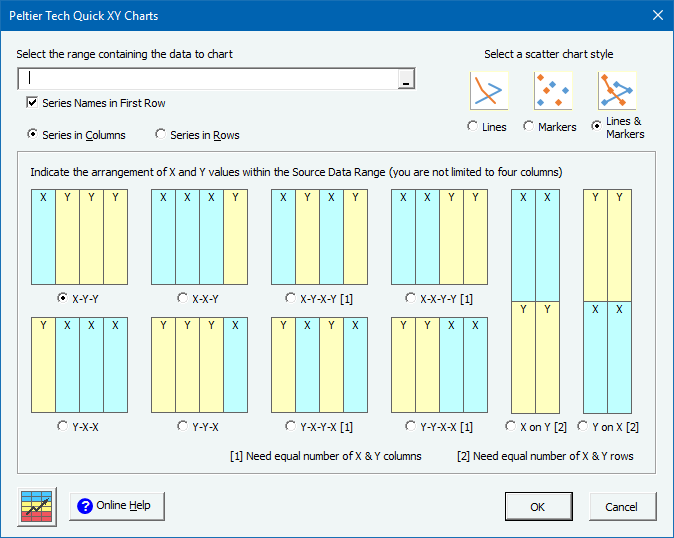
I built the Quick XY Charts feature because data comes in many different configurations, not just with X values in the first column or row and Y values in the rest of the range. Maybe the X values are in the last column. Maybe you have one Y range and multiple X ranges. Maybe you have different X and Y values for each series, with X and Y alternating, or X clumped to one side and Y to the other. The bottom left arrangement in this dialog would have worked nicely for the original chart of the first data range.
Select your range, click the Quick XY Charts button, select the data alignment and other options, and press OK.
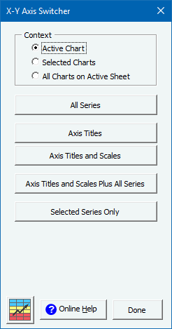
The software has another feature, the X-Y Axis Switcher, which allows you to switch any or all aspects of a chart’s axes. You can switch the data for all series, as we did in this tutorial, or for just one series, or you can switch the axis titles, or the axis scales and titles, or you can just switch everything.
Peltier Tech Charts for Excel puts several chart types at your fingertips, including some types that Excel does not natively support (Dot Plots, Marimekko Charts, Clustered-Stacked Bar and Column Charts, and more), and some types which Excel does support in Office 365 (Box Plots, Waterfalls, more), but Peltier Tech does better.
Peltier Tech Charts for Excel includes numerous features to help with formatting your charts and manipulating data. In addition to switching axes, you can more easily add error bars, label the last point in a series, copy and paste series formats, move and resize charts and chart elements, edit SERIES formulas, and save charts as image files, and export charts en masse to PowerPoint and Word.
Visit Peltier Tech Charts for Excel to read about these features and more, and to buy a license for this versatile and powerful set of tools.


Pete Luetchford says
Great content as always. Would be good to also mention my usual go to method for manipulating the SERIES formula, dragging the highlighted regions in worksheet. I find it fairly quick, easy and error free. Combine this with using the up/down cursors to cycle through series and transforming the whole graph doesn’t take long although I think I’ll add this subroutine as it’s a surprisingly common manipulation I do. Thanks