This Surplus-Deficit chart shows the history of surpluses and deficits (positive and negative values) over the past few years. The two colors help show when the deviation was positive and when it was negative. It takes a little bit of Excel magic to get that effect to work properly in an Excel area chart.
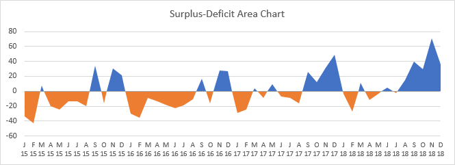
I showed how to make this kind of chart in an old tutorial, Area Chart – Invert if Negative. That approach required repeating the data in a new range, inserting a row after every row of data, and doing some interpolation to get the chart data right.
But I was looking over a “visual vocabulary” by my colleague Jon Schwabish of Policy Viz, a rough draft summary of many chart and visualization types and guidelines for building them in Excel. When it’s ready for public consumption, I’ll be sure to post a link.
Jon showed a surplus-deficit area chart, and on inspection, it wasn’t exactly right. He went to my earlier post and fixed it, but in the meantime, I thought of a way to do the calculations in a more compact way, supplementing rather than supplanting the original data.
Surplus-Deficit Column Charts
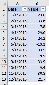
For this tutorial I will use a simple data set, with monthly surplus-deficit data. I’ve shaded this original data blue, so you can follow it in the long protocol. Note that the data is in an Excel Table, which has lots of magic of its own.
You can make a surplus-deficit chart with any number of chart types. Below is a simple column chart of this data showing surpluses and deficits in a simple data set.
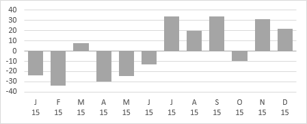
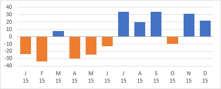
Easy to make, easy to read: surpluses grow upwards from the horizontal axis, deficits downwards. Excel makes it easy to show positive and negative values in different colors in bar and column charts. Format the bars with the main (positive) color, then in the Format Fill part of the Format Series task pane, check the Invert If Negative box, and select the color for the negative values.
Surplus-Deficit Area Charts
The Two-Color Area Chart
In general, I prefer columns for this kind of data rather than areas: it always seems to me that an area chart minimizes the points on either side of an axis crossing, and overemphasizes points in the middle of a positive or negative run.
But area charts have their place, so let’s make an area chart of the data:
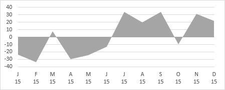
Let’s format the colors like we did for the column chart. Main color, blue, that’s fine. But there’s no Invert If Negative setting. Let’s stop and scratch out chins for a while. What if we have separate Pos and Neg series in the chart? We can always format them with the desired different colors.
Here’s the data with Pos and Neg data columns added. I’ve used these formulas for Pos and Neg respectively:
Pos: =MAX(0,B2)
Neg: =MIN(0,B2)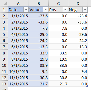
Here’s the (unstacked) area chart showing Pos and Neg:
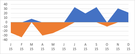
It’s not exactly right. The sloped edges of the different colored should meet on the horizontal axis, along the lines shown in the following chart:
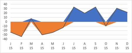
Our data isn’t complete enough. We only have points at the vertices of the surplus-deficit data, indicated by the circular markers in this line chart:
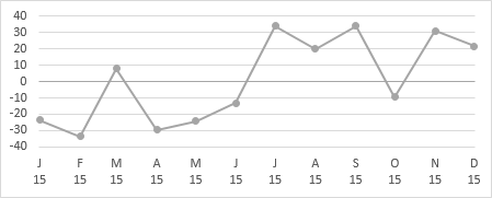
That’s fine for a one-series area chart. But in our Pos and Neg data, here are the points we have:
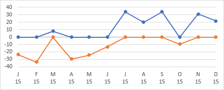
Adjusting the Data
For the areas to line up correctly, we would need data points at the axis crossings between vertices, like this for the one-series line chart:
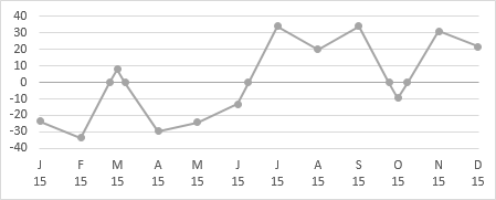
…or like this for the Pos Neg chart:
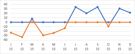
This is where we need to interpolate our area chart data. In my old tutorial, I inserted rows to make room for interpolation, like this. The blue is our original data, and the gold shaded rows are the interpolated data. The green shaded row at the top is a placeholder to make sure I have as many interpolated rows as original rows, for when I adjust the data in a minute.
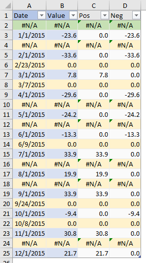
In the Value column, the formula in the gold cell B4 compares the values in the blue cells above and below it (B3 and B5). If their product (B3*B5) is positive, it means that both have the same sign, so there is no axis crossing, and the cell will show #N/A, to suppress plotting of that point. If their product is negative, it means the blue cells have different signs; the line must cross in between, so the cell contains zero for the Y value at the crossing. Don’t worry about the formulas yet, they need to be redone when the table is adjusted.
In the Date column, if there is no axis crossing (product of blue Value cells B3*B5 is positive or gold Value cell contains #N/A), then the gold Date cell contains #N/A, to suppress plotting. If there is a crossing (product of blue Value cells is negative or gold Value cell contains zero), the gold Date cell A4 contains an interpolated value between the two blue Dates A3 and A5.
Anyway, I realized that I can add columns to the data table for these calculations. To illustrate, I’ll adjust my data in two steps. First I’ll move the gold and green cells to the right by four columns:
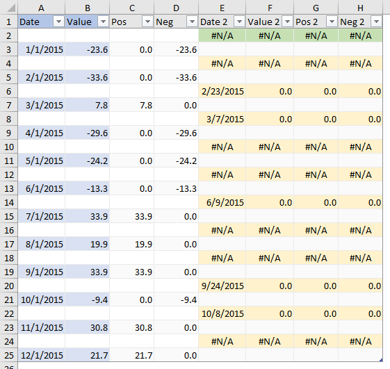
Now I’ll remove the blank cells between rows.
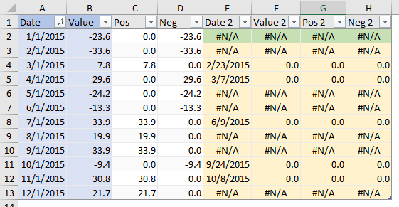
And we no longer need the gold and green to distinguish interpolated rows.
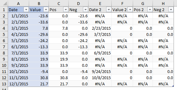
The table contains the original data in the blue columns, and these formulas in the other columns
Pos:     =MAX(0,B2)
Neg:     =MIN(0,B2)
Date 2:  =IF(ROW()=ROW(INDEX([Date],1)),NA(),IF(B1*B2>0,NA(),
             B1/(B1-B2)*(A2-A1)+A1))
Value 2: =IF(ROW()=ROW(INDEX([Date],1)),NA(),IF(B1*B2>0,NA(),0))
Pos 2:   =IF(ROW()=ROW(INDEX([Date],1)),NA(),IF(B1*B2>0,NA(),0))
Neg 2:   =IF(ROW()=ROW(INDEX([Date],1)),NA(),IF(B1*B2>0,NA(),0))
There are a few tricks. The first IF looks at the condition
ROW()=ROW(INDEX([Date],1))which is true if the row is the first data row of the table. And if it’s true, the formula uses NA() to put #N/A into the cell.
The second IF looks at B1*B2. If values in both B1 and B2 are positive or both are negative, the result of multiplication is positive, so the formula returns #N/A. If they are mixed, we get a negative result, so the formula puts zero into the cell.
We’re never actually multiplying B1 and B2, which would produce a #VALUE! error, because cell B1 contains a text header label. In that row of the table, the first IF takes precedence, because it already has determined that the cell is in the first data row and the value should be #N/A.
Adjusting the Chart
Now we just need to get this additional data into the chart. The original Pos-Neg area chart looks like this.

The two series formulas look like this:
Pos:  =SERIES(Sheet1!$C$1,Sheet1!$A$2:$A$13,Sheet1!$C$2:$C$13,1)
Neg:  =SERIES(Sheet1!$D$1,Sheet1!$A$2:$A$13,Sheet1!$D$2:$D$13,2)
We need to change the X values fromSheet1!$A$2:$A$13
to(Sheet1!$A$2:$A$13,Sheet1!$E$2:$E$13)
And the Y values fromSheet1!$C$2:$C$13
to(Sheet1!$C$2:$C$13,Sheet1!$G$2:$G$13)
andSheet1!$D$2:$D$13
to(Sheet1!$D$2:$D$13,Sheet1!$H$2:$H$13)
You can make the changes by typing in the series formula directly, or by using the Select Data dialog. After changing the series formulas, the areas in the resulting chart align across the axis as desired.
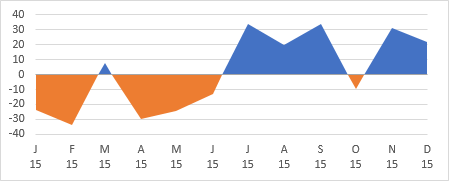
It’s a nice little trick, and it works for area charts and other charts that have category axes that can display a Date scale. These charts internally sort by date before plotting the data. So we can put the data anywhere in the list, even in a separate column that makes up a different part of the list.


derek says
I linked to a demo of eliminating interpolated rows in the comments to your June 2008 article there, but I’m sure the link has rotted long ago (the picture still works, as I linked to an image hosting site that still functions).
I’ll see if I can find the original on my computer, and if there’s a place I can put it.
Sunny Kow says
Hi Jon
Can’t we just paste a shape (rectangle) with its top half green and the bottom half red onto the chart and then Format Data Series – Fill – Picture or Texture Fill – Offsets – Top or Bottom % to get the effect?
Jon Peltier says
Sunny –
Now that’s elegant, and it’s much easier. Thanks for sharing.
It’s not dynamic: if the data changes, you may need to adjust the offsets. And it’s not totally formula driven: to get the boundary between colors to line up, you may need to manually tweak the offsets.
Here is Sunny’s technique:
Start with the original area chart, with only one series and one color fill.
Make two rectangles, top one blue for positive, bottom one orange for negative.
Select the two rectangles and copy (ctrl+C). Select the area chart series and paste (ctrl+V). The rectangle fills the area chart, so the top half is blue and the bottom half orange.
Since the data reaches farther in the positive direction (70.59) than in the negative direction (-43.34), the middle of the pasted shape is above zero, so some of the positive filled areas are orange. You can adjust the position in one of two ways:
1. Make the blue rectangle taller than the orange one, by the ratio of 70.59:43.34, before copying. This means a lot of rework if the data changes.
2. After pasting the rectangles, format the area chart series. Under the paint can, Fill, click on Picture or Texture Fill, and adjust the Offset Top and Offset Bottom values. A positive offset brings the top or bottom of the pasted colors toward the center, which would essentially truncate the tops of the peaks: not what we want. A negative offset moves the top or bottom of the pasted colors away from the center. We don’t want to change the top, but if we move the bottom lower, the boundary between blue and orange will move down. I found that an Offset Bottom value of -23% worked pretty well.
I came up with a formula that works for these numbers; I don’t know how general it is. But this percentage is the same as
(max + min)/(max – min) = (70.59 + (-43.34))/(70.59 – (-43.34)) = 0.239
So maybe 24% is better than my experimentally-derived 23%.
Andrew says
Hi Jon,
Thanks for this – exactly what I was looking for. However, I’m struggling to adjust this to fit my data. I can recreate your example, but when I change the dates to a daily increment (rather than monthly) it doesn’t work. Any idea how I can accommodate this?
thanks,
Andrew
Jukas says
Hi, after hours of trying, I finally understood the problem with this method. And no, it does not work for all cases, unfortunately.
Basically, you need to have at least days in between each date (original date).
the axis format should be Date axis, this means dates /number are sorted ascending.
if you do not have 2 days between each original date, you will have sharp drops when crossing zero. this because the chart does read decimals.
I hope I have helped some people with my answer,
regards
Jukas
Jon Peltier says
Line and area charts don’t deal with fractions along the X-axis. They only deal with whole numbers of days.
The more days between points, the better my approach can interpolate the horizontal axis crossing points.
The data in my example showed monthly values, so my interpolations worked well. If you have daily data, you can’t interpolate, you can at best get the preceding of following day as the crossing point, which will look awful.