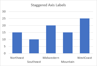
When you have a chart that is too narrow, and has too many axis labels, or the labels it has are too long, Excel tries very hard to prevent the labels from overlapping. Usually Excel will incline the labels so they don’t overlap. Excel may also decided to only show some labels. But you can stagger axis labels to keep them horizontal and not overlapping.
Excel “Helpfully” Formats the Axis Labels
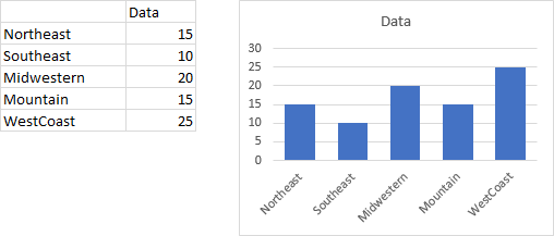
Here is a chart with inclined labels. They’re harder to read than horizontal labels, but easier than overlapping labels.
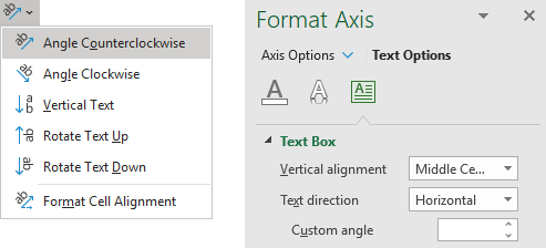
You can overrule the labels’ orientation: on the Home tab of the ribbon, on the alignment tab, click the dropdown to select any alignment, then click it again to unselect the selected alignment. Alternatively, in the Format Axis task pane, select Text Options, then click on the Textbox icon, then where the Custom Angle box is blank, enter any nonzero value, then enter zero. I don’t know why you need to do either thing twice, but Excel is like that sometimes.
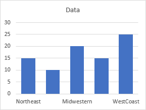
Now the labels are horizontal. And to prevent overlapping, Excel has decided to hide alternate labels. Unfortunately, this hides information from us.
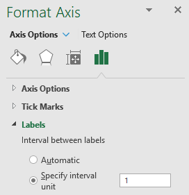
To get the labels back, go to the Format Axis task pane, and under Labels, Interval between Labels, select Specify Interval Unit, and enter 1.
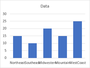
Now all of the labels are horizontal and visible, but they overlap. So maybe Excel wasn’t so dumb after all, but it can’t do what we need without a little help.
How to Overcome Excel’s Labeling Issues
How do we fix the labels? We can’t select individual axis labels and move them or change their contents.
But we can change the data in the worksheet. The trick is to insert a line break in front of alternating labels. The line break will force these labels down line, so they won’t block the adjacent labels.
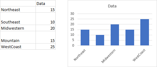
Starting from scratch, we’ve inserted a line feed in the cells containing the second and fourth labels. And as a reminder, you can insert a line break in a cell by holding the Alt key while pressing the Enter key. Here’s the range and the chart, with its inclined labels. Apparently Excel only shows the first line of an inclined label, so the second and fourth labels are not shown.
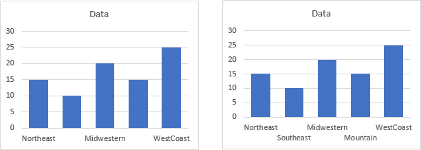
Go through the complicated gyrations to make the labels horizontal (below left), then repeat the axis label interval gymnastics to make every label appear (below right). We have successfully staggered the labels.
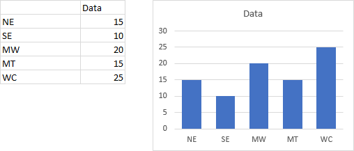
There are other ways to avoid overlapping labels. First, you could use shorter labels or acronyms.
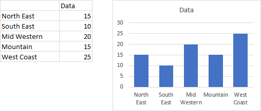
Next, you could try to use labels with spaces, where Excel can choose to wrap the text.
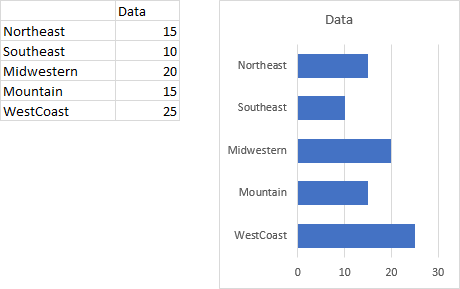
Finally, you can change from a vertical column chart to a horizontal line chart, which allows much more room for long, horizontal labels.
Formulaic Approach
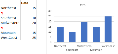
We’ve tricked Excel into staggering our axis labels by inserting a line break in alternate cells. If we could see these line breaks the way we can see paragraph markers in Word, it would look something like this:
If you don’t want to spoil your original data range by inserting line breaks, you can always link to the original labels in another range (even on another sheet), and include a little logic in the link formulas to put line breaks where needed. Here I show the original data on the left and the chart source data on the right.
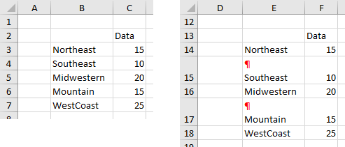
(Note: the red pilcrow characters are not really there, I’ve added them for illustration purposes.) The formula in cell E14, filled down to E18, is
=IF(MOD(ROW()-ROW($F$13),2)=0,CHAR(10),"")&B3where CHAR(10) is a linefeed character.


Bob says
Hi Jon,
Always a quick win on this site.
Thanks
Hassan Thakur says
There is another way that I happened to discover accidentally, while trying to go around the same problem:
1. Click the Plot Area.
2. Reduce the size of your Plot area from bottom so that you have extra space at the bottom. (i.e. Chart Area is bigger than the Plot Area by some extra margin)
3. Now click your horizontal axis labels.
4. Click Reduce Font (Or Increase Font) button
The text will automatically wrap to fit in the available space.
Jon Peltier says
Hi Hassan –
Thanks. That procedure works also works. The problem is that it’s hard to apply uniformly. Especially the change in plot area size.
DocBrody says
Hassan’s method works better if you turn on snap to grid, and then set up your spacing so you can snap the bottom border of the chart-area to the grid. Makes it’s easier to keep things aligned across multiple charts.
Jon Peltier says
Doc –
You don’t even need to set ‘snap to grid’. You get the same effect if you hold the Alt key while dragging and resizing objects: the Alt key makes the edges of the object snap to the cell boundaries. This not only includes the edges of the chart object itself, but also the internal chart elements, such as the plot area. So using the Alt key makes Hassan’s approach easier to apply uniformly.