Ganesh, a reader of my web site, asked whether I could make a chart like this one:
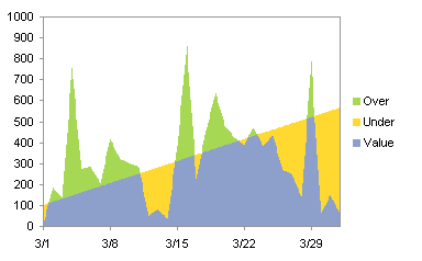
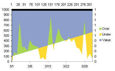
The series are shown as a fluctuating blue Value line and a steadily increasing red Limit line in the line chart below, but Ganesh wanted to color code regions in the chart, so that regions where the value exceeded the limit were shown in green, and regions where the value fell short of the limit were shown in yellow.
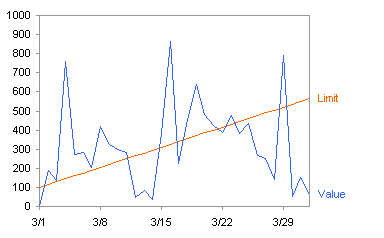
The data (Dates, Value, and Limit) are shown below with some calculated columns. These will be described as we need them.
| Date | Value | Limit | – Diff | Diff | Value | Under | Over |
| 3/1/08 | 5.73 | 100 | 94.27 | -94.27 | 5.73 | 94.27 | 0 |
| 3/2/08 | 188 | 115 | -73 | 73 | 115 | 0 | 73 |
| 3/3/08 | 138 | 130 | -8 | 8 | 130 | 0 | 8 |
| 3/4/08 | 757 | 145 | -612 | 612 | 145 | 0 | 612 |
| 3/5/08 | 272 | 160 | -112 | 112 | 160 | 0 | 112 |
| 3/6/08 | 284 | 175 | -109 | 109 | 175 | 0 | 109 |
| 3/7/08 | 206.24 | 190 | -16.24 | 16.24 | 190 | 0 | 16.24 |
| 3/8/08 | 419.77 | 205 | -214.77 | 214.77 | 205 | 0 | 214.77 |
| 3/9/08 | 323.92 | 220 | -103.92 | 103.92 | 220 | 0 | 103.92 |
| 3/10/08 | 299.74 | 235 | -64.74 | 64.74 | 235 | 0 | 64.74 |
| 3/11/08 | 284.13 | 250 | -34.13 | 34.13 | 250 | 0 | 34.13 |
| 3/12/08 | 47 | 265 | 218 | -218 | 47 | 218 | 0 |
| 3/13/08 | 82 | 280 | 198 | -198 | 82 | 198 | 0 |
| 3/14/08 | 36.32 | 295 | 258.68 | -258.68 | 36.32 | 258.68 | 0 |
| 3/15/08 | 383.48 | 310 | -73.48 | 73.48 | 310 | 0 | 73.48 |
| 3/16/08 | 864.6 | 325 | -539.6 | 539.6 | 325 | 0 | 539.6 |
| 3/17/08 | 225.17 | 340 | 114.83 | -114.83 | 225.17 | 114.83 | 0 |
| 3/18/08 | 455.05 | 355 | -100.05 | 100.05 | 355 | 0 | 100.05 |
| 3/19/08 | 638 | 370 | -268 | 268 | 370 | 0 | 268 |
| 3/20/08 | 483 | 385 | -98 | 98 | 385 | 0 | 98 |
| 3/21/08 | 424.2 | 400 | -24.2 | 24.2 | 400 | 0 | 24.2 |
| 3/22/08 | 390 | 415 | 25 | -25 | 390 | 25 | 0 |
| 3/23/08 | 475.21 | 430 | -45.21 | 45.21 | 430 | 0 | 45.21 |
| 3/24/08 | 382.45 | 445 | 62.55 | -62.55 | 382.45 | 62.55 | 0 |
| 3/25/08 | 436.2 | 460 | 23.8 | -23.8 | 436.2 | 23.8 | 0 |
| 3/26/08 | 269 | 475 | 206 | -206 | 269 | 206 | 0 |
| 3/27/08 | 250 | 490 | 240 | -240 | 250 | 240 | 0 |
| 3/28/08 | 140.82 | 505 | 364.18 | -364.18 | 140.82 | 364.18 | 0 |
| 3/29/08 | 789.8 | 520 | -269.8 | 269.8 | 520 | 0 | 269.8 |
| 3/30/08 | 53.3 | 535 | 481.7 | -481.7 | 53.3 | 481.7 | 0 |
| 3/31/08 | 150.16 | 550 | 399.84 | -399.84 | 150.16 | 399.84 | 0 |
| 4/1/08 | 64.49 | 565 | 500.51 | -500.51 | 64.49 | 500.51 | 0 |
First, let’s plot Limit and Value together, to see what we have. Here is an unstacked area chart, with Limit the first series (plotted behind Value, the second series).
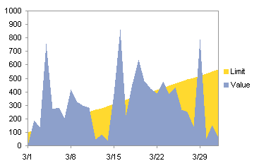
That’s partly right, but we have to imagine where the Limit lies where the Value exceeds the Limit. If we put Limit in front of Value, it’s worse, because we have no basis to imagine where the Values may lie.
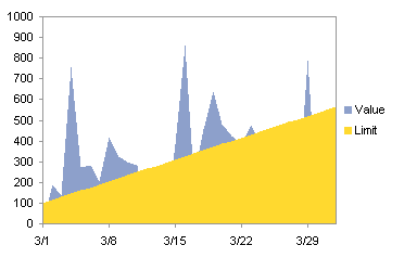
The next attempt is to compute the differential between the Limit and the Value, which is calculated in the -Diff column. Then the Value and -Diff columns are plotted in a stacked area chart.

Looks like a useful chart, and we can see the entire extent of both Value and Limit, but it shows positive and negative deviations in the same color. Let’s calculate another column, Diff, which is essentially the negative of -Diff, and plot the Limit and Diff as stacked columns.

That’s the same chart except for the legend. Time to try something radical. Let’s plot the Limit and Value together again, but with Value on the secondary axis. Maybe that will show us something different.
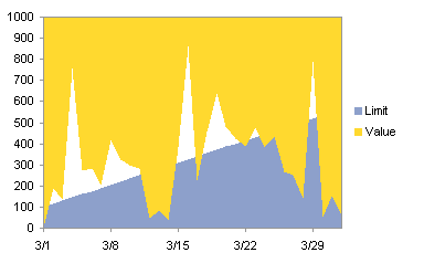
Then again, maybe not. This doesn’t differ much from our first attempt. Well, sometimes charting is an interactive trial-and-error exercise. If we step back a moment and take it logically, we can see that we need three series:
- Series 1 is the Value data, up to a maximum of the Limit
- Series 2 is the difference between Limit and Value if Limit is greater, otherwise zero
- Series 3 is the difference between Value and Limit if Value is greater, otherwise zero
This leads us to the last three columns in the table. Value is for Series 1, Under is for Series 2, and Over is for Series 3. Let’s plot these three columns in a stacked area chart.
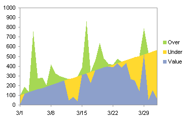
This is almost right, except the Blue and Green areas do not line up as we want. The reason is that the area chart series don’t know they’re supposed to meet between categories (dates). We’ll have to make the same chart type. but with a different strategy for our categories. We will increase the number of categories so the resolution along the junction of the three series is finer. To do this we will calculate values in a new range, with known data points every ten rows, and interpolated points in between.
A portion of the new data table is shown here. The black rows are the original data, while the blue rows are interpolated. Assume the original Date, Value, and Limit data is in columns A:C, with row 1 holding headers and the data starting in row 2. The first ata cell of the new Date column (below), say it’s cell E2, has thi formula:
=INDEX(A$2:A$34,(ROW()-2)/10+1)
This basically repeats each value in column A ten times. This formula is filled down as far as needed (row 312 if you’re keeping score at home). This interpolation formula is entered into the first cell of the Value column (cell F2) Is:
=((10-MOD(ROW()-2,10))*INDEX(B$2:B$34,(ROW()-2)/10+1)+MOD(ROW()-2,10)*INDEX(B$2:B$34,(ROW()-2)/10+2))/10
This formula is copied to the cell to the right (G2), and these are filled down to row 312. To complete the formulas, Value (cell H2) is simply MIN(F2,G2), Under is MAX(0,G2-F2), and Over is MAX(0,F2-G2).
| Date | Value | Limit | Value | Under | Over |
| 3/1/08 | 5.73 | 100.00 | 5.73 | 94.27 | 0.00 |
| 3/1/08 | 23.96 | 101.50 | 23.96 | 77.54 | 0.00 |
| 3/1/08 | 42.18 | 103.00 | 42.18 | 60.82 | 0.00 |
| 3/1/08 | 60.41 | 104.50 | 60.41 | 44.09 | 0.00 |
| 3/1/08 | 78.64 | 106.00 | 78.64 | 27.36 | 0.00 |
| 3/1/08 | 96.87 | 107.50 | 96.87 | 10.64 | 0.00 |
| 3/1/08 | 115.09 | 109.00 | 109.00 | 0.00 | 6.09 |
| 3/1/08 | 133.32 | 110.50 | 110.50 | 0.00 | 22.82 |
| 3/1/08 | 151.55 | 112.00 | 112.00 | 0.00 | 39.55 |
| 3/1/08 | 169.77 | 113.50 | 113.50 | 0.00 | 56.27 |
| 3/2/08 | 188.00 | 115.00 | 115.00 | 0.00 | 73.00 |
| 3/2/08 | 183.00 | 116.50 | 116.50 | 0.00 | 66.50 |
| 3/2/08 | 178.00 | 118.00 | 118.00 | 0.00 | 60.00 |
| 3/2/08 | 173.00 | 119.50 | 119.50 | 0.00 | 53.50 |
| 3/2/08 | 168.00 | 121.00 | 121.00 | 0.00 | 47.00 |
| 3/2/08 | 163.00 | 122.50 | 122.50 | 0.00 | 40.50 |
| 3/2/08 | 158.00 | 124.00 | 124.00 | 0.00 | 34.00 |
| 3/2/08 | 153.00 | 125.50 | 125.50 | 0.00 | 27.50 |
| 3/2/08 | 148.00 | 127.00 | 127.00 | 0.00 | 21.00 |
| 3/2/08 | 143.00 | 128.50 | 128.50 | 0.00 | 14.50 |
| 3/3/08 | 138.00 | 130.00 | 130.00 | 0.00 | 8.00 |
Now we have a chart to construct. Select the range with the second value column and the Under and Over columns, and create a stacked column chart:
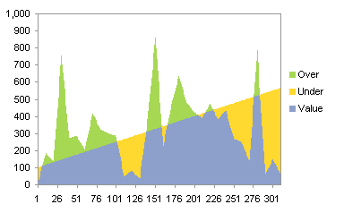
We didn’t use the date column for category values; we left it blank so Excel simply uses {1, 2, 3, …}. The series look good; you could still see the misalignment if you blow it up (see below), but breaking the X range up into ten times as many points has helped minimize the effect.

Now we need a decent date scale axis. We will add a dummy line chart series to provide this scale. Here is our data:
| Axis | |
| 1-Mar | 0 |
| 1-Apr | 0 |
Copy the data, and use Paste Special > Values to add the data as a new series, series in columns, categories in first column, etc. The series doesn’t appear because its values are zero. Select one of the series, and click the up arrow button until the Axis series is selected. Go to the Chart menu, select Chart Type (or on the Chart Tools > Design tab in Excel 2007, choose Change Chart Type), and choose a line style for this series.
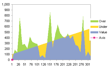
The series still barely appears down in the lower left corner of the chart. We need to have this series on the different axis group than the area chart series, and because of the way Excel does coincident axes, we need it on the primary axis. One by one, the area series need to be moved to the secondary axis. Here is the series with the Over series moved:
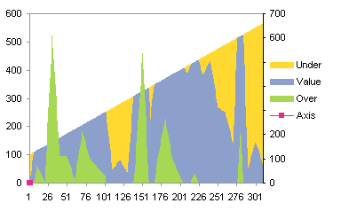
Moving the other area series changes the appearance drastically, because the line series now dictates the category axis.
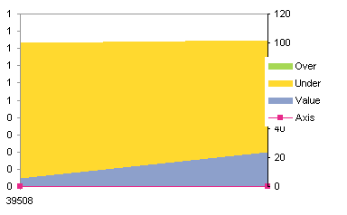
Excel helpfully provides only a secondary Y axis, so the secondary X axis must be added from Chart menu > Chart Options > Axes tab, or from the Chart Tools > Layout tab.

This is almost right. The axes need formatting, and the Value series is hanging from the secondary category axis at the top of the chart. Switch the left and right axes as follows. Format the primary category axis (bottom) so that its Y axis crosses at the maximum, then format the secondary category axis (top) so that its Y axis does not cross at the maximum.
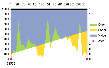
Format the primary category axis so it has an appropriate date scale.
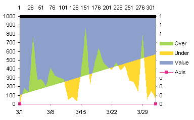
Format the line series so it shows neither the line nor its markers. Then select the axis (one click) and then the Axis legend entry (a second click), and press Delete to remove this legend entry.
Format the primary Y axis (right side) so it has no ticks and no labels).

Finally format the secondary category axis (top) so that it has no ticks and no labels. Then format the secondary Y axis (left) so that its Y axis doesn’t cross at the maximum.

And there’s the chart.


Dan says
On the one hand, Impressive! And on the other… Blech! What would Tufte say? :P
Ganesh says
Thanks Jon,
It worked.
Jon Peltier says
Dan –
I thought of that too, but this is a more benign way of dressing up a chart than the gaudy gradient, 3D, shadow effects that usually appear when someone tries to make it “look nice”.
Jon Peltier says
Damir –
The data point itself is on the upper edge of the green section, not in the blue section. The boundaries between colors are what indicate the Value and Limit; data doesn’t exist in the interior of the colored areas.
Admittedly, the line chart at the beginning of the article is easier to create and probably less ambiguous. I should remove the legend, remove the blue fill color from the lowest region, lighten the other fills, and add in the Value and Limit lines. This restores the simplicity of the line chart, while adding a little green/good, red/bad coloring.
Damir says
Uh, not sure if do understand this chart at all. Let’s look at x=3/16, y=500,limit=300; a vertical line would pass through blue and green areas. Does it make sense to color the areas in the first place?
Otherwise–nice exercise. How do you get to Carnegie Hall? Practice, practice.
Jon Peltier says
Damir –
Area charts should be used with care. They can be used anywhere you would use a line chart, but the fill disrupts the usual clarity of a line chart. I like to use area chart series as background series to identify regions on an XY chart that have special meanings (a band on a run chart that means “good”, or several bands that indicate different levels of variability about a norm). They are good also for comparative measures, for example, using an area series for a series of predicted or target values, overlaid with a line chart showing actual performance.
They can also dress up a chart if you’re careful, like the chart in my last comment.
Jon Peltier says
Damir – While area can be made relevant to some real value, keep in mind that people do not interpret areas nearly as well as they do linear dimensions (bar charts) and positions (XY charts).
Damir says
Yes, nicer. BTW– what would you say; when should one use area chart in the first place?
Damir says
How about: “When area under the curve represents (is proportional to) a meaningful value.”
Like in:
for X=time
Y=speed; Area -> travel
Y=flow; Area -> amount of liquid or material
Y=sales per unit of time; Area -> total $$
etc.
The cumulative value does not have to be represented on a Y axis, but when comparing two charts for different periods one can easily grasp the difference in areas.
Colin Banfield says
The one objection that might be raised in the chart is that the over portion of the values are highlighted in green but the **inverse** of the under values are highlighted in yellow, which can result in interpretation problems.
If the shape of the graph isn’t that important or if the actual values are more important than the shape (trend) , a stacked column is a useful alternative. With the stacked column, the Value series would represent the limit if the actual value is equal to or greater than the limit and zero otherwise. Over would represent the difference between the actual value and the limit when the actual value is equal to or greater than the limit and zero otherwise. Under would represent the actual value when the actual value is less than the limit and zero otherwise. The limit line can then be plotted using a line chart.
Mike Alexander says
Your reputation is definately warranted. Amazing work.
I do think the chart improvements you made in the comments to Damir make a marked improvement in readability.
Jon Peltier says
Mike – Thanks, you may kiss my ring.
Seriously, I appreciate all the comments. Especially the ones like Damir’s that make me take one more look at something, to ensure that I stay honest and uphold the principles I claim to follow.
amy says
I am very desparate to find a way to combine an area charts with a stacked column chart. There has got to be a simple way to to this……can you help?
Months J-F-M-A-M-J-J-A-S-O-N-D across the X. The area is a staffing plan, the stacked column separates the actual time divided into 4 categories.
I am going crazy – its such a simple concept (esp compared to the stuff you are doing …..)
Jon Peltier says
Amy –
If the area series uses the same category labels as the columns, simply make a stacked column chart with all series, then right click on the one series, choose Chart Type, and select an area type. The area will be behind the columns, partially obscured.
amy says
That worked – I knew it was not rocket science. Do you know if General Electric have any existing purchase agreements for your products?
Jon Peltier says
I have no pending agreements with General Electric, but I wouldn’t mind selling them a corporate-wide license!
Yvette says
I’ve been tasked with producing a graph like this with 2 additional stacked areas which likewise change colour on crossing a target line. I’ve acheived a workable result (using technique of adding 20 points between each data point for a stacked area graph on a single x axis) but it is complicated and unwieldy. Is there a simple way of incorporating this into your existing model? I’m not familiar with image sharing sites and don’t have a website – can I email an example?
Yves Hanoulle (@YvesHanoulle) says
Hi,
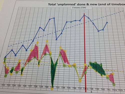
Thanks. We have a similar problem, that we hope to solve with your solution.
In our challenge, the two lines are irregular.
I hope to use your solution with it.
Any advice for that?
Jon Peltier says
Yves –
In principle, your chart is no different than the one from this example.
Gerhard says
Hi, have YOU a Example workbook for this ??
Regards
Jon Peltier says
Gerhard –
While working through the example in Excel 2013, I discovered that the protocol breaks down in this version. Unexpectedly, because I was not doing anything that should really have exerted it. I haven’t tested in other recent versions of Excel.
I’m going to rewrite this post for modern versions of Excel. Since the blue region below the values and the limits doesn’t really make any sense, the new example will be aimed at filling above the limit one color and below the limit another color.
Gerhard says
Please take a look at an example, do you think that I so create a chart without VBA?
1st Chart , http://sparkshapes.de/wp/?page_id=245
I believe that your technique is right for this diagram.
I need your messages always translate into German, so I do not understand anything, so an example file would help me a lot!
I hope soon to hear from you …
Thank you for your effort ..
Gerhard says
Hello,
I do not want to annoy, but I would like to know if anyone can help me?
BR
Jon Peltier says
Gerhard –
Those charts can certainly be made using this approach. An updated version of this article is being written, and will be available within a couple weeks.
Gerhard says
Hey, there’s already something new?
Gerhard
Gerhard says
Hello,
maybe someone has already seen a solution? I find this nowhere ..
Please help me ..
Thank You!
Gerhard says
Hi,
can You help me?
BR