In VBA to Split Data Range into Multiple Chart Series I shared a VBA procedure that split a range into separate series in a chart. In fact, this is fairly easy to do using conditional chart formatting techniques I describe on my web site (see Simple Conditional Charts). The way these techniques work is to use formulas in separate columns to capture values from the main data column when certain conditions are met.
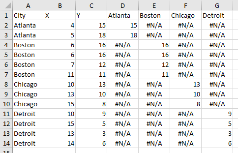
The data used in the other post is shown below, with the conditional columns added.

The unique items from column A are entered into row 1 of columns D through G. The following formula is entered into cell D2 and filled into the entire range D2:G14:
=IF($A2=D$1,$C2,NA())
The formula compares the label in column A with the header in row 1: if they match, the formula returns the value in column C otherwise it returns #N/A, which is not charted in a line or XY chart (for a bar or column chart, you can use the empty string “” instead of NA()).
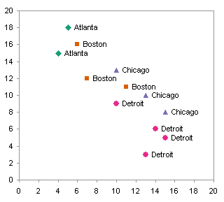
Select the X Values (B1:B14), then hold CTRL while you select the conditional Y values (D1:G14), then create a chart. After formatting, the result is identical to the chart processed by VBA approach:

The benefit of this approach over VBA, in addition to not requiring the user to enable macros, is that the data for each city does not need to be together in the data range.
Peltier Tech Articles About Conditional Formatting of Excel Charts
This is one example of conditional formatting in Excel charts. I have written numerous other articles on this topic:
- Conditional Formatting of Excel Charts
- Conditional XY Charts Without VBA
- Invert if Negative Formatting in Excel Charts
- Conditional Donut Chart
- Highlight Min and Max Data Points in an Excel Chart
- Conditional Formatting of Lines in an Excel Line Chart Using VBA
- VBA Conditional Formatting of Charts by Value and Label
- VBA Conditional Formatting of Charts by Series Name
- VBA Conditional Formatting of Charts by Value
- VBA Conditional Formatting of Charts by Category Label


Frank R. says
This is exactly what I was looking for. Thanks.
Richard says
This works well as long as you are only plotting points.
If you want to interrupt a line between the points it seems that you now have to write a macro to copy out the data, leaving blank cells where gaps are needed.
What a nuisance! It used to be so easy! Or am I missing a trick, here?
Jon Peltier says
Richard –
This behavior is unchanged since Excel 97 (or earlier).
Ryan says
What about using an if statement to the macro I recored below?
ActiveChart.Legend.Select
ActiveChart.Legend.LegendEntries(1).LegendKey.Select
With Selection.Border
.ColorIndex = 3
.Weight = xlThin
.LineStyle = xlContinuous
End With
How could I add an if statment to account for if the series does not exist then don’t do anything? I am not very good with If statments in VBA…
Thanks!
-Ryan
Jon Peltier says
You have to be careful with legend entries, as they don’t always correspond with series the way you’d expect.
Anyway, you have to check for the existence of the legend. If it exists, it certainly has one legend entry.
Ryan says
What I am really trying to solve with my if statement is say there are only three sereies but I want the code to check if there is a forth and if so modify it how I want. So I tried the following but it won’t work for some reason:
If ActiveChart.Legend.HasLegendEntries(4) Then
With ActiveChart.Legend.LegendEntries(4).LegendKey.Select
Selection.Border
.ColorIndex = 44
.Weight = xlThin
.LineStyle = xlContinuous
End With
End If
Which the first line was orgionally:
ActiveChart.Legend.LegendEntries(4).LegendKey.Select
Jon Peltier says
Change this
With ActiveChart.Legend.LegendEntries(4).LegendKey.Select
Selection.Border
to this
With ActiveChart.Legend.LegendEntries(4).LegendKey.Border
and try again.
But why are you using the legend key to format the series instead of the series itself?
Paul says
Hi Jon
You’ve been so helpful before, I am hoping for a innovative solution (using vba or not). Im using Excel 2003.
I have an area chart (standard normal distribution) that looks like a bell curve. I use dynamic ranges to break my data into 3 specific (variable) x-axis sections (e.g., 0-2,000, 2,000-7,000, 7,000-8,000), and would like to either distinctly shade these vertical sections of the curve, add 2 drop lines solely at 2,000 and 7,000, or somehow otherwise differentiate the 3 sections.
I know I can do this be creating 3 DUMMY data series from the original, based upon my dynamic ranges, but would prefer NOT to replicate 1 very large data column into 4. I considered replicating the x-asis as a secondary axis and plotting the 2 points against that axis, but I’ve not been successful creating the 2nd axis, and would prefer not to have to go this route in any event.
I’ve trolled the web, and spent considerable time looking through your site in particular, but haven’t found a solution. Any insight you can provide will be appreciated.
Thanks in advance for your help.
-Paul
Jon Peltier says
Paul –
Excel plots the data you give it. Trying to do something fancy like plotting multiple series from one data range sometimes can be done, but saving a few cells is usually not worth spending hours setting it up and more hours later fixing it when something changes. Add three ranges for three dummy series, and pat yourself on the back for being more clever in the long run.
Paul says
Thanks Jon. Wise words.
Alessandro says
Thank you :) with your tips I resolve my problem in 10 minute