In Web Browser Stats: Problems With Data Gaps I looked at my website statistics to evaluate how relative usage of Internet Explorer, Firefox, and Google Chrome has evolved over the past year and a half. For part of my analysis, I plotted SPC-type control charts of browser stats using a simple mean ± 3 SD approach to control limits. My colleague DaleW reminded me that my quick and dirty approach was not as good as a rigorous Shewhart Individuals control chart analysis. I should have known better; I even covered the individuals chart approach in Introducing Control Charts (Run Charts).
To review the approach, the raw data is plotted in two ways. The actual points are plotted in one chart, and the moving ranges (differences between points i and i-1) are plotted in another chart. A horizontal line is drawn on each chart at the mean of the data. Control limits are calculated using the moving range as a measure of variability instead of standard deviation. The upper control limit (UCL) of the moving range chart is calculated as 3.27 times the mean of the moving range, and this is plotted on the moving range chart. The upper and lower control limits (UCL and LCL) of the individual values is given my the mean of the individual values ± 2.66 times the mean of the moving range, and these are plotted on the individuals chart.
If there is a trend in the data, the moving range will be smaller than the standard deviation, because the basis for determining variability is difference from the previous point, rather than from the mean of all points.
Individuals-Moving Range Analysis
This table shows the individual values and moving ranges for the three main browsers. The means and control limits are computed below the table of values, and values in the table are colored red if they lie outside the control limits. The values show browser usage each month by percent of visits to my site.
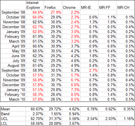
There is a lot of red (i.e., out of statistical control) in the IE and Chrome individual values, notably at the beginning and end, indicating a trend from start to finish. Firefox shows only one red point, and there’s no obvious trend. The only red value in the moving range data is a single point for IE.
The data is plotted in the following I-MR charts. The Y axis ranges are the same for all browsers for easy comparison. The trends for Internet Explorer and Chrome are rather obvious when the new control limits are plotted.

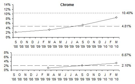
For IE (above) the upper and lower control limits calculated using mean and standard deviation were 67.9% and 53.5%, much further apart than those in the I-MR chart; in fact, those limits fall outside the Y axis scale of the I-MR chart. For Chrome (below), the Mean-SD upper control limit is 10.4%, which also falls outside the corresponding I-MR chart. Both calculations for Chrome’s LCL are below zero; since this makes no physical sense, zero is used.
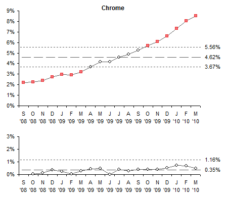
The Firefox control limits based on mean and SD are further apart than the I-MR limits, by one percentage point (32.4% and 27.0%), but would still be visible in this chart.

I-MR Analysis for Sparse Data
The conclusion from my earlier post was that three points over 18 months is insufficient data to judge whether there was a trend in the browser usage percentages. This conclusion holds when the more rigorous I-MR evaluation is carried out. If we perform the above analysis on four points, one point every six months, the I-MR calculations and charts show the processes are in control, and cannot be attributed to changing patterns of usage.
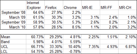
The moving range values are much larger than for monthly data points, since six months of changes are lumped into one point. As a result, the control limits are pushed far enough away from the means that there are no out-of-control points.
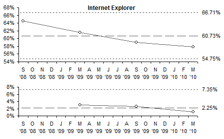
The data is plotted in the following I-MR charts. The Y axis ranges are the same for all browsers for easy comparison. Although we “see” trends for Internet Explorer and Chrome, since there are no points outside the control limits and not enough points to invoke the special Western Electric rules, we cannot conclude there is any variation not attributable to random fluctuations.

Further Reading about Statistical Process Control
- ISO 9001 – Introduction to SPC
- Control Charts on Wikipedia
- Interpreting Control Charts
- Selecting the Right Control Chart


Daniel says
The X-MR chart assumes the data data has random variation, so the limits help identify non-random causes of variation. The limits tell you that given that level of variation, 99.9% of the data will fall between the limits. This applies to any distribution for the data.
However, Standard Deviation assumes the data are homogenous, which usually it’s not the case in reality, and thus not very useful.
Given the obvious trends on the X chart, the best option is to take (for example) the first 8 points and calculate the mean & limits, then the last 8 points and calculate mean & limits, and then trace te line to link these points. That’ll give you an XMR chart for trends (going up, or going down).
DaleW says
Daniel –
Alas, there is no methodology — certainly not SPC — that can take twenty or so observations, regardless of any *possible* underlying distribution of the data, and assure us that 99.9% of our future data will fall between finite limits. (Mathematicians are good at creating pathological distributions as counter-examples.)
You do raise an interesting question. Jon has provided a nice example of how SPC can be much more powerful than simply looking at what amounts to the pattern of standardized residuals when our hypothesis is that we have a constant value plus simple random noise. Clearly that seems a bad hypothesis for the browser share data here. Why don’t we keep using this SPC approach as we generate more complex models? Once we realize that a better model of our browser data might be a linear trend line plus simple random noise, why not generate I-MR SPC charts of the pattern of residuals, after subtracting off the trend line? People almost never build and test models of their data this way . . . but why?
Jon Peltier says
Dale –
You know what’s better than mathematicians at creating pathological distributions? Real life.
I think I remember seeing an SPC approach that was based on a steady linear change in the variable being tracked. This was eight or ten years ago, so I don’t know where to find it, or even if my memory is accurate.
Daniel says
DaleW,
I agree. My statement wasn’t clear. The first paragraph should read (changes between asterisks):
“The X-MR chart assumes *the variation* in the data is random, so the limits help identify non-random causes of variation. The limits *in an XMR chart* tell you that *given the level of variation observed in the data*, 99.9% of the data will fall between the limits *if the variation continues being random (no assignable cause present)*”.
The XMR doesn’t *assure* that all future data will fall between the limits. It applies a normal distribution to calculate the limits given the local point-to-point variation in the data, so that it helps identify possible signals of non-random causes of variation, which in turn helps determine if a given value is worth investigating further. It aids on analysis, it doesn’t predict the future. Makes sense?
Thank you for the opportunity to try clarify what I intended to mean.
-Daniel.
DaleW says
Daniel,
Technically, 99.7% of the data would be expected to fall within the ±3 sigma limits of an SPC chart under ideal conditions. This is because — as you mentioned — the equations of SPC ultimately assume that the residual common cause variation is normally distributed.
Consider what happens if our data happens to be a truly random sample from a perfectly stable distribution where the random variation doesn’t follow a Gaussian distribution. Then our SPC limits — just like simpler ±3 stdev() limits around the mean — will not capture the expected 99.7% of the present distribution as our sample sizes become sufficiently large. (We’re not trying to predict the future, just understand the present.) Often, but not aways, the SPC charts are still close enough.
Incidentally, this is much of the reason that their creator Dr. Shewhart preferred his Xbar-R charts to his more commonly seen I-MR charts today: Xbar-R charts mitigate the impact of residual variation which isn’t normally distributed.
Daniel says
Hi DaleW,
Agree. Thank you for the your accurate clarifications. I was being generic, and thus not accurate. In my work, I try to apply SPC analysis to administrative & managerial processes (human decision making), where a 99% is already extremely good (most managers use variations of 80-20 for decisions, so using 99% already drives a lot of precision on those areas). Especially on these cases that usually have high variation.
Also, I’m not concerned with sampling. In these processes (i.e. customer claims) I can use all of the data over time, and so XMR charts are simple and with very high accuracy to the need. The difference between “experimental studies” (based on sampling, the impact of the experiments, and extracting the most out of little info), versus “observational studies” (we look for unknown or unplanned change on a sequential analysis using a continuing stream of data from a live operation). The tools available today for gathering and analyzing these amounts of data don’t require us to do sampling because they can manage the load easily.
However, I understand this don’t apply to all cases (even to the above examples on browsers, as each point accumulates along a month). Again, my interest is in SPC type analysis applied to business processes for decision making. Are there specific techniques you’d recommend for these cases? Maybe this is not the forum for that? (Sorry, I’m a new reader.)
Thanks!!
-Daniel.
steve says
“The upper control limit (UCL) of the moving range chart is calculated as 3.27 times the mean of the moving range, and this is plotted on the moving range chart.”
Jon, why did you use 3.27 and why not stdev+mean for the moving range?
I was trying to simulate your charts but I didnt get this point.
BTW, could you provide a copy of this workbook?
Thank you
DaleW says
Hi Daniel,
If you’re measuring something that potentially has a stable average over time, you might be able to use SPC.
SPC can serve as a good watchdog for such “observational studies”: it barks when there is reasonably good evidence that there is a signal rather than just background noise. (Here, a signal is any variation with time that could not be anticipated from just the background noise.)
While 80-20 typically refers to prioritization tactics, it’s also true that good managers may need to take action by the time they are 80% confident that something important has changed. But only a really bad manager — or someone trying to cope with a really bad process — emulates a neighbor’s irritating high strung dog and barks almost constantly at every 1 in 5 instances of *routine* data they obtain and then interpret as threatening because it is outside their central 80% comfort zone.
How readily do we want our watchdog to bark? There is no universal answer. It becomes a risk management question: what is the relative cost of false positives (barking at nothing) versus false negatives (silence when a visitor is out there).
Standard SPC chart limits will “bark” under ideal conditions at one in 370 samples due simply to random noise, when there is no signal whatsoever. In practical terms, that means < 1% false positive rates (usually).
If you find yourself trying to draw an SPC chart which will fit a trend, rather than just around a constant long-term average, it's probably time to do some (statistically informed) process modeling. Granted, as Jon observes, every now and then one might see an SPC chart of a linear rate of change in the original measurement. Most systems can't sustain linear growth for extended time — e.g., for Chrome browser shares, diminishing growth is likely to set in long before it reaches 100% browser share.
PS – I was using the term "samples" in the sense of samples from your process of interest, rather than as sampled data to represent your larger dataset.
Jon Peltier says
Steve –
The factors of 3.27 and 2.66 came out of Shewhart’s original work on run charts. Back in the day it was tedious to compute standard deviations, and these factors used with moving range were easier to compute, and still provided the same probability that points from a statistically-controlled process would not exceed the limits. I talked about this process in my earlier article, Introducing Control Charts (Run Charts).
DaleW says
Jon,
Please don’t spread urban charting legends!
Dr. Walter A. Shewhart at Bell [Telephone] Labs knew what he was doing nearly eighty years ago when he designed his charts using those peculiar factors instead of the traditional if tedious standard deviation calculation. He wanted a robust locally focused estimator rather a global estimator like stdev() for his “common cause” variation.
Not mere serendipity but smart design allowed the I-MR SPC chart of your post here to be vastly superior to the quick & dirty average±3stdev() run chart from your previous post, when trying to detecting special causes such as a highly significant trend.
DaleW says
Daniel:
Following up on Jon’s reply, the reason for using a different and less well known estimator than stdev() to set limits on the expected variation is linked to what an Statistical Process Control chart is trying to achieve. Most of the people who use SPC don’t really understand the math behind it.
An SPC chart tries to separate the common cause variation from any special cause variation in the dataset. While the stdev(data) is the best estimator for all sources of variation combined, it also can quickly get much larger than the common cause variation if there are unwanted special causes in the dataset at hand. Instead an SPC chart uses an estimator that better tends to track the common cause variation (or background noise) and thus its limits can be much more resistant (robust) to any variation added by special cause(s). This allows an SPC chart to achieve a much higher signal:noise ratio, as Jon’s example with the trending browser shares showed. The trend indicates a special cause beyond random noise, and the SPC chart limits were much more powerful at finding this apparent special cause than a corresponding quick and dirty run chart using ±3 stdev limits around the average.
Daniel says
Steve, DaleW,
Another way I use to explain this situation to my coworkers is that StdDev() assumes the data are homogenous, when the XMR (as DaleW very well explained) intends to find prove of non-homogeneity.
The effect of special cause variation on StdDev() is similar to the effect it causes into the Mean calculation. (Here I move into another scenario.) Using Average (or Mean) when you have outliers have a significant effect on its calculations, and thus on the calculation of the limits. That’s why you can use MEDIAN in those cases, as it’s less prone to the effect of outliers.
When you use use MEDIAN instead of Average in the XMR, you have to use 3.86 (instead of 3.27) to calculate the Upper Range Limit for the moving median, and 3.14 (instead of 2.66) for calculating the limits.
Signals of change contained in the data will inflate any measure of dispersion that is computed globaly, thus creating wider limits, where we may miss signals.
The disadvantage of using Median is that you will need more data points to get to the same accuracy as using Average. But as in any analysis, the CONTEXT of the data (the meaning of the data related to the process you measure) needs to be interpreted by the analyst. As general guidelines to my team, I recommend using Average as the primary calculation, and only switch to Median if they see outliers in the data that may significantly dilute the chances of detecting signals.
For example, let’s say that a patch delivered to customers of an application produced a side effect by which a button in the UI stopped responding. Customers started calling help desk, and thus a particular huge spike on support is detected by the XMR on volume to help desk. This will show as a point significantly outside of the upper XMR’s limit. This will also inflate the Average and the width of the limits. In this case, if we use Median we remove the influence of this outlier on the effectiveness of the chart to continue identifying real signals.
Again, this explanation was a different scenario than StdDev() versus two point moving ranges (local variation); only similar in that a global statistic will get inflated by special causes.
Hope this helps,
-Daniel.
DaleW says
Daniel,
Whether we use mean or median, aren’t we using an equally global (or local) statistic?
I would reframe your point as being that we often have a choice between highly efficient but brittle estimators, and somewhat less efficient but robust estimators. Using robust estimators and robust methods can keep us out of a lot of trouble.
The standard deviation is a highly efficient estimator of common cause sigma — in the absence of special causes! As you point out, SPC charts are intended for situations when one can’t just assume there are no special causes, but one actually wants to verify. It’s not kosher to assume what you are trying to prove (as opposed to assuming something so you can disprove it by internal contradiction). Thus, proper SPC charts always start with a more robust estimator of common cause sigma than the overall standard deviation of the dataset in question.
If we want an SPC chart that is even more robust against outliers, the median does offer a more robust estimator of central position than the mean. Typically, yes, we might reserve the Median Moving Range chart until we see that our Average Moving Range chart has one or more seriously out of control points.
DaleW says
Confirming the power of SPC to separate a trend from the noise . . . by one source (StatCounter), Chrome just edged out Internet Explorer as the top web browser.