There are two Conditional Formatting features in Excel 2010 which allow for graphical displays right in the worksheet. Sparklines, the word-sized graphical elements invented by Edward Tufte, are a new addition to Excel 2010. Data Bars were introduced in Excel 2007, but they have been improved and expanded in 2010. I gave each a test drive today.
Sparklines
There are numerous products which add sparklines to Excel. Two popular commercial products are BonaVista Microcharts and Bissantz SparkMaker, which work by forming the graphics using specially designed fonts. Sparklines For Excel is an open source add-in which works by drawing sets of shapes to construct the sparklines. These are full-featured sparkline programs which accommodate many chart types and styles.
Microsoft has gotten its start in sparklines in Excel 2010. The Microsoft Excel Team Blog has discussed this new feature in Sparklines in Excel, Adding Some Spark to Your Spreadsheets, and Formatting Sparklines. There are only three chart types: line, column, and high-low; and they do not have such features as baselines or axes or shaded zones. However, I think it’s a promising start.
To try out the sparklines, I loaded my blog stats into a pivot table, with months in rows and day of the month in columns. Creating the charts was easy. I selected the block of data to plot, then clicked the Sparklines – Lines button on the Insert tab.

A simple dialog pops up with two RefEdit boxes, one for selecting the data, the other for selecting the cell(s) to contain the graphics. If you’ve selected cells containing data, the Data Range box indicates this range; if you’ve selected a range of empty cells, the Location Range box indicates the selected range. These two ranges do not need to be on the same worksheet.
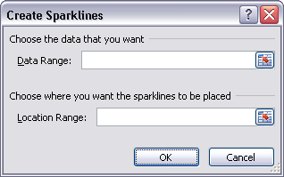
Click OK and the sparklines appear in the indicated position.

The weekly cycles within each month are readily apparent, but the scales aren’t quite right. The statistics begin in March 2008, about one month after starting my blog. The numbers on the first day were nowhere near where thay have been for the past few months.
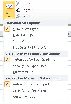
The default setting is that each sparkline scales the vertical position of the data point so that its minimum and maximum fill the cell. When I selected the ‘Same for All Sparklines’ setting, the scales of all sparklines are the same, so the earlier months are pretty much flat compared to more recent months.

It’s easy to change from one sparkline style to another: just click in the range of sparklines, then click the button for the desired style.
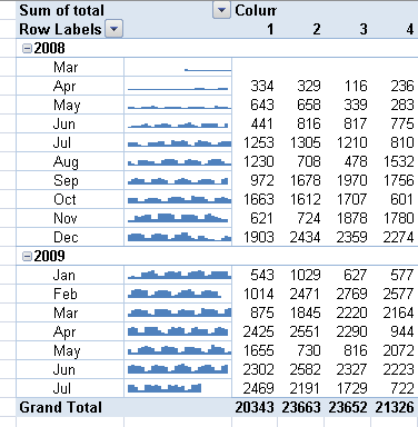
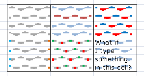
Above are the line and column styles. A third style is Win-Loss, which plots a positive block for any positive number, a negative block for any negative number, and a blank for a zero.

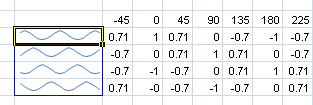
The sparklines in a set are grouped together, and when you select one cell, the whole range of sparklines is outlined with a thin blue border, as shown in the sine waves below. When you apply sparkline formatting to a cell containing a sparkline, all sparklines in the group assume this formatting. You can ungroup the sparklines, and format them individually.
Although there are a limited number of sparkline chart types, within each type you have a range of formatting options. In the line charts, you can draw the line only, you can add markers, and you can format positive and negative markers differently (there is apparently no distinction between zero and positive markers). You can highlight the first and last points, and the high and low points. I added the last group to see what happened when the cells contained both sparklines and content. Apparently the sparklines decorate the back of the cell, and the text appears in front.
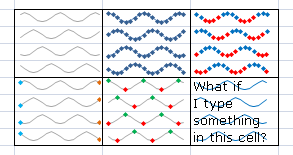
You can format the bar chart sparklines all the same (top left) or different positive and negative bars (top right). You can highlight the first and last bars, or the high and low bars (bottom left and center). Any text in the cell appears in front of the sparkline.
The top center group below shows how one sparkline can be ungrouped in order to format it differently. The other three have remained grouped despite not being contiguous.
Data Bars
Data Bars appeared in Excel 2007 as a way to show values visually using bars within the cells containing the values. In 2010 the capabilities of Data Bars were expanded, and the ability to make deceptive Data Bars was reduced.
Data Bars in 2007 had their base at the left edge of the cell, and they extended to the right. If a cell had a zero value, it still had a small length of bar, giving the wrong impression that the cell really did contain some value. Also, the bars started out with a good enough color at the base, but they faded to the right, so in some cases it became very difficult to judge where the bars ended.
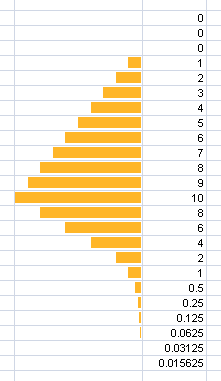
These deficiencies were corrected in Excel 2010. Below left is the Excel 2007 representation of data bars. The first few cells contain zeros, but the cells have data bars of finite length. The bars increase in size appropriately, but they fade out from left to right, and eyes are forced to work just too hard to distinguish their ends. Finally, at the bottom the values decline asymptotically towards zero, but the bars don’t completely vanish.
In the center is the Excel 2010 version of the same data bars. Zero equals zero, and the bars have a distinct endpoint. You still can make the faded bars, but you know better. I’m not sure whether you can make nonzero bars for zero values; I don’t think so, and I hope not.
In Excel 2010 you can make your bars go right to left, as shown below right.
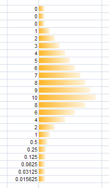
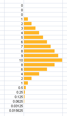
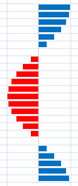
The unorthodox treatment of non-positive values in Excel 2007’s data bars is further illustrated below. At left, since Excel 2007 didn’t allow for negative or right-to-left data bars, the sine wave showed positive bars, even for the most negative value. The Excel 2010 data bars plot negative values in the opposite direction, optionally in a different color.
You can control the color of the axis where positive meets negative, but unfortunately you cannot change the line style. The designers have picked a dashed line, which by nature of its discontinuous dashes, draws more attention to itself than a solid line would. However, data bars have been improved so much, that a small cosmetic problem like this isn’t too important.

Backwards Compatibility
A commenter on one of the Sparklines blog posts wondered what would happen if a workbook with sparklines were opened in a previous version of Excel. I tried it and discovered:
- A workbook containing sparklines will show blank cells when opened in Excel 2007 or 2003.
- A workbook containing Excel 2010 data bars will show Excel 2007 style data bars when opened in Excel 2007, and blank cells when opened in Excel 2003.
In either case, you receive a warning about the file being created in a later version of Excel, and while your version of Excel will do its best to open the workbook, there may be some formatting which will not be faithfully displayed.
I also tried round-tripping a workbook through previous versions of Excel:
- When a workbook with 2010 data bars and sparklines is opened and saved in Excel 2003, and reopened in Excel 2010, the sparklines have vanished, and the data bars have reverted to Excel 2007 style (bars fade at the ends and all start at the minimum at the left and extend to the right, although there are no positive length zero values).
- When a workbook with 2010 data bars and sparklines is opened and saved in Excel 2007, and reopened in Excel 2010, the sparklines reappear, and the data bars retain their Excel 2010 style.
Apparently these features survive displacement by one version, but not by two.
Summary
Excel 2010 introduces a simple version of sparklines for compact visualization in the worksheet. The native Excel sparklines are not as comprehensive as existing third-party solutions can produce, but they can still be useful in many cases.
Excel 2010 also fixes conceptual problems and cosmetic issues with the data bars that were introduced in Excel 2007.


sam says
The only small deficiency that I found with the Data Bar is the inablity to adjust the width of the bar.
If you increase the Row Height then the Data bar widens as well…
jeff weir says
Hi Jon. It would be interesting to see how the new sparklines compare head to head against some in-cell graphs, given you can put a cell sized chart in 2007 and have all the formatting options you get with any normal 2007 chart.
For instance, I’ve posted a picture of an implementation of in cell graphs and some closeups at http://cid-f380a394764ef31f.skydrive.live.com/browse.aspx/.Public?uc=3 – (the relevent picture files all start with MJ or MU)
With this kind of functionality, I can only imagine that sparklines would help make this kind of functionality easier for the average user, but might not add much (if anything) to a more advanced user. Its possible the new sparklines functionality might actually suck compared to what you can do with incell graphs. Your thoughts?
PS…is it possible to use tags when writing comments here? (And if so, which ones, and how do we use them)
Regards
Jon Peltier says
Jeff –
I had experimented with “real” charts as sparklines. You can do it in Classic Excel if you give yourself some margin, by making the chart object no less than about four rows high, making the plot area one row high, and positioning the chart object so the plot area overlies the cell. Pain in the neck, but that’s why Bill Gates invented VBA. 2007 made this a bit easier by removing the margin, the several pixels all around the chart area that are inaccessible in Classic Excel, and by allowing the whole chart to shrink to a cell’s height and still show its contents. But other issues with 2007 charting limited my experimenting there. Your mini charts are interesting.
Fernando Cinquegrani, who does some amazing graphics in Excel, experimented in Excel 2003, using Camera images of charts shrunk down to cell size. This was pretty interesting, though using more than half a dozen or so camera objects in a worksheet is asking for trouble. I don’t see this example on his web page.
And I don’t know about the tags.I’d like to get threaded commenting hooked up too, one of these days.
Colin Banfield says
Jon, great article capturing the essence of these two features. It never occurred to me to consider Sparklines as conditional formatting because, well, they aren’t based on any condition, or fall under the Conditional Formatting umbrella…
I like how Sparklines work with tables – very much like a calculated column. Refreshing a table from an external data source automatically adds new Sparklines to the “calculated column.” Alas, although you can fake out Sparklines in a PivotTable, it’s all pretty much a manual process to update, configure for different fields etc. In other words, any serious visual analytics is pretty much out of the question.
Despite seeing axes on Sparklines in the Excel Blog postings, I haven’t been able to display them at all. After selecting the “Show Axis” option, I don’t see any axis displayed in the cell(s). Is this option working for you?
Jon Peltier says
Colin –
“Show Axis” did nothing that I could see. I could plot left-to-right, and it seemed that changing to a date scale also worked (though I didn’t try hard to break it).
I wouldn’t say that “serious” analytics is out of the question. As always, you’d need careful planning, and probably some clever VBA. If you need to extend your sparklines, since it’s contained in the formatting of the cell, you can just fill the cell down or right as needed.
Jerry Betz says
Hi Jon-
Does the Excel 2010 Visual Basic Editor pick up actions when working with Sparklines? It would be good if the actions were picked up properly so we could learn the new object syntax, unlike how charting worked in 2007.
Jon Peltier says
Jerry –
I haven’t tried recording a sparklines macro yet. It was getting late and I was approaching a deadline (bedtime).
Colin Banfield says
My macro recording experience with Sparklines is similar to that with charts. Add some formatting during recording and the macros bomb on playback.
Jan Karel Pieterse says
The axis option is abvailable on later 2010 builds than the one we got.
Same seems to go for recording macros.
MSFT is still working on this thing.
James says
Hi Jon,
These look like very useful new features. I liked using the conditional formatting in 2007, but never could work out how to get them out of Excel, ie to get data bars in a Word table. Do you know of any way to do so?
Cheers,
James
Jon Peltier says
I haven’t tried doing this, but maybe you could embed the Excel worksheet in Word, or copy the table in Excel, and paste it as a picture (probably bitmap) in Word.
Christian Bracchi says
Would it be possible for an exmplanation on how you were able to actually insert the sparklines into the pivottable? It looks like you have managed to get a blank column in the table and insert the sparklines in there.
Jon Peltier says
Christian –
I sure wish I could remember how I did that. I did it originally many months ago during the technical review. That was two versions ago, I deleted the virtual machine that was on, and I didn’t save the files.
If anyone kows how I did that, please remind me.
nutsch says
I manage to replicate something similar by:
– adding an empty column with a bogus title in the data source,
– inserting that column as the last row field,
– replacing (blank)s by spaces,
– replacing title by space,
– changing layout of previous row field to Show item labels in tabular form.
That creates an empty column in which you can put your sparklines.
nutsch
Skip says
Sparklines look like a quick and easy way to add some visualization.
The problem I have is using the parent company’s form the shows expenses as negative amounts. The Sparkline show oposite from what it should (up for high expense, down for low expense). I know I can add a hidden row and change the sign. Is there any way to condition the sparkline cell to change the sign?
Thank you
Tim Heschotmail.com says
Where do you find databars? You show where sparklines are but not databars. What up? Once again a waste of my time!! If you like sparklines so much don’t mention databars cause they’re not i n the same spot!!!!!!!!!!!!!
Jon Peltier says
Tim –
I mentioned at the top of the article that these graphical features were based on Conditional Formatting. One way to format values is via data bars, which can be found via the Conditional Formatting button on the Home tab. I’ll include a screenshot when I get a chance.
Sorry to have “wasted” your time.
Julian Brinckmann says
I have troubles with the Data Bars in Excel 2010. I have Data that have extreme negative numbers but small positive Data. Now I want the Data Bar to extend almost all the way in the negative direction but the cell should end shortly after the positive end of the Data Bar. I cound not find a way how to format the c3ell to do this.
Maybe you guys could help me out.
Thanks in advance
Julian
Jon Peltier says
Julian –
I entered a few numbers into a new sheet and applied data bars. I don’t see the problem you’re reporting:
Gerardo Serrano says
Hi, is there a way to format databars in more tan 2 colors, I mean as in red, green and yellow? because there is only a format for positive and negative.
Jon Peltier says
Gerardo –
You can have two colors if negative values are a different color (or you can format negatives to use the same color as positives). No more colors than that can be applied.