This article will show how easy it is to create a scatter chart with its plot area divided horizontally and vertically into four regions. The regions are separated by the chart axes, and these axes can be positioned where needed to demarcate the quadrants.
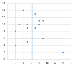
I have written a tutorial showing how to create an Excel Chart With Colored Quadrant Background, which was more complicated, as it used stacked areas and secondary axes to get the colored background. This is much simpler to create and maintain, and serves much the same purpose.
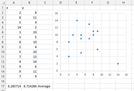
Here is the sample X and Y data, with calculated averages, and the initial XY scatter chart. We will position the axes at the respective averages of the X and Y data, though you can position them wherever it makes sense in your analysis.
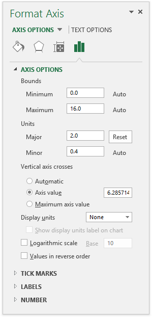
We need to reposition the axes of this chart. Double click the horizontal axis, or select the horizontal axis and press Ctrl+1 (numeral one), to open the Format Axis task pane (shown here, Excel 2013) or Format Axis dialog (works much the same in earlier Excel versions). Under Axis Options >Vertical Axis Crosses, select the Axis Value option, and enter the X average into the box, as shown.
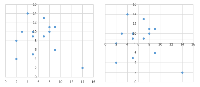
The result is shown below left. Repeat for the vertical axis, below right.
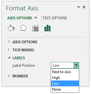
Those axis labels are totally in the way, but it’s easy to move them. Format each axis (open the task pane or dialog as above) and under Labels > Label Position, select Low from the dropdown.
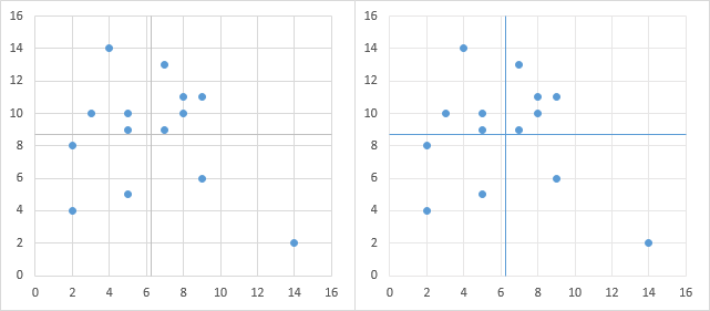
Now those labels are along the edges of the chart, where they do more good than harm (below left). You can do a small amount of formatting to make the quadrants stick out a bit more clearly. In the chart below right, I’ve used a lighter shade of gray for the gridlines, and I’ve used a darker color, in fact, the same color as the markers, for the axis line color.
It is easy to use VBA to position the axes and axis labels, using a simple routine like that shown below. This routine positions the labels, then uses the averages calculated in the worksheet to position the axis lines.
Sub AxesAsQuadBoundaries1()
  With ActiveChart
    With .Axes(xlCategory)
      .TickLabelPosition = xlTickLabelPositionLow
      .CrossesAt = ActiveSheet.Range("A17").Value2
    End With
    With .Axes(xlValue)
      .TickLabelPosition = xlTickLabelPositionLow
      .CrossesAt = ActiveSheet.Range("B17").Value2
    End With
  End With
End Sub
The next routine skips the worksheet calculations, instead taking the averages of the X and Y values plotted in the chart to position the axis lines.
Sub AxesAsQuadBoundaries2()
  Dim vData As Variant
  With ActiveChart
    vData = .SeriesCollection(1).XValues
    With .Axes(xlCategory)
      .TickLabelPosition = xlTickLabelPositionLow
      .CrossesAt = WorksheetFunction.Average(vData)
    End With
    vData = .SeriesCollection(1).Values
    With .Axes(xlValue)
      .TickLabelPosition = xlTickLabelPositionLow
      .CrossesAt = WorksheetFunction.Average(vData)
    End With
  End With
End Sub
You can even use worksheet events to reposition the chart axes. My X and Y values were calculated using =RANDBETWEEN(2,14), so whenever the worksheet calculates (e.g., by pressing the F9 function key), the values change. I can tap into this calculation event as follows.
- Right click on the worksheet tab, and select View Code from the popup menu. The VB Editor opens with a code module corresponding to the worksheet.
- Select Worksheet from the left hand dropdown at the top of the new code module.
- Select Calculate from the right hand dropdown.
- Enter the code as shown.
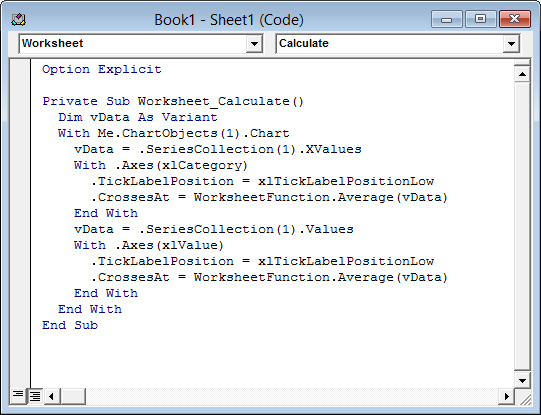
Here is the code so you don’t need to type it all yourself. Simply copy and paste into the worksheet’s code module.
Private Sub Worksheet_Calculate()
  Dim vData As Variant
  With Me.ChartObjects(1).Chart
    vData = .SeriesCollection(1).XValues
    With .Axes(xlCategory)
      .TickLabelPosition = xlTickLabelPositionLow
      .CrossesAt = WorksheetFunction.Average(vData)
    End With
    vData = .SeriesCollection(1).Values
    With .Axes(xlValue)
      .TickLabelPosition = xlTickLabelPositionLow
      .CrossesAt = WorksheetFunction.Average(vData)
    End With
  End With
End Sub
Depending on the details of your worksheet model, you could use the Worksheet_Calculate, Worksheet_Change, Worksheet_PivotTableUpdate, or other event procedures to update the chart.


Phil Gray says
I use these to plot variation year-on-year, and performance against a comparator value. The intention is place the scored value in one of four quadrants that show its relationship to the prior year value (Y axis) and comparator value (X axis0).
The scored value, and the comparator value, are plotted on the X axis, the variation is plotted on the Y axis, so always centres on 0.
Rather than try and dynamically centre the axes I opted to format the comparator to look like the X axis – it has no line and no marker but it does have a vertical error bar that extends the width of the plot area.
Jon Peltier says
Error bars are another means to add a horizontal or vertical line. The nice thing about using the axis is that whatever the axis scales, the axis spans the extent of the chart. When you use error bars, you need to adjust the axis scales, and make them non-dynamic, in order for the error bar to span the chart.
Andreas Schuderer says
Thanks for this post. I hadn’t fully realized you can use axes for this as well. This is true for a lot of posts by Jon, by the way.
I also want to avoid manual (or scripted) adjustments as far as possible. Right now, you can choose to use error bars and you have to fiddle with the axis scales. Alternatively, you can choose to use axes, but then you have to fiddle with their position. Choose the drawback you’d prefer to have. Excel is kind of that way.
Personally, I’m more and more often choosing to just plot a line between two points in an extra series and generally to use fewer clever tricks (I’m not being dismissive, one needs to know those tricks in order to determine how to best solve a particular problem, and I wouldn’t have been able to solve a lot of problems without clever tricks like this one). Anyway: In this situation, just plotting a line looks like another possible solution — it needs more data cells which makes it less elegant, and it has other drawbacks, but I’ve grown to feel that if I have to deal with drawbacks anyway, I could just use the most straightforward way possible, particularly if there’s a possibility that someone will have to maintain this contraption some time in the future.
I tend to not use borders on my charts’ drawing areas. This makes the most important drawback of plotting a line, i.e. that automatic scaling creates a gap between the end of the line and the edge of the drawing area, invisible. That makes the need for additional series the only remaining drawback that I know of.