A reader of this blog asked how to add a series to a 3D column chart, to show reference values. Excel doesn’t allow combination charts if one of the chart types is 3D (fortunately!), so she added lines from the Insert Shapes group on the ribbon. Here is the result.

At first she insisted that the colors were Excel’s default, but when I asked which theme used such colors, she found out that her co-worker had designed it himself. When he’s cleared his backlog, I’ll have him design me a new template for my web site.
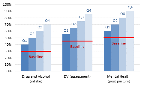
The protocol below shows how to achieve the same effect of a reference line in an easy and perhaps more aesthetically pleasing way.
Here’s the data my reader used for her chart. It’s totally made up, because she’s working on top secret government projects, and I don’t think y’all have the appropriate security clearance. I sure don’t.

The first step is to create a clustered column chart.
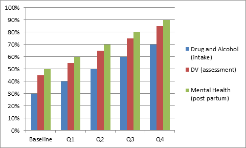
The second step is to switch rows and columns in the source data orientation if necessary (it was).

Now we’ll move in the opposite direction of the 3D chart at the top of this article, and do some unformatting. Let’s remove the chart area border, remove the line for the vertical axis, and use lighter gray lines for the gridlines and horizontal axis. Oh, and remove the tick marks from the horizontal axis.
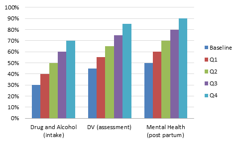
Move the Baseline series to the secondary axis.
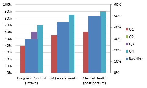
Delete the secondary Y axis (right of the chart) so all the data uses the primary axis.
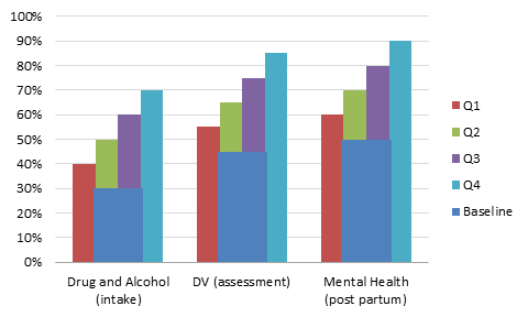
Apply a consistent set of colors to the Q1 through Q4 series.

Make the Baseline series into a hollow box by removing the fill and applying a thick border of a contrasting color.

Reduce the gap width of the Baseline series so each hollow box encompasses its corresponding cluster of columns. In this example, the gap width of the Baseline is 15%.
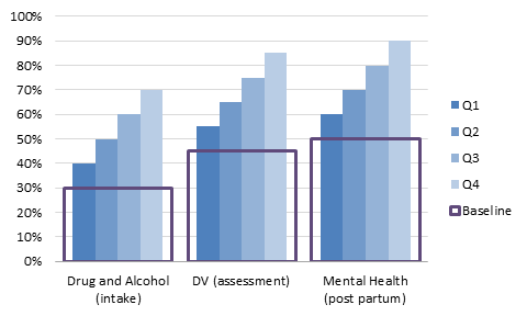
We can get rid of that legend.
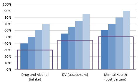
Let’s apply data labels to all of the series using the Outside End position. If you select the whole chart and use the Data Labels command on the ribbon, all series will be labeled in one step. This saves a lot of time over labeling one series at a time.
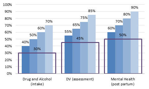
Change each set of labels from Value to Series Name, and change the Baseline label position to Inside End.

Finally, if desired, use a darker shade of the bar colors for the labels.
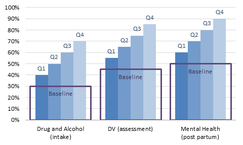
It’s a lot of steps, but they’re quick and easy. My reader admitted that she likes this version better than her original. I haven’t yet heard from the graphic designer she works with.
For an alternative that has only the horizontal part of the “hollow box”, see Another Simple Baseline for Excel Column Chart.


Chris says
I’ prefer using a custom marker, looks a little bite nicer is as easy to build.
Jon Peltier says
By custom marker, do you mean you drew a red line, copied it, selected a line chart with markers but no lines, and pasted the image? Yes. that works too. I have an alternative that I might be able to write up soon, which uses an XY series with horizontal error bars. Same idea.
Jon Peltier says
Chris –
Check out Another Simple Baseline for Excel Column Chart.
Tamoghna says
Had no idea we can use custom marker such a clever way :) Thanks Chris and Jon !
Here is my version of the chart
Chris says
Yeah Jon, I copied and pasted a drawn line as a marker, but I guess the scatter-plot error bar idea is an even nice one. Didn’t think of that.