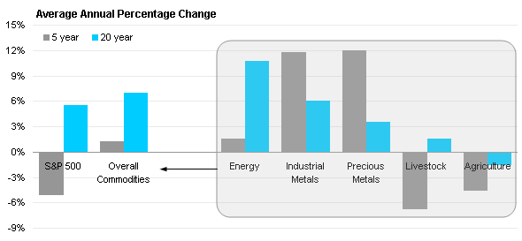
Earlier this week, Tony Rose wrote about Highlighting Data in a Chart. He used an example called The Mixed Commodities Bag from Business Week, a magazine whose graphics always lead to discussion, for better or worse. I’ve reproduced the chart below using my graphics engine of choice, though I didn’t spend a lot of time to make the category labels just right. The caption comes from the Business Week page.

Although returns vary for individual goods, overall commodities have gained an average 1% a year over the past five years and an average 7% a year since 1988—even after the latest plunge.
The chart isn’t totally bad, either. It makes a good attempt to show the components of the overall commodities data. I wasn’t happy with the rounded rectangle, I felt it obscured the data as much as included it. I also thought the right to left alignment of the chart was backwards, at least for Western audiences.
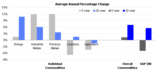
I proposed moving the individual commodities to the left part of the graph, and the overall commodities and market index to the right. I proposed lighter fill colors for the individual commodities, and labeling that better separated the individual commodities from the combined commodities. Here is my version of the chart:

But some boss, or editor, or client will want an arrow. So I dropped in an arrow that was as unobtrusive as I could make it.

I think it’s an improvement, do you agree?


greg says
I have to admit that I prefer the original example. As a “Westener” it reads correct to me. As I take in the chart’s message, I start from the left and I am informed of the average commodity prices changes. What makes up the commodity measurements? My eye continues to the right to see the break-down and recognize the contribution of energy price changes on the commodity measures. Reading it your way, I am first presented with the parts of the whole and automatically go to the right to see what it is that these parts make up. Once I understand that these parts are a subset of commodity price changes and I register this ‘average’ change, I then must go back to the left to see what makes up the parts of the whole. That is an inefficient use of my time.
Also the original author uses the box as a type of ‘balloon’ or magnification representation, thereby I quickly recognized that I was supposed to consider the bars in the gray box as being in a different subset than the bars not in the box. Though I would have changed the arrow to point in the other direction. Your improvement did not help me in this manner, I had to study the chart that much more to recognize this when a simple gray box would have simplified this.
Alistair says
Looks better to me; one possible improvement in either chart would be to clarify the role of the S&P 500 bars. I’m assuming they’re there as a comparison set, rather than something which directly relates to the individual commodities as the overall bars do. If so, I’d suggest some delimiter like a vertical line between the Overall Commodities bars and the S&P bars to show that they are separate.
Jon Peltier says
So far the voting is split 50-50. I think a more informative title would have helped both responders:
Average Annual Percentage Changes in Individual Commodities and in Commodities Overall,
S&P 500 Index Shown for Comparison
Alistair says
Thinking about it again, a more familiar technique than the rectangular box would be a telescope-style effect, with a small circle over/around the ‘overall’ bars extending out to a large circle, as though it is zoomed in.
Tony Rose says
Jon,
I think the answer may be in the middle. I like your version that doesn’t use the box to highlight part of the data. However, I prefer the totals on the left versus on the right. I know this goes against what I am use to in spreadsheets, but I just like it better. Maybe it’s the left to right reading method.
Also, I’m not a big fan of the double legend. If anything, maybe one color for the commodities and total commodities and another color for the S&P500. But even that would still require 2 legends for each set.
Even these changes I don’t think would be optimal. I may need to start from scratch with just the data and play around with it.
Glad I could provide you with something to do. ;)
Herbert says
My instinct is that I prefer the 1st chart a little bit more.
Colin Banfield says
I would probably opt for two separate charts. Why? I ask myself, what is being compared? I find it difficult to compare individual commodities with each other AND individual commodities with overall commodities AND overall commodities with the S&P 500 all at the same time. A single chart forces this comparison. Separate charts don’t.
However, if you want to maintain a single chart, I’d make two slight mods: 1) Add a secondary value axis. With a chart this long, the eyes have far to go to measure the values on the right from the primary value axis; 2) Move the individual commodities category labels below the plot area. Some category labels obscure the bars, making these bars harder to read (always an issue when there are negative values).
Jon Peltier says
Colin –
In general, I prefer a two-chart approach when possible. But sometimes other people are defining possibilities.
Doug Glancy says
I like the original. I understand the convention of big picture leading to detail, and that the same colors mean the same thing on both.