Shaded Background Quadrants
People often ask how to shade the background of an XY Scatter chart. This may help to define certain regions of performance or cost-benefit. The desired end result is something like this:
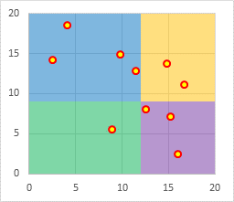
This is a rework of an older article. The protocol has been simplified and the steps reordered to work more reliably in Excel 2013 and other recent Excel versions.
Scatter Plot Data
Here is the simple XY data used in this tutorial. The data scales between 0 and 20 on both axes.
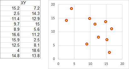
Background Data
These two tables show the data and calculations needed to draw the shaded background areas in the chart.
The first table shows relevant values for the X and Y axis, including the minimum and maximum, as well as where we want the divisions between left and right shaded areas and between upper and lower shaded areas. You don’t need to use such a summary table, but you might find it helpful.
In this example, we want the areas to extend from X=zero (the left edge of the chart) to X=12, and from X=12 to X=20 (the right edge of the chart). Likewise we want them to extend from Y=zero (the bottom of the chart) to Y=9, and from Y=9 to Y=20 (the top of the chart).
The axis parameters were selected arbitrarily here, partly to show that the quadrants don’t have to be of equal width or height. These are static values, but you could put formulas into the range C3:D5 if you wanted the divisions based on the statistics of the data or on any other variable criteria.
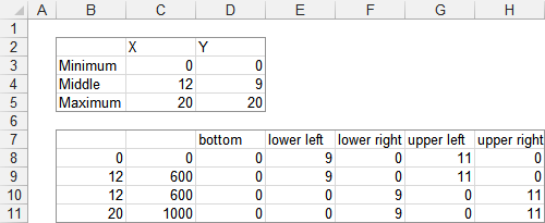
The second table above uses formulas that reference the first range:
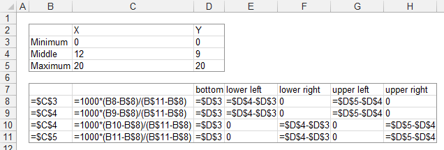
The factor of 1000 is used in the formulas in C8:C11 simply because it will provide the appropriate resolution of the division between shaded areas.
This data will produce this background pattern:
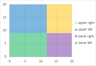
The need for the “Bottom” area series is discussed at the end of this tutorial. It may be better to wait until indicated in the middle of this protocol before you read it.
Building the Chart
Start constructing the chart by selecting the XY data and inserting an XY Scatter Chart from the Insert tab of the ribbon. The legend has been included to help show all the series in the chart through this protocol.
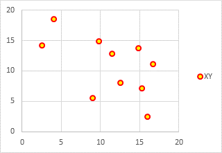
Next, copy the data for the shaded regions, which is in C7:H11 (don’t include column B, which has intermediate values).
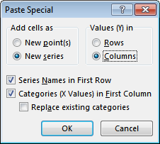
Select the chart, then click the little down-pointing triangle on the Paste button of the ribbon’s Home tab, and select Paste Special. You will see a dialog like this, and you should make sure these are the settings before clicking OK. In this case, Excel should figure them out correctly.
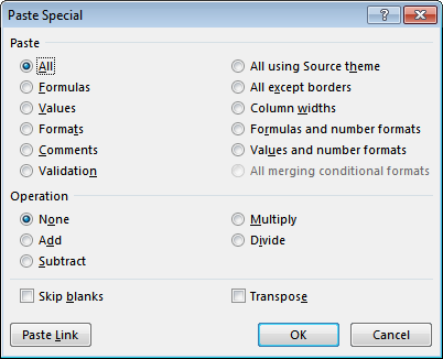
The following Paste Special dialog is for pasting data somewhere in a worksheet. This means that a cell or cells in the worksheet were selected when you clicked on Paste Special. Cancel this dialog, select the chart, and re-invoke Paste Special.
The chart now looks like this. Since the added series have a maximum X value of 1000, the original XY data with its maximum of 20 is pushed to the left edge of the chart. Don’t fret…
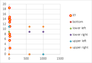
One by one, select each of the newly added series, and assign them to the secondary axis. This is the first setting you can control if you select the series and press Ctrl+1 to format it. It also can be done from the new Change Chart Type dialog in Excel 2013, shown at a later step of this procedure.
Excel has added a new vertical axis along the right edge of the chart.
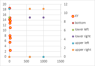
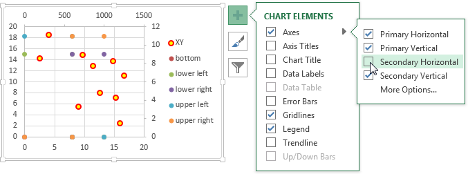
Add the secondary horizontal axis. The easiest way in Excel 2013 is to click on the Plus icon next to the chart, click on the right-pointing triangle next to “Axes”, and check the appropriate box.
You could also use Excel 2013’s Add Chart Element control on the Chart Tools > Design tab.
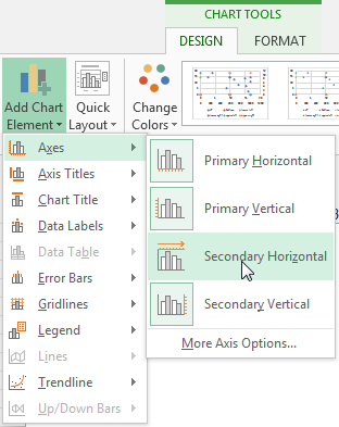
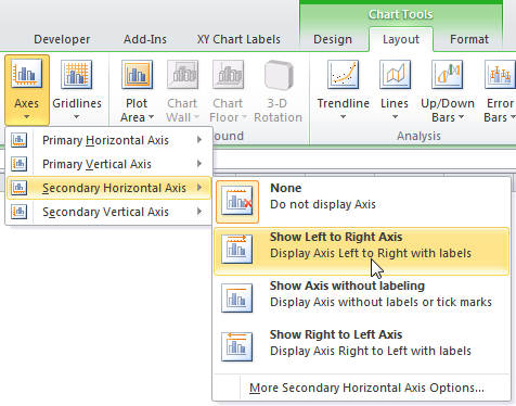
In Excel 2007 or 2010, go to the Chart Tools Layout tab, click the Axes down-pointing triangle, then Secondary Horizontal Axis, then select show Left to right Axis.
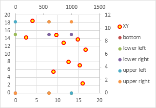
Here is the chart with all four axes deployed. Now the original XY data on the primary axis overlaps with the added data on the secondary axes.
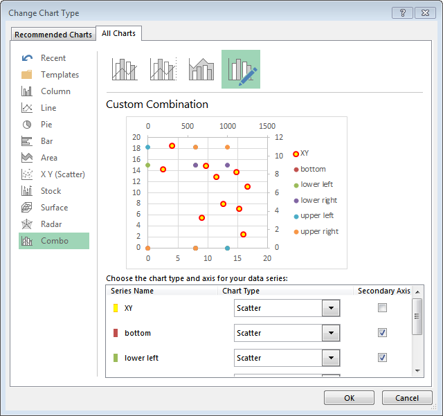
Now we need to change the added series from XY to Stacked Area. This is very easy with Excel 2013’s new Change Chart Type dialog. Right click on any series in the chart and choose Change Series Chart Type… The dialog shows the chart with a list of series in the chart. Beside each series is a dropdown showing its chart type and a checkbox showing its axis group.
We could have changed the axis group of the added series to secondary in this dialog, as long as we did so before selecting a different chart type.
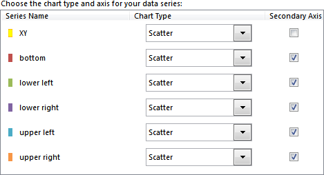
This panel shows all series in the chart, after changing axis group of the added series, but before changing their chart type to Stacked Area.
Click on the chart type dropdown, and you’ll see a collection of chart types. The XY Scatter type is selected, and the cursor is hovering over the Stacked Area icon.
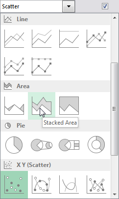
Here is the panel of chart series after changing the added series to Stacked Area.

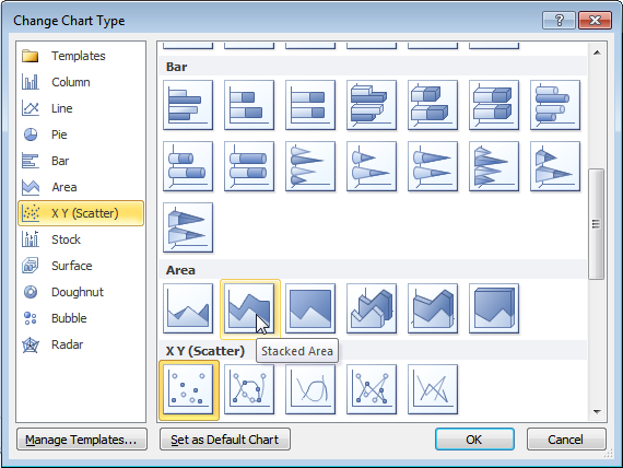
If you’re using Excel 2007 or 2010, you have to right click on each series you need to change, one at a time, and select Change Chart Type. You will see this dialog. The XY Scatter type is selected, and the cursor is hovering over Stacked Area.
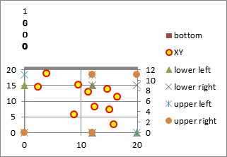
If you have to change one series at a time, the intermediate chart will look rather strange. This is the chart after changing one series to Stacked Area in Excel 2010. If you only changed one series on the secondary axis in 2013, it would also look like this.
But don’t panic: after changing all of the series, the chart will look the same in all three Excel versions.
Here is the chart with all added series changed to Stacked Area.
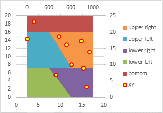
The need for the “Bottom” area chart series becomes evident in the chart above, with a little explanation. If you are interested, there is an explanation at the end of this tutorial.
The next step is to format the area series. Here I’ve made the “bottom” series completely transparent, and applied a transparency of 50% to the rest. This tones down the intense colors, so they don’t overshadow the actual data, and also allows the gridlines to show through.
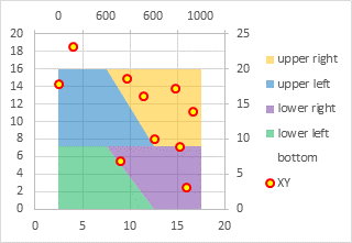
Select the secondary (top) horizontal axis and press Ctrl+1. In the formatting dialog or task pane, change the Axis Type to Date Axis. This changes the diagonal lines between adjacent shaded regions into vertical lines.
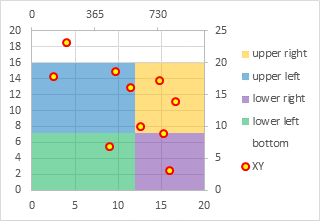
Select the secondary (top) horizontal axis, and press Delete. Then select the secondary (right) vertical axis and press Delete.
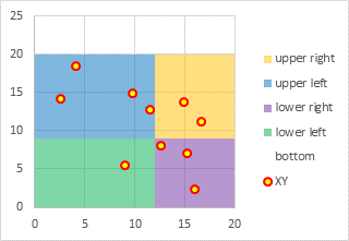
Finally, rescale both axes as appropriate. For this example, both should have a minimum of 0, a maximum of 20, and a major unit of 5.
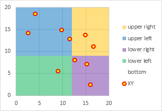
Finally, delete the legend, and the chart is finished.

Variations
Once you know the approach, it is not hard to expand the grid to 3-by-3. In the table below I’ve lightened the zero values to enhance the data for the shaded areas.
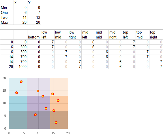
In fact, you can use any reasonable (i.e., visually and cognitively useful) number of shaded areas, and you don’t need the same number of rows and columns of colors.
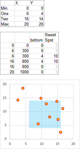
It’s also easy to highlight a target region, especially since you only need the bottom area and the target area.
Why We Need the Bottom Fill Series
Here is the chart right after all of the secondary axis series have been converted to Stacked Area type.

The “bottom” series seems to be on top of all of the rest of the series, which is pretty strange.
If we delete the “bottom” series, the “lower left” series has disappeared from the lower left region of the chart and now it is seen on top of the chart. Broken!
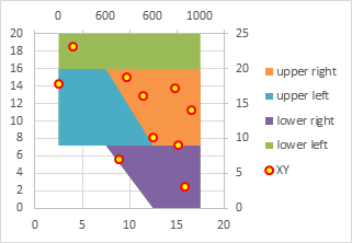
So what’s going on, anyway?
Let’s start with only the “lower left” series, in the position we want it: the bottom left portion of the filled regions.
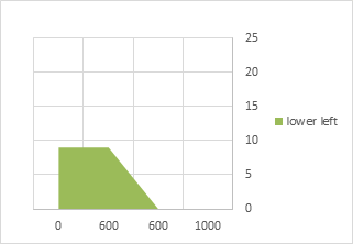
Look what happens when we move the category (horizontal) axis to the top of the chart, where the secondary category axis is found. Instead of filling below the “lower left” data points, the fill is above these points.
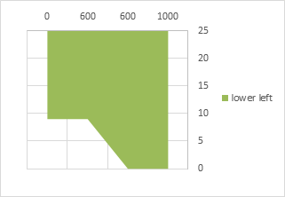
Aha! In an area chart, the first series fills between the category axis and the data points. So let’s start with the “bottom” series, with values of zero.
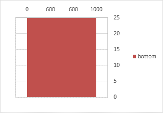
The “bottom” series starts from the category axis at the top of the chart, explaining why it appeared above the other areas, and extends to the bottom of the chart, or actually, to zero on the value (vertical) axis.
Let’s now add the “lower left” series, nearly transparent so we can see both series.
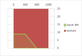
The “lower left” values are added to the “bottom” values, so it fills below its data points, in front of the “bottom” area.
Let’s add the other three series:
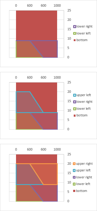
They all stack up nicely in front of the “bottom” series. Nice, just what we wanted.
Back to the non-transparent version that brought us here.

You may now return to the protocol.
More Peltier Tech Articles About Combination Charts
- Pareto Charts in Excel
- Clustered Column and Line Combination Chart
- Precision Positioning of XY Data Points
- Add a Horizontal Line to an Excel Chart
- Horizontal Line Behind Columns in an Excel Chart
- Bar-Line (XY) Combination Chart in Excel
- Salary Chart: Plot Markers on Floating Bars
- Shaded Quadrant Background for Excel XY Scatter Chart
- Excel Chart With Colored Quadrant Background
- Fill Under or Between Series in an Excel XY Chart
- Fill Under a Plotted Line: The Standard Normal Curve


Bill McNair says
Brilliant , Wonderful, Perfect. Thank you!
derek says
Nice explanation. That behaviour just reinforces my belief that the software default should have been for the bar or area to extend to the zero line’s position on the Y scale and stop, not for it to extend to the *X scale’s* position on the Y scale.
Drew Georgopulos says
Chart voodoo laid bare!
Thanks so much for this.
Helen says
I’m so glad I found this tutorial. Upgrading from Excel 2003 to Excel 2010 at work has been quite traumatic! This was a really nice and easy tutorial to follow. Plus the trick of copying data and using paste special to add it to a chart is a little gem. Thank you so much for taking the time to write this.
Gavin says
Thank you for this tutorial. It has helped a lot. I am using one of your chart GetXYonAnyChart.xls to create custom message when a data point is clicked. It works find on my Excel 2010 but another colleague has Excel 2007 and it doesn’t work there. Nothing happens when I click on data point. No events are getting fired. I tried to do multiple setting changes but nothing worked so far. Would really appreciate if you can provide any pointer on this.
In your example, out of 6 charts on a sheet, the one with scatterline work on Excel 2007 of my colleague. Other five do not work. I changed my chart type to scatterline but that did not work for me.
Any help will be highly appreciated.
Jon Peltier says
Gavin –
I haven’t looked at that stuff for years. I’m not surprised it didn’t work in 2007. A lot of chart stuff, including the chart event procedures used in that example, were broken in 2007. I remember pulling out my hair whenever I had to program charts in 2007. I never officially upgraded to 2007 for my own work, I kept working in 2003. When 2010 came out, I did move over, and now I’m mostly using 2013. And 2003 looks awfully dated to me now.
Brandon says
I’m looking for a way to post XY data onto a scatter plot that has unique colored quadrants, as can be seen in the website: http://www.flickr.com/photos/104159538@N06/10071269716/. There are several unusual things about it: One, the axes are not uniform in spacing, and it’s not logarithmic either. Second, I also need to be able to use data where, say I have four data points A, B, C and D, I can choose whether to plot A, C and D or just A and B or even just C by itself. Is pivot table the best option there, and how would I approach it? Thanks so much.
Sean says
I could not get this to work with Excel Mac 2011. The ‘change axis to date’ step throws up an error “the entry is invalid for the data used by this chart. Please enter a value that falls within the minimum and maximum data values used by this chart.” Could not figure out any dates that would avoid the error and show the boxes.
The closest I felt to a solution was a discovery that it may be an Office Mac bug.
http://www.realgeek.com/forums/horizontal-axis-scale-issue-470229.html
Hanne says
So helpful, thank you!
Philippe says
Dear John,
This tutorial is just perfect ! Thank you so much ! I was searching for this kind of tricks since several weeks. I met a problem during the step “Show secondary horizontal axis” (I am using Excel 2010). When I try to show the secondary horizontal axis, the only options I have are : “None”, “Show default axis”, “Show axis in thousands” etc but any “Show left to right axis”.
When I try to apply “Show default axis”, the result is only applied to the “Bottom – upper right” data but not for the “XY” series. I could not figure out how to solve this problem. The “XY” marks are still sticked to the left.
Could you please help me to solve this problem? Thank you in advance.
Philippe says
Dear Jon,
please find a printscreen of my issue here : http://aspw.free.fr/Quadrant.jpg
Jon Peltier says
Philippe –
Make sure all five series (bottom, lower left and right, upper left and right) are plotted on the secondary axis. If any are still on the primary, then both axes will scale to accommodate the full 0 to 1000 range of X values, and the markers with their puny X values will be smushed against the left edge of the chart.
Philippe says
Jon,
Super thanks ! You solved it ! :)
Best regards,
Christa says
Thank you so much for this tutorial – it works perfect!
However, I have a followup question as I tried to do the same in VBA. The key step by setting the second x-axes to “Date axis” doesn’t lead to the same result (I used:
ActiveChart.Axes(xlCategory, xlSecondary).CategoryType = xlTimeScale ).
When I check the properties of that axes it is acutally changed to “Date axis”, but the chart still displays diamonds instead of rectangles. Do you have any idea why this happens?
Any help is much appreciated!
Best regards,
Christa
Jon Peltier says
By “diamonds”, do you mean the background areas don’t have vertical edges? You probably need to make sure your data in the coded version is the same as in the manual version, which presumably worked. You need two points with the same X value and different Y values to get a vertical line on a date axis.
In the old days, Microsoft called the date axis a time axis, even though it could only deal with integers, or whole days, and not fractional numbers, or times. They changed the wording in the dialog, but kept the xlTimeScale constant name in VBA.
Christa says
Hi Jon,
thanks a lot for your answer. Yes, by “diamonds” I mean “no vertical edges”.
The input data for manual and VBA, resp., are the same. But I found a not-so-nice workaround: copy/paste the chart updates it and everything is correct (refresh / calculate / .. wouldn’t do it).
Thanks a lot again for this tutorial
Jon Peltier says
Funny thing. I was having a similar issue, that a chart with a shaded background like this was not updating properly when modified using VBA in a specific version of Excel, I think 2010. So in the code I tested for Excel version, and if it was the offending version, the code copied the chart and pasted it where the old one was, then deleted the old chart. Months later when revisiting other features of the code, I wondered if I really needed that workaround, so I tried without copying the chart, and it worked fine. I don’t know why it started working, maybe there was some fix included in some update of Microsoft Office.
Alice says
Hi Jon,
Thanks for your tutorial, it is great! I have followed it step by step and my chart looks the same as yours but when I change the Secondary Horizontal Axis type to Date Axis the two area series on the left (green and blue) stretch horizontally across the entire chart and the other area series (yellow and purple) disappear. Do you have any idea what the problem might be?
Many thanks,
Alice
Jon Peltier says
Alice –
Are the series all on the appropriate axis?
Enrique says
Jon,
Great tutorial, I’ve been a fan of your work and knowledge for some years now. I have a question: Why if I extend the limits of the X axis the shading extends and does not stop at 20 and this doesn’t happend to the Y axis, if I extend the limits to 40, the vertical shading will stop at 20 and from 20 to 40 there is white background. For my particular application I would want the x axis to not have shading from 20 to 40
Thank you very much.
Sincerely,
Enrique De Velasco
Jose Pla says
Jon,
Thanks a lot for this tutorial, it really worked.
I just have 1 more inquiry, Is it possible to add tags with a list of names to each of the XY points?
Once again, thanks
José
Philippe says
Hello Jon,
Still very satisfied with your shaded quadrant background tips, very useful. I know this is an Excel oriented tips but I am thinking to migrate to LibreOffice. I am trying to generate shaded quadrant background in Calc but I couldn’t figure it out. Any chance you had experiment this in Calc?
Thanks in advance for your reply.
Oliver Verderber says
Thanks so much!
@Jose Pla, you probably should try XY Chart Labeler
Clem says
Hi Jon
I worked through your tutorial, and it worked perfectly.
I’m now trying to apply this to an X-Y scatter chart where the X and Y axes start at a -ve minimum through to a +ve maximum. I’m stumped with the minimum as your example starts with a minimum of zero – I’ve tried to figure out what I need to change in the formulae, any guidance would be gratefully received!
Great work with the blog btw :o)
Jon Peltier says
Clem –
Did you enter your negative value in D3, instead of 0?
Clem says
I think I tried that, but knowing me I probably didn’t!
I’ll let you know how I get on, thx
John says
John,
Thanks for this tutorial, it was very useful. One question: I have used this method to create shaded areas and although it looks 100% when created, something happens when I save and later reopens the file: the shaded areas go skew! I checked the values at the top and bottom of the area and the horizontal axis values are the same. Have you come across this before?
Kind regards
John
Jon Peltier says
John –
What version of Excel are you using? Excel 2010 sometimes messed this up if none of the service pack updates were applied, and I think 2007 did as well.
John Little says
Brilliant tutorial – very clear and easy to follow. Saved me a heap of time. Many thanks.
Pierre Lefebvre says
I have a question
Presently I was just able to add the X and Y values on the graph.
In my application X and Y are used for on supplier.
I need to have the supplier name instead of the X&Y value
Can you help me
Jon Peltier says
Pierre –
You can change the labels as appropriate using one of these approaches:
+ Select each label (click to select the series of labels, then click again to select the individual label), double click to edit the label’s text, and type the label you want.
+ Select each label (click to select the series of labels, then click again to select the individual label, but without selecting the text of the label or having the cursor in the label), type an equals sign in the formula bar, and click on the cell containing the label you want, then press Enter. The formula bar will show the link, e.g., =WorksheetName!$F$2.
+ Download and install Rob Bovey’s free Chart Labeler from http://appspro.com. This allows you to assign labels from a worksheet range to the points in a chart.
+ If you’re using Excel 2013, you can format the labels to use Values from Cells, and select the range of cells containing your labels.
Thang Tran says
Hi,
Brilliant tutorials, I follow it & works without a fault. Million thanks!
However, Some questions though:
– what can I do if I want the area to be dynamic? because not all of my data can be plot on the same value range (example: Market A has 10 items which can be plot between 0 to 20, but Market B has 10 items which can only be plot between 100 to 200. putting them on the same plot would not be suitable)
– what I need to change in the range to include negative axis? example: a Profit & growth plot will have negative & positive together & I need to separate them at 0 axis
Thank you again
Thang Tran
Marcell says
Hi!
Can I ask you what is the different in the calculate tabel, if my chart range are -50:-30 ->+50:+50
Thank you for your help
Gwenn says
Hi Jon, this tutorial is awesome. However when I apply the same concept to my range of data, I get a completely different result. Would you mind helping me figure out where I’m wrong?
Thanks in advance.
Gwenn
ChrisB says
Hi
Thanks for your blog, Jon.
My graph plots scores (X-axis) and Improvement since last tested (Y-axis). It looks fine if I use only +’ve numbers in the Y-range but my range goes starts negative and goes positive. I’ve used the lowest and highest numbers in each range for the Minimum and Maximum and I’ve used the average of each range for the middle point.
Minimum 84.6 -1.7
Middle 123.2 0.5
Maximum 157.6 3.2
All other formulas are as per your example. Any suggestions?
Jon Peltier says
Chris –
By bad. The formulas for lower left and lower right should be changed from
=$D$4
to
=$D$4-$D$3
I’ve updated the screenshot.
ChrisB says
Works perfectly.Terrific.
Thanks
Gustavo says
Hi! Thanks for the awesome guide! I used it many times already!
Is there a way to do this with a Bubble Chart? Where you can actually increase the bubble size based on a third variable?
Thanks you very much!!
Jon Peltier says
Bubble charts do adjust bubble sizes based on a third variable. However, you cannot combine a bubble chart with another chart type, so no way to get the shaded background on an “official” bubble chart.
You could try the simpler technique described in Simple XY Quad Chart Using Axes as Quadrant Boundaries.
Or you could make an XY chart, and use VBA to modify the symbol size.
Neither of these options is formula-driven, so you need to manually move the axes in the first option, or use VBA for either option.
Sam Hadfield says
Amazing – this worked perfectly! However when I save the file and return to it the horizontal axis has reverted to the original scale and it goes back to the other shading.
How can I save it an ensure it stays the same? I’m using Excel 2010.
Jon Peltier says
Sam –
From time to time, I’ve had issues with the date axis being unreliable. What versions of Excel and Windows are you using?
Sam Hadfield says
Hi Jon, I’m using Excel 2010 on Windows 7. Thanks!
Jon Peltier says
Sam –
A client has a problem with a quadrant-type chart (mixed XY-Area type) in Excel 2010. This is a chart sheet, not an embedded chart. When the chart is updated, the date axis breaks. Interesting that if the chart is copied, the copy has a working date axis, and the original can be deleted.
I don’t know if this helps at all.
Arjit says
When I am changing axes one by one. Secondary Axes are not showing.
Jake Mohlman says
As always, amazing advice. One question though, when I delink the chart (Excel 2010, using your tips here: the secondary axis changes to a text axis and there is no way to get it back to a functioning date axis, which leaves everything slanted. I even tried changing the x-axis values to actual dates to no avail. I know I could copy and paste as a picture, but with xy charts it’s nice if the user can hover over the point to get the values.
Any thoughts? I’ve only found one other instance of this issue via Google and no real resolution so any guidance would be appreciated.
Jon Peltier says
Arjit –
You need to format at least one series so it appears on the secondary axis.
At this point, Excel usually shows the secondary vertical axis, but not always the secondary horizontal axis. Make sure the axes you want are visible using the Axes controls on the ribbon, or the Axes item in the pop-up when you click on the “+” skittle floating next to the chart in Excel 2013+.
Jon Peltier says
Jake –
What version of Excel? I recall that charts in Excel 2010 would sometimes not work correctly when the time axis data was delinked from the worksheet.
Jon Pricer says
I’m having two problems:
1) When I change the secondary horizontal axis to “date”, I completely lose the lower and upper left boxes.
2) I want the four boxes to meet at one specific point, but it seems like no matter what values I change for the 5 boxes, the layout stays exactly the same with only the secondary axes changing.
Thanks!
sushma says
Thanks a lot Jon, This blog has helped me lot.
Just wanted to understand if there is a way to reduce the width of specific quadrant in the chart.
Jon Peltier says
Sushma –
With this approach, you can change the width of both quadrants in a column, or both quadrants in a row, by changing the values in cells C4:D4 in my example.
Collin says
Can you do this with percentages? I have growth as a percentages as my x, and margin as a percentage as my y. Everything seems to work up until I change the secondary (top) horizontal axis’s Axis Type to Date Axis. At this point, I lose my quadrants.
john lin says
hi,jon,thank you for this tutorial, inspire me a lot. when i try to make this graph, i found that the stacked bar chart can do the trick, and the backgroud data can be simpler. and i am very interested in the way you treat the data.
Jon Peltier says
Collin –
You can use percentages, but you have to process them like any other data. In the section called “Background Data”, you X value percentages go in cells C3:C5, and they are converted in C8:C11 into values normalized to a full scale of 1000.
Jon Peltier says
John –
For simple quadrants, for example if the left and right parts are the same width, then yes, stacked columns are easier. But using areas make the approach a little more complicated and a lot more flexible.
john lin says
jon,the way how to construct the background data for stacked aera chart is charming, and can u share how can i master such skill.
Diogo says
Fiz os passos conforme descrito, mas quando altero o tipo de gráfico para área empilha, o eixo secundário horizontal superior se altera (Fica: 1,2,3,4) e quando realizado a alteração do tipo de eixo para “Eixo de Data” não ocorre nada. As figura continuam do mesmo jeito. Poderiam me ajudar?
Google Translate:
I did the steps as described, but when I change the chart type to stacking area, the upper horizontal secondary axis changes (Fits: 1,2,3,4) and when changing the axis type to “Data Axis” Nothing happens. The figures continue the same way. can you help me?
Kirs says
When I make date axis on horizontol, nothing happens?
Jon Peltier says
Diogo –
Could you share your data with me?
Jon Peltier says
Kirs –
Could you share your data?
Andreas says
I used this technique to produce a chart with diagonal shaded areas. In that case I had to change the secondary horizontal axis to text axis.
MARCO says
Good morning, I have followed all the steps and obtained the graph from the Web page, please give your recommendations to obtain the same graph but in logarithmic scale, I have followed the same steps but by varying the Minimum, Average and Maximum values of the horizontal axis, the values do not match in the graph, please your support.
Greetings and success.
Jon Peltier says
Marco –
You only need very small adjustments to the formulas. In this example I have points with X and Y values between 1 and 100, and I want my quadrants to split the chart at X=20 and Y=20.
The formulas in the screenshot are the same except for B8:B11, which compute the log of the X values in C3:C5. We don’t need to worry about the Y values in the table, except that the Y minimum (for the Background series) is 1 not 0.
RGT says
Comprehensive, Thank you. I now have a shaded background to better display my data.