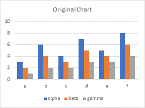
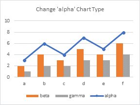
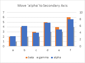
I was demonstrating how to save a chart template, so you can apply a lot of custom formatting to new charts. Maybe I should write a post about that sometime. But I noticed some strange behavior. I started with identical charts, then applied different custom formatting to them, then I assigned chart types from either built-in chart types or from custom chart templates. I noticed that the end result did not always look the same.
For example, I might start with a simple clustered column chart.

Then I might change one series to a line type.

Or I might assign one series to the secondary axis. The blue bars of ‘alpha’ are plotted in front, partially hiding the orange and gray bars of ‘beta’ and ‘gamma’.

What if I want to reverse these changes?
If I change the formatting (chart type or axis group) of the individual series that I initially changed, the chart reverts to its original appearance with no surprises.
If I go to Change Chart Type on the Chart Tools > Design tab, however, the resulting chart has its series plotted in a different order than the original.

It took me a long time and many sacrificial charts to figure out the behavior, but I think this is it. In the first case, when I changed series ‘alpha’ to a line chart series, Excel moved ‘alpha’ from first to last in the legend. This is because Excel draws areas first, then columns, then lines. In the second case, when I moved series ‘alpha’ to the secondary axis, Excel again moved ‘alpha’ from first to last in the legend. This is because Excel plots the primary axis series first, then the secondary axis series.
The final chart above still has ‘alpha’ last in the legend. So I think if you change one series at a time, Excel keeps track of each individual series. But when you change all series en masse, by applying a built-in chart type or a custom chart template, Excel applies formats to the series in order.
The order in which Excel applies formats is the legend series order, or rather, in the order the series are drawn, from back to front.
The order in which we might have expected Excel to apply formats is the plot order, or the order series are listed in the Select Data Source dialog.
I’ll say it again:
Formats are applied according to legend series order, not source data series order.
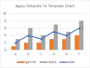
Here is a further illustration of this confusion. Start with the original chart, change series ‘alpha’ to a line, and save the chart as a template.

Now assign this template to the chart just used to define the template. You wouldn’t expect it to change the chart, but the result is changed.

Excel knows the first series (‘alpha’ in the template) is formatted as a line, so it took the first series in the legend of the chart it was changing (‘beta’) and made it the line series. The second series (‘beta’ in the template) is formatted as an orange bar, so the second series in the legend (‘gamma’) becomes an orange bar. Likewise with the gray bars.
This isn’t a big deal, but it is very confusing, and it explains why your series may appear in a different order than expected when you apply a chart template.


Jorge O-L says
I am presently dealing with this very problem, and I am grateful that you bring this up. It is very confusing indeed. Question: What determines the order of the Series in the Legend?
If the order used is the Legend order, how can it be controlled? Is it done by programmatically ‘relocating’ the series in the Series Collection? Or is the Series Collection also reordered according to Axes and Chart Type?
Jon Peltier says
The legend shows first the primary axis series, and second the secondary axis series. Within each of these axis groups, it shows first the area series, then the column series, then the lines, then the scatter series. However you try to switch things (and I’ve tried all kinds of ways), you cannot put series out of their axis order, or out of their chart type order.
There is some variation depending on whether the series are clustered or stacked, and whether the legend is displayed horizontally (top or bottom position) or vertically (left or right). It would take a PhD thesis to deconvolute all the possibilities, but if you have a specific case in mind, you could do some test charts and figure it out.
Shobi Imran says
Thanks for sharing! Keep up the kind sharing!
Jacob Cothran says
Hello,
Were you ever able to find a way to create a template that keeps the series name and chart type originally selected?
Jon Peltier says
Jacob –
I don’t use templates myself, other than when I’m showing them in a training session, so I haven’t bothered to follow up. If this is something that I need to do, I’m more likely to roll a bit of VBA to handle it.