Stacked column charts in Excel offer a feature called “Series Lines”. These are lines between the stacks, connecting the tops and bottoms of corresponding blocks in adjacent stacks.
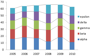
At first glance, these lines seem useful, because the lines will converge or diverge depending on changes in value of a series from stack to stack.
Unfortunately, the differences in slope is not really observable unless it is substantial. There are better ways to display this data.
The Data
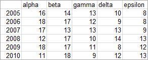
Here is the data used in this example.
Standard Charts
Let’s start with the simple stacked column chart below. We can readily see how the total varies from year to year: a steady increase from 2005 through 2008, a plateau between 2008 and 2009, and a drop in 2010. We can also judge variation in series “alpha”, because this series starts at the base of the chart.

Series “beta” is harder to judge, because its blocks are added to the staggered baseline formed by the tops of the alpha blocks, and the baseline is staggered further. Comparisons between points in different series is also made difficult by the lack of a single baseline for the bars.
We can add the series lines to connect endpoints of corresponding points. These lines may help judge changes in a series from year to year if the changes are large enough, but they don’t reset any staggered baseline to a straight line. They also do not help at all with comparisons of different series. In fact, the lines may guide your eyes away from the comparisons you are interested in.

Series lines add useless elements to the chart. This is the definition of chart junk.
Feeble Improvement Attempts
Let’s give the data a common baseline by unstacking the points. Now we’ll have an easier time comparing lengths of the bars, because the different lengths only move the tops, not the bottoms, of the bars.
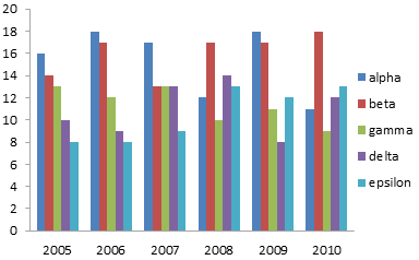
There is a problem with this display: it is too cluttered to read easily. We can easily compare the bars within a given year, but when we compare from year to year, the bars in between interfere with the comparison. This is especially problematic with the shorter bars.
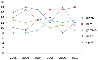
If we convert the bar chart to a line chart, we’ll remove the vertical rectangles of ink that interfere with our comparisons. Now there is a different problem. The overlapping of points makes it difficult to trace a series from left to right. Even the different colors don’t help a lot, and if you are looking at a photocopy, you’re lost.
A Better Approach
Well, we don’t need to overlap all of the data. We can plot each series in its own stretch of horizontal space, so each series occupies its own panel. Yes, it’s a panel chart, even if we don’t have lines between all of the panels. It’s also similar to a type of chart known as a cycle chart.
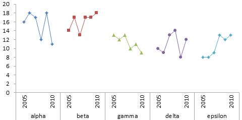
We can see immediately that gamma has an overall downward trend and epsilon a similar upward trend. This was not at all visible in the earlier charts. We can also clearly see that the general amplitudes of alpha and beta are similar, as are those of gamma, delta, and epsilon. We could have seen this in the stacked charts, if we’d squinted long and hard enough. That’s too much work; the panel chart is so much easier.
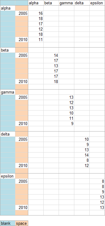
The panel chart is not too hard to create. It’s really a simple line chart. What’s complicated is the data layout, shown below. The data is spread out vertically so the blocks of data do not overlap. Each blue shaded cell is completely blank (not a formula returning a null string, but a completely empty cell). The tan shaded cells contain space characters.
The two blank cells in the top left tell Excel that the top row should be used for series names and the left two columns should be used for category axis labels. The blank cells between series names in the first column tell Excel to center the labels across the blank ranges. The space characters keep the year labels from moving out of place. I hid all but the first and last year labels, since these two were sufficient to describe the data.
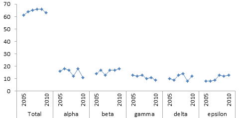
We actually don’t need different formatting for the different series, since they are separated in the chart. We can use a single column to define our data range (keeping the same category axis data, with its blank cells and space-containing cells).

The resulting chart shows our data as clearly as the previous one. Adhering to a single format makes the chart a bit cleaner.

Obviously this chart does not include the totals for each year. We could include them in this chart, but that has the undesirable effect of shrinking the individual series, reducing the resolution.
There’s a radical approach to showing both the individual series and the totals. It doesn’t involve mucking around with dual axes, which cause more confusion than anything else. It doesn’t involve any kind of tricks to force all the data into the same chart. What is the radical approach?
Two charts.
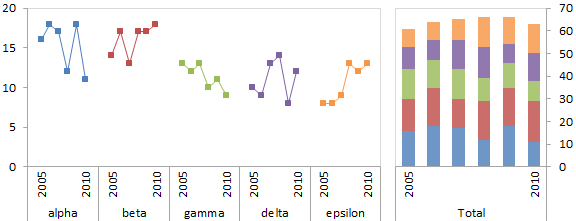
The first chart shows the individual values, in the panel style chart above. The second chart shows the total values, I used a stacked bar, but you could have used a line chart of the totals without its constituents. I’ve revived the colors for the line chart on the left, so the lines can serve as a legend for the colored blocks on the right.
What do you think of this approach?


Chad says
Jon,
Great post as usual. One thing I’ve sometimes done in this situation is to place two bar charts directly above each other, one with the stacked chart showing nominal values, the second (usually below), another 100% stacked chart, showing % of total.
What are your thoughts on this?
Chad
chipg says
I like it. Shows the trends and also distinguishes volume of each brand.
Sadly this is the kind of useful chart that, once presented in a draft to a client or internal person, I will inevitably be asked to go back and convert to something people are more used to seeing. Like, say, a stacked bar chart. “You could put those connectors so you can see the differences.”
Sad, but too common.
Jon Peltier says
Chad –
It’s good that you’ve discarded the notion that everything has to fit onto a single chart; that’s often harder to teach someone than how to make a different kind of chart.
Two stacked charts don’t give views that are particularly different from each other, and they certainly don’t provide for comparison of individual values the way the panel line chart does.
I doubt you need both stacked charts. One will be more important or useful than the other, so that’s the one to use. Then figure out which other chart would help most to display other aspects of the data.
Chip –
Been there. In my position, I can afford to push back, and I’ve even terminated projects where the client refused to listen. I’m sure most of my readers do not have this flexibility. You could try to point out that you were following advice of a (how to say this without being arrogant) “world-renowned Excel graphics expert” (oh hell, I’ll be arrogant!). Good luck.
Joe Mako says
How about this as another option:
http://public.tableausoftware.com/views/percentoftotalrunningsum/Dashboard
It is the same data, but a percent of total running sum, done with a quick table calculation in Tableau. I added an action so you can click on a colored line and still get its actual value.
Jon Peltier says
Hi Joe –
Took a moment, but I see what you did. It cleans up the line chart a bit.
Maybe I’m exposing my loss aversion, but the running average smooths over some of the data. You lose a sense of the variability of the data, and of the comparison of each year’s data (as opposed to the running average).
Too much detail clutters the chart, but making it cleaner hides the details.
Joe Mako says
Jon, I agree completely, you remind me of Shneiderman’s mantra: “Overview first, zoom and filter, then details-on-demand” when you say “Too much detail clutters the chart, but making it cleaner hides the details.”
Gregor says
Hi Jon,
You’re right that comparing slopes of lines is quite hard. What do you think about this modification?
Using fills instead of lines makes things a bit easier, but of course, you run into the same problems as with stacked area charts.
I like your combination of small multiple line charts and stacked bars, although you’ll end up in trouble if you don’t have just 5 categories to compare.
But now comes the biggest problem I have with series lines or even your line charts: if you’re looking at yearly stats you always deal with something like yearly sums or yearly averages. Those are per definition discrete variables and you just can’t interpolate values in between them. Thus, every chart that implies a continuous change between discrete values is kind of wrong.
Jon Peltier says
Gregor –
Thanks for your thoughtful comment. I’ve inserted your chart into your comment. For some reason my WordPress settings discards any image links entered through the comment dialog.
The area fills don’t seem to improve the ability to detect converging or diverging series lines. I also get a funny effect, that the different shading and inclined edges of these fills make the chart seem somewhat 3-dimensional. Distracting.
Sure, the chart with area fills might look more appealing because of the added color, this comes with the cost of adding more extraneous chart elements. I think we’re better without them.
Regarding the discrete annual values… I agree that this is always a possible issue. However, placing a marker above every year at a precise value, and connecting the markers, is a strong indicator that data exists where there is a marker and the lines help to show which markers go together and how their values change over time. Joe’s chart (see link to Tableau in his comment above) had no markers, so I’d expect this problem to be more pronounced in his chart.
Regarding the case where there are too many categories, I have a follow-up post in mind. Maybe that will be ready Monday.
Peter Bartholomew says
Hi Jon
I think the line chart could be also improved slightly by converting it to a scatter chart. Thin but smooth curves between the markers are easier for the eye to track than ‘zigzags’. I also found that dotting or chaining some of the curves that intersect with common values (=13) in 2007 helps more than color. The shape of individual curves is still clearer from separate charts but you lose the pointwise comparison.
It is interesting that smoothing is not available for line charts – perhaps it is a non-approved style for the business world.
Jeff Weir says
I think the panel chart is great, but it’s a pain to set up the data in the way you’ve shown above. So I’d use 5 charts side by side. Do the first chart using the series with the largest values, set the min and max axis settings to manual, background transparent, then copy 4 times, and simply click on each subsequent chart one by one and amend where it points to with a quick drag.
Jon Peltier says
Peter –
I don’t like using smoothed lines (which are in fact available in line charts, not among the chart type options, but in the format series dialog). I think they’re somewhat dishonest. The algorithm that draws the curved lines can make the curve extend outside the bounds of the data, which to me is inventing spurious data. Even if it stays within the data, a curve could hint at a formulaic relationship, while a straight line is sufficient to connect related points without implying such a relationship.
Good point about dashed lines. I will use them sometimes to help distinguish series in close proximity, but not if I can avoid them.
Jeff –
That works too, as long as the data doesn’t change and require different axis limits.
Peter Bartholomew says
@Jeff
The drawing tools align and distribute operations can be useful placing the chart objects.
@Jon
Clearly in my line of work I was far more used to continuous functions, where the curve represents an interpolation between calculated points. I did give some thought as to the significance of lines on a category chart where any values implied between categories have no meaning. My conclusion was that they serve merely to guide the eye from one point to the next and I judged the options simply on that basis.
I did observe that for a continuous function I minimise or omit the markers whereas for a chart against discrete categories I emphasis the markers and reduce the visual impact of the intervening lines.
One further observation is that, if one is forced to show a sum on the same chart using a secondary axis, the scaling that works best is one that places the summation curve at the average value of the other legend category curves (if read off against the primary rather than secondary value axis).
Jon Peltier says
Peter –
There is a difference between plotting a continuous function that has a theoretical or empirical bases, and plotting observations which may or may not follow a function. If you are plotting the former, you don’t need markers, and you are best served by calculating your points very close together, so the function, and not Excel’s smoothing algorithm, draws the curve. If you are plotting measured data, use a marker for each observation, so the viewer knows where the data is, with thin lines connecting adjacent observations (not the crayon-thick lines that Excel 2007+ defaults to).
Rather than using a secondary axis, it’s probably less confusing to simply plot the average instead of the sum.
Peter Bartholomew says
Jon
Have you removed some charts from this page? I seem to remember some nested bar charts.
You commented that, if I were going to scale a ‘totals’ curve to align it with the average of the individual curves, why not plot the average and have done with it.
I have just realised that the same applies to bar charts. A ‘master’ chart showing averages across one category can be aligned with a panel of charts showing the breakdown of each bar with respect to the second category. Because bar charts tend to obscure one an other I used a moderately heavy outlines but no fill for the ‘master’ series.
The resulting presentation did seem to provide some information value running across the individual charts in the panel.
I have attempted to post the workbook under your name on a shared skydrive folder.
https://skydrive.live.com/#!/?cid=59A816B11701AEAC&id=59A816B11701AEAC%21104
Jon Peltier says
Peter –
There weren’t any “nested bar charts” on this page, but I’ve discussed it in other articles, including:
Marimekko Replacement – Overlapping Bars (Easy)
Marimekko Replacement – Overlapping Bars (Hard)
The nested bar approach can be an effective way to show how values compare to an average or to a target.
Peter Bartholomew says
Hi Jon
Sorry to waste your time with a worksheet that doesn’t display properly. I thought
[wrongly] is was posible for you to download from a shared folder. I have placed a pdf of the worksheet in the same folder.
My comments are, as you suggest, more relevant to the Marimekko Replacement articles. I am not yet familiar with the content of your site.
Jon Peltier says
Peter –
The file didn’t display properly in the browser, but it downloaded just fine.