The Problem
A member of the MrExcel forum wanted to know about using form controls to select columns from a data table to populate a graph. Essentially he wanted his users to be able to choose between two charts, one comparing their scores to district and regional scores, the other comparing their scores to the top 20%. This is a retelling of my suggested approach to his question.
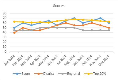
Here is some dummy data I used for his problem, and a chart showing all of the data.

My suggested approach will add some columns (F:I) to the existing data range with formulas that show or don’t show data based on which of two option buttons is selected, and my chart will use all of this data. When the formulas don’t show the values, they will not appear in the chart.
The Data
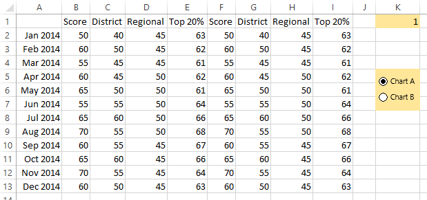
The extended data range is shown below. At first the formula in cell F2 (and copied into the entire range F2:I13) is simply
=B2To give the user a choice, add two option buttons and label them Chart A and Chart B. Right click on one of them (doesn’t matter which) and select Format Control, and on the Control tab, click in the Cell Link box, and select cell K1. This cell shows which of the buttons is selected, 1 or 2.
You don’t need to show all of this to the user. You could put the chart and option buttons on the active sheet, and all of the data (and the option button linked cell) can go onto another sheet, and you can hide this other sheet if you want. Or you can place the original data on the same sheet as the chart and option buttons, and the formulas onto another sheet, a hidden sheet if desired. You could replace the two option buttons with one listbox that shows both options; the linked cell works the same way.
The Chart
Set up the chart first, before adjusting the formulas to show the result of the option button selection.
Select A1:A13, then hold Ctrl while selecting F1:I13, and insert a line chart.
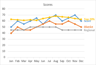
Delete the legend, because it will always show all series, even if some don’t appear because of the formulas. Instead, label the last point in each series with the series name, and use label text that matches each series color. This is more user-friendly than using a legend, anyway. (I also shortened the axis tick labels so they could all be displayed horizontally.)
The Formulas
Now adjust the formulas. Keep the formulas in column F the way they are, since this series appears whichever option is selected. The formula in G2 (copied into G2:H13) is
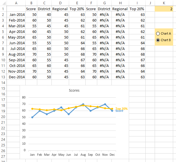
=IF($K$1=1,C2,NA())This means if the first option button is selected, show the corresponding value, otherwise show #N/A. #N/A isn’t plotted in a line or scatter plot.
Similarly the formula in I2 (and filled into I2:I13) is
=IF($K$1=2,E2,NA())That is, if the second option button is selected, show the value, otherwise show #N/A.
The Finished Product
Here is the data and chart if the Chart A option button is selected:
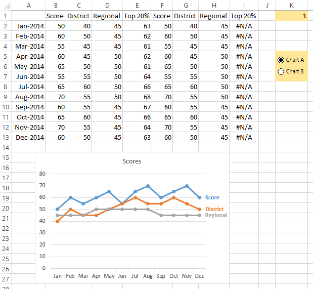
Here is the data and chart if the Chart B option button is selected:
You can download a sample workbook by clicking on this link: MrExcelOptionButtonChart.xlsx.


Andreas Schuderer says
I can attest that this works well.
The NA-unless-relevant trick also works nicely to simulate mixed layout in the same series by overlaying different selections of the same data. For example, if the series have different lengths, and you still want the last point labelled, you add a “label” column which is NA() except for the last point in this data series. Then, format this “label” series to not have lines or markers, only labels. You’ll get the last point dynamically labelled, without any need for VBA.
I use the same trick frequently to show an “end dot” for the current value (neutral color for normal, accent color for warning — as described for sparklines). I usually don’t use dots for intermediate values in line charts, so this end dot adds significance to the most recent value (you can also use this to stress several values with particular significance (top/bottom three quarters, what have you).
Additionally, I often choose to use the value as a label (not the series name). This way, I can give a custom label to the “end dot” which can state the current value, if needed (e.g. ‘0% “Returns”‘).
For cases when the choices are mutually exclusive, using OFFSET removes the need of adding the NA()-helper columns.
Jon Peltier says
Andreas –
I’ve used the NA-Unless-Relevant trick (nice wording!) in many more ways than I could ever write about, even if I could keep to a weekly blogging schedule.
Bob says
I agree NA-Unless-Relevant is a great turn of phrase.
Bob
Excel Leon says
I agree as well ;)
TedWed says
I’ve used the NA-Unless-Relevant trick (nice wording!) in many more ways than I could ever write about, even if I could keep to a weekly blogging schedule.
Charlene says
This is fantastic!
Is the same thing possible with check boxes? I have a data set with 10 series which makes for a very messy graph… I would like to make it so the user can chose which series are displayed but at times we may want to look at different combinations of series… I will try to work this out myself now, hopefully I can – but Thank you for posting this!!
Cheers!
Jon Peltier says
Charlene –
The same approach works with checkboxes. See:
Interactive Charts with Checkboxes and Formulas
Interactive Charting by Combo Box or Checkbox
Master It says
Nice tips, thanks for sharing Jon!
pratibha says
Hi,
I want to know, when I select a cell the focus should redirect me on another sheet. Which has relevant data. Is it possible in excel?
Jon Peltier says
You could write some VBA that responds to selecting a cell, but if the related ranges are linked by formulas, it might be more efficient and more flexible to learn to use
Trace PrecedentsandTrace Dependentson the Formulas tab of the ribbon.Michelle Clancy says
I’ve gotten as far as the “NA if irrelevant” step, but all the data is still showing in my chart. Help?
Jon Peltier says
Michelle –
The original chart plotted columns A through E. Your chart should use the data in columns A and F through I, which includes the columns that disappear when the formulas change from values to #N/A.
Check out the sample file to see how I did it (MrExcelOptionButtonChart.xlsx).
Michelle says
Thanks for the quick reply – yes, it only includes the columns with relevant data. I ended up solving it in a bit more complicated way with named ranges and offsets.