Risk Matrix Charts
A risk matrix is a graphical way to analyze risks and benefits of a company’s potential actions. The actions might be a company’s decision about which market to enter or which other company to acquire. When I was working in corporate R&D, we used a risk matrix to decide which projects to allocate our resources on. Risk is usually placed on the horizontal axis, and is a measure of the cost of an acquisition or the estimated probability of success of a venture or project. Benefit is usually plotted on the vertical axis, and is a measure of success, such as anticipated revenues or cost savings.
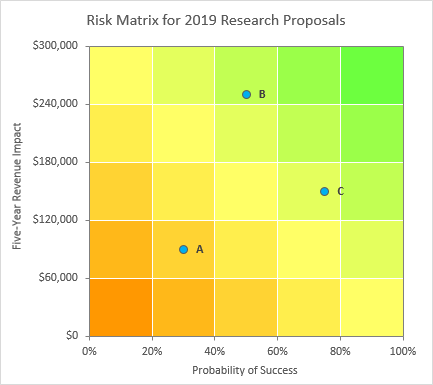
The green and orange background reminds the viewer that the preferred options are in the top right of the chart. If the axes have the opposite preferred direction, for example, if the horizontal axes indicated cost of acquisition, then the grid could be produced with green in the top left corner and orange in the bottom right.
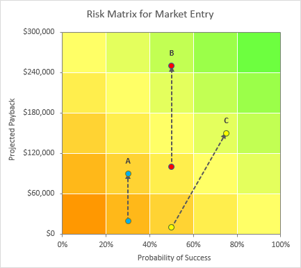
Sometimes pairs of points will be used, to show the risk-benefit analysis before and after certain mitigation steps are taken, with an arrow connecting the points to show the direction of the mitigation.
Data and Components of Risk Matrix Charts
The charts are not as complicated as they seem. The background is a stacked column chart on the primary axis using data like that shown below. The stacked columns are colored appropriately, and the gaps between them are eliminated.
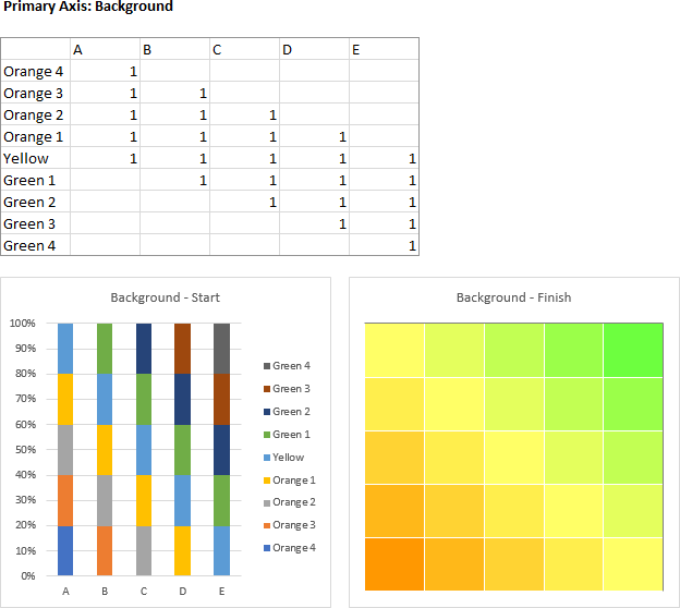
You can use as large a grid as you like. We used to use a 3×3 grid, but 5×5 is also common.
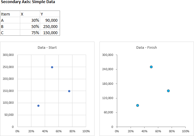
The foreground is a simple scatter chart on the secondary axis with simple data and formatting.
For the paired data, a secondary axis scatter chart is also used, with arrow formatting of the connecting lines. Each pair of points has a separate data set.
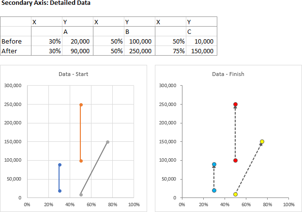
I’ll show you how to construct this background and superimpose the foreground data.
This is a common request, so I’m considering risk matrix charts as an addition to Peltier Tech Charts for Excel.
Constructing the Risk Matrix Background
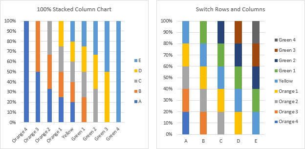
The first step in construction of the risk matrix is to select the column chart data (see image in above section) and create a stacked column chart (below left). Since there are more rows than columns, Excel plots by column, which means the columns aren’t stacked how we want. Fix this by clicking the Switch Row/Column button on the Chart Tools > Design tab of Excel’s ribbon (below right).
Format the stacked column series appropriately. I’ve used a set of fill colors described below the charts, with a thin white border (below left). Next, delete the legend (below right).
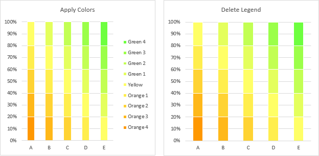
I made up my own green-yellow-orange color scheme, listed below.
Green 4: RGB(109,255,63)
Green 3: RGB(155,255,73)
Green 2: RGB(194,255,83)
Green 1: RGB(228,255,93)
Yellow: RGB(255,255,102)
Orange 1: RGB(255,238,77)
Orange 2: RGB(255,211,51)
Orange 3: RGB(255,184,25)
Orange 4: RGB(255,152,1)
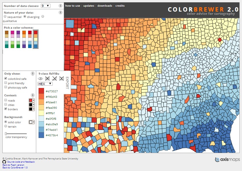
You should also investigate the diverging map colors designed by Cynthia Brewer, found at Color Brewer.
Next I formatted both axes so the crossing axis crosses at the maximum value or category (below left). Then I formatted both axes so the line color is 50% gray. You could probably get away with a lighter shade of gray.
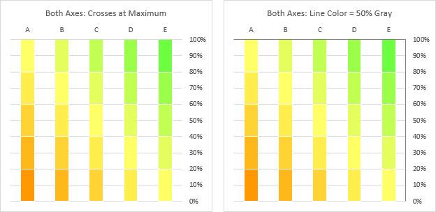
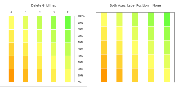
Then I deleted the horizontal gridlines (below left), and I hid the axis tick labels by setting the label position to None (below right).
Finally I set the gap width of the column chart series to 0% (below).
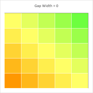
The risk matrix background is now ready to accept data.
Add Simple Risk Matrix Data
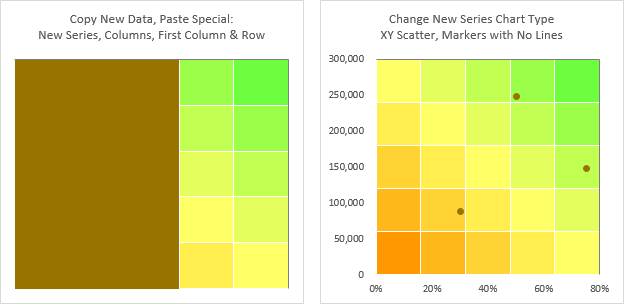
Starting with the finished background matrix above, copy the X-Y data for the secondary axis points, select the chart, and use Paste Special from the Paste dropdown on Excel’s Home tab, to add the data as a New Series, with Series in Columns, and with Categories in First Column and Series Names in First Row (below left).
This obliterates much of the chart, but that’s only temporary. Excel added the new series another set of stacked columns: right-click on the new series and choose Change Series Chart Type from the pop-up menu, and select XY Scatter. Excel automatically places the series on the secondary axis, and puts the two secondary axes on the bottom and left of the chart, since we’ve moved the primary axes to the top and right edges where secondary axes normally reside (below right).
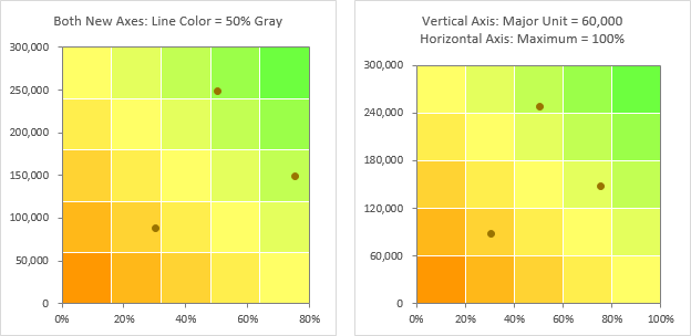
Format both secondary axes to use 50% gray for line color (below left). Adjust the axis scales of these axes so the tick marks align nicely with the color grid: use 60,000 as the vertical axis major unit and 100% as the horizontal axis maximum (below right).
Finally apply a little formatting to the markers. I enlarged the markers to 7 pts, added a dark gray outline, and applied a blue fill (below).
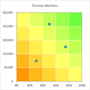
You should add titles to the secondary axes and data labels to the points, as I did in the sample risk matrix charts at the beginning of this article.
Add Paired Risk Matrix Data, Connected by Arrows
Adding the more detailed paired data is much the same as adding simple data.
Starting with the finished background matrix above, copy the X-Y data for the first set of secondary axis points. Then select the risk matrix, and use Paste Special from the Paste dropdown on Excel’s Home tab, to add the data as a New Series, with Series in Columns, Categories in First Column, and Series Names in First Row (below left).
This obscures much of the chart, but we can fix that. Right-click on the new series and choose Change Series Chart Type from the pop-up menu, and select XY Scatter. Excel places the series on the secondary axis, and puts the two secondary axes on the bottom and left of the chart (below right).
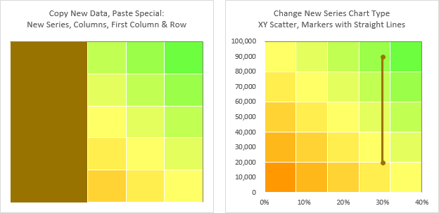
Repeat the Copy-Paste Special sequence with the additional sets of risk matrix data (below left). Format both secondary axes to use 50% gray for line color (below right).
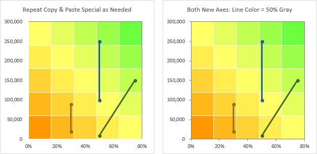
Adjust the axis scales of these axes so the tick marks align nicely with the color grid: use 60,000 as the vertical axis major unit and 100% as the horizontal axis maximum (below left).
Now format the risk matrix scatter chart series. Enlarge the markers to 7 pts, add a dark gray outline, and apply suitable color fills. Format the connecting lines to use a dashed dark gray line of suitable thickness (I used 1.5 pts), and apply an arrowhead to the end of the lines (below right).
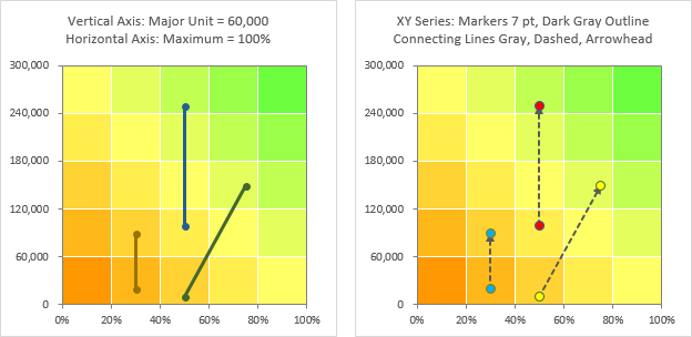
Finally, label your axes and data points to clarify the meaning of the chart.


Livio says
Hi Jon, thanks for the tutorial, this chart type will come in handy.
For the background, my alternative was a stacked area built with this table:
Jon Peltier says
Hi Livio –
I often will use a stacked area chart instead of stacked columns, which allows for unequal widths of the columns (shown below). But it’s harder to set up and maintain.
Nick Charalambous says
I need to create the unequal widths using a stacked area, but not having much luck. I would appreciate some tips / instructions.
Jon Peltier says
Hi Nick –
Have you followed the instructions in my tutorial Variable Width Column Charts (Cascade Charts)?
Nick Charalambous says
Thanks – a lot more difficult than I had thought. Almost there though. The only element I am struggling with is the labelling on the X-Axis as you have in the graph above. I tried the addin your recommended but cannot make it work i.e. the 10% increment are not evenly spaced.
Nick Charalambous says
Did it in a round about way, by having a Major Axis of 10 day increments…but it is not a true percentage
Jon Peltier says
Nick –
You have to fudge the axis. The date scale for an area chart cannot have increments less than one day.
I usually use a scale of 0 to 1000, with a number format of 0,%. The comma shows units of thousands, so the maximum of 1000 is 100000%, but is displayed as 100% (dropping three zeros).
Nicolas Turrin says
Thanks for the tips!
I have 94 data points to add and would like to add “bubbles” showing the count of items falling at each data pair (I have a 10×10 with, let’s say, 10 values at (1,2) 3 values at (1,3), etc.). Is that possible?
Jon Peltier says
Nicolas –
On the Mr Excel forum, I answered this question: (a href=”https://www.mrexcel.com/forum/excel-questions/1109538-scatter-plot-x-y-coordinate-number-occurrences.html” title=”Scatter Plot X,Y Coordinate Number of Occurrences”>Scatter Plot X,Y Coordinate Number of Occurrences, which shows the formulas to count items in each grid box. You can’t combine a bubble chart with another chart type, but you can add all the XY Scatter points you need, and with a little VBA magic (or a lot of manual tedium) you can change the sizes of the points to reflect the number of items you’ve counted.