You can easily make a repeated Gantt chart in Excel to track such things as an ice hockey player’s time on and off the ice. This chart compares the ice times of two rival players:

Gantt Charts
I recently rewrote my tutorial on Gantt Charts in Microsoft Excel, and I’ve written several times about repeated Gantt charts: Gantt Chart for Repeated Tasks, Easier Gantt Chart for Repeated Tasks, and Gantt Chart with Repeated Tasks via Excel XY Chart.
Blog visitor Jesse read the Gantt chart tutorial, and asked,
I have a question … I want to graph two hockey players … from two opposing teams that faced each other in a game. The goal is to chart their start times and duration, and they go on the ice in shifts.
So, for example, player 1 during his first shift, enters the ice at :55 (which means 55 seconds have elapsed in the game) and stays on for 1:26 (a minute and 26 seconds) …
I thought, sure, I can just post a link to those ancient repeated Gantt articles (this tutorial is very closely related to Easier Gantt Chart for Repeated Tasks), or I could get some data and create a real-world example. So here we are.
Hockey Shift Data
Apparently you can get this kind of data from the web site of the National Hockey League. This means you can use Power Query to get the data from the NHL, then clean it up. Jesse supplied me with a file containing data arranged like this:

I might have tried to clean up the data more in Power Query, and maybe I’ll do just that and write another tutorial at a future time. But it’s not too hard to clean it up in Excel. First, all of the data is in text format, not numerical. Second, for the Start of Shift and End of Shift columns, there are two times in each cell: time elapsed in the period, and time remaining in the period, separated by a slash. Third, the times are for each period, and I wanted total time in the whole game, so period 1 goes from 0:00 to 20:00, period 2 from 20:00 to 40:00, and period 3 from 40:00 to 60:00. Finally, I want to make sure the times are in minutes and seconds, not the hours and minutes Excel would assume if it saw, for example, 12:34.
Here is the data with a couple columns added.
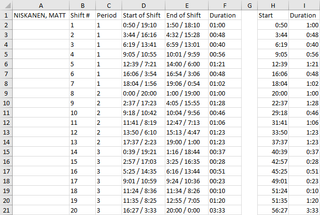
The formula in cell H2 is
=TIMEVALUE("0:"&LEFT(D2,FIND(" ",D2)-1))+((C2-1)*20/60/24)
LEFT extracts 0:50 from 0:50 / 19:10 in cell D2, "0:"& converts 0:50 to 0:0:50, so Excel will produce the output in minutes and seconds, and (C2-1)*20/60/24 adds 20 and 40 minutes for the second and third periods.
The formula in cell I2 is
=TIMEVALUE("0:"&F2)
which inserts the blank hour so our elapsed time is in minutes and seconds.
We’re almost ready to go.
Gantt Chart of Ice Time
To give myself a category variable, I inserted the shift numbers from column B into the blank column G, as numbers.

Then following the procedure for creating a Gantt chart, I selected the blue shaded range and inserted a stacked bar chart. Note: don’t do this yet; I’m explaining why it won’t quite work like this.
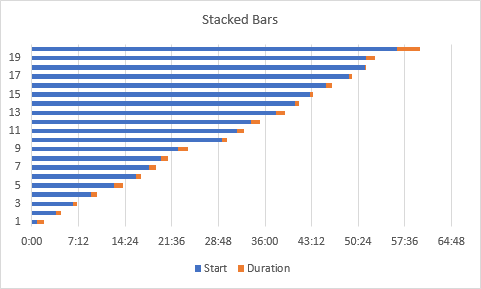
I formatted both axes, reversing the vertical axis and using friendlier parameters for the times on the horizontal axis.
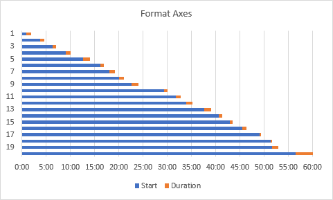
Finally, I hid the “Start” series by formatting those bars to have no fill.
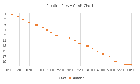
This is a Gantt chart of player time, but it shows each shift on its own level of the chart. It would be a better chart if we could plot a repeated Gantt chart, with all of a player’s shifts on one horizontal level.
Category Axis Tricks We Can Exploit
The vertical axis in a bar chart is a category axis, and it behaves like the horizontal category axis in a line or column chart. I’ll show the interesting behavior in line and column charts, because it’s easier, then extend it to bar charts. Then we’ll make out repeating Gantt chart, I promise.
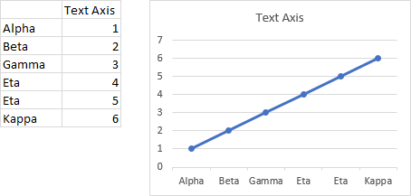
If I just use simple labels for my X values, my chart will have a Text Axis. Excel uses the X values as separate labels in a line chart. Excel doesn’t sort the labels (alphabetically, Gamme should come after Eta, at least in English). Excel doesn’t care about gaps (Delta, Epsilon, and Zeta come between Gamma and Eta in the Greek alphabet and in a custom list I’ve built for my use in Excel: see Built In and Custom Lists in Excel). And Excel doesn’t care about duplicate labels (Eta Eta).
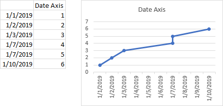
If Excel recognizes the X values as dates, the chart will have a Date Axis. Excel uses the X values as dates, and it treats these dates semi-numerically. The dates are internally sorted prior to plotting (not illustrated here, but see Plot Two Time Series With Different Dates). Points with larger spaces between dates are plotted further apart (one day between 1/2/2019 and 1/3/2019 vs. four days between 1/3/2019 and 1/7/2019). And duplicate times are plotted at the same date (two points for 1/7/2019). Excel ignores times on a Date Axis: all points from 12:01 am to 11:59 pm on a given date are plotted at the integral value of that date.
If your X values contain regular numbers, Excel just treats them as non-numeric labels in a line chart, just like the text examples two charts ago. Different gaps between numbers are plotted with the same spacing, and duplicates are treated as separate entries.
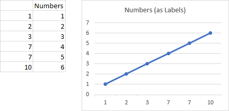
However, we can format the axis, and tell Excel to use a Date Axis. Now the chart shows that 3 and 7 are further apart than 2 and 3, and it shows multiple data points for X=7.

We’re going to make use of that behavior of plotting multiple data points for the same X value at the same axis position.
Here is the data for the ice time Gantt chart I made earlier. I’ve plotted it as a stacked column chart. My X values are the shift numbers from 1 to 10.

I’ve turned the chart into a floating bar chart by hiding the “Start” series (no fill).

Here I’ve replaced the shift numbers with player number, which is 1 if I’m plotting one player’s shifts. Now instead of 1 to 10, I see ten 1’s along the X axis.
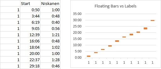
When I format the axis as a Date Axis, all the floating bars line up horizontally.

That’s the trick, we’ll use player numbers and a Date Axis to align the floating bars vertically.
Repeated Gantt Chart of Ice Time
Final Data Setup
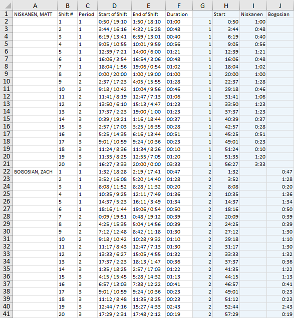
Here is my updated data range, with shift data for two players. I have replaced shift number with player number in column G, my shift start times are in column H, shift durations for player 1 are in column I, and shift durations for player 2 are in column J. I could have kept both players’ durations in column I and the chart would be essentially the same, except the floating bars for both players would be in one series and thus formatted the same. For columns H:J, use a number format of [m]:ss; the square brackets tell Excel to keep incrementing minutes and ignore hours, so that 60 minutes (the end of the game) is displayed as 60:00 instead of 1:00:00.
Create the Chart
Start by selecting the blue shaded range, and inserting a stacked bar chart. I’ve already changed the colors in this chart, with “Start” in gray, “Niskanen” in red, the color of the Washington Capitals, and “Bogosian” in Blue, for the Buffalo Sabres.
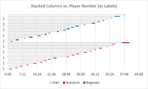
Next, hide the “Start” series by changing its fill color to none, to make a floating bar chart.

Format the vertical axis so categories are plotted in reverse order, and so the (horizontal) axis crosses at the maximum category.
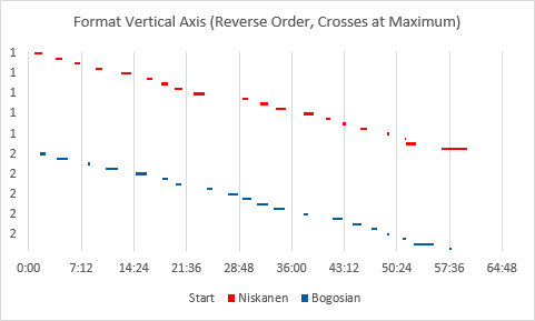
Change the vertical axis style from Automatic (Text Axis by default) to Date Axis.
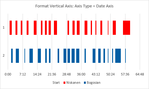
Shrink the height of the chart (this one changed from 3″ to 1.5″), and format one of the series of bars to reduce the gap width to zero.

Hide the vertical axis labels (don’t delete the axis, in case you need to reformat it later).

Format the horizontal axis scale. Unfortunately it’s not as easy to do as it should be. It would be nice to be able to enter 60:00 for the axis maximum and 5:00 for the major unit, but Excel makes you enter their decimal equivalents. The 60-minute axis maximum should be set to 0.041666667 (60 minutes is 1/24 of a day), and the 5-minute major unit should be set to 0.003472222 (5 minutes is 5/60 of an hour or 5/60 of 1/24 of a day).

Move the legend to the right of the chart.

Click on the legend, then click on the “Start” legend entry, then press delete to remove it. Then align the center of the legend with the center of the plot area.

You can align the legend manually, or if you have Peltier Tech Charts for Excel, you can right click on the legend, and use the buttons on the context menu that pops up.

Finally, expand the plot area.

Repeated Gantt Chart
The result is our repeated Gantt chart for tracking player ice times and shift changes.

This approach can be used to chart numerous on/off situations. Hockey player ice times, ambulance crew waiting vs. on-call, factory or plant operating vs. standing by, even your child’s sleeping/waking cycles.


KeithC says
Sweet; should have posted the day after you first posted this; very helpful and I’ve linked the charts to my hockey stats package via PQ to feed ad-hoc comps. Also added a few drop downs for PP,PK and ES situations. Great work, eh!
Matias says
Wow, really nice job!
I’m trying to do something similar but I still can’t find the way, maybe you know and could help me?
Let’s say I want to compare the playtime pattern for a same player in several matches. Is there a way to organize the chart in a way in which you have something such as “Net time since start of match” in the X Axes, three categories in the Y Axes (one for each period), and for each period, one bar for each match played?
What I want to do is compare two (or more) regular gantt charts with the same categories, but from different moments, for the same player (in this case).
It would be really helpful to hear some comments or tips to get this around.
Thank you very much!
Bob Pieciak says
What about multiple repeated tasks on the same chart? Or to use your current version, Player 1, Player 2, and Player #3 alternate ice time. I want to know which one was on the ice when.
So #1 started at 1:13 with duration 20
then #2 starts at 1:33 with duration 5
then #1 starts at 1:38 with duration 8
then #3 starts at 1:46 with duration 10
There is no particular pattern to when the different players get ice time. Just that there are no overlaps.
Jon Peltier says
Hi Bob –
Not a big deal. In the table below I show fabricated ice times for three left wingers from the 1971-72 Boston Bruins. There are three (not two) columns of durations (I:K) and the values in column G are 1, 2, and 3 for Cashman, Bucyk, and Marcotte.
Here are two variations. The top chart shows the three players’ times in separate lanes across the chart. If there are no overlaps, I can change all of the values in G to 1, and get the players’ times in a single lane (bottom chart). The colors are a bit harsh in the bottom chart; I’ve lightened them slightly, but really they need more help.
Bob Pieciak says
Jon,
You are nothing short of a miracle worker. I have posed that question to every blog and video producer that has anything even close. You are the first person to pose a solution.
Now I have to figure out how it’s done.
Thank you so very much!