While in line at the bank last week, I picked up a copy of the Worcester MA Telegram and Gazette, and stuck in the middle of the front section I saw a chart showing how much a family of four would have to pay for health care for the three health reform plans under debate. I had to reproduce it from memory: it wasn’t my paper, and I can’t find an online version. The chart was a bubble chart that looked much like this:

Okay, as you move left to right, the bubbles get larger. The bubbles in the top row are larger than the rest, but except for the first bubble in the second row, the bubbles don’t change much from row to row. If not for the numerical labels, we wouldn’t notice any difference at all.
Apparently bubble area, not diameter, encodes the values; if diameters controlled size, the leftmost bubbles would practically disappear. On closer inspection, I noticed that the top row of bubbles, Income, obviously uses a different scale than the others.
Given our difficulty in judging bubble areas (or diameters), and given the unannounced scale change between Income and Family Contribution, the data may as well have been presented in a table. It has the same grid and numbers, but is smaller and lacks those distracting circles.

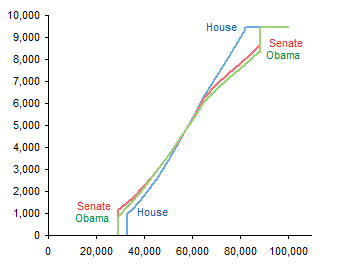
However, you can make much sense of the data if you make a simple line chart. Now you can see the similarities and differences in the three plans.

But I thought this was a bit simplistic, a bit incomplete. I spent ten or fifteen minutes at the Kaiser Family Foundation Health Reform Subsidy Calculator and filled out the data. When you’re making a bubble chart, you don’t need many data points, in fact, you can’t accommodate many data points. But a line chart can represent a continuum of data points.

In this chart it becomes clear that the plans are similar in the middle of the income range, but differ at the ends, not only in the costs, but also in the income levels where the plans kick in at the low end and where the plans reach maximum contribution at the high end.
If we superimpose the data from the bubble chart onto the line chart, we see that the bubble data actually shows a smaller difference between the plans at the high end than we can see in the line chart.

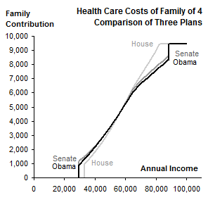
Nice chart and all, but I’ve neglected some details. There are no titles in the chart, so someone reading the newspaper would actually have to read the article to get the story. Also, except for USA Today, most newspapers are limited to black and white graphics. And the charts I’ve made are rather large for their data content (though smaller than the original bubble chart).
So how can we make this chart more suitable for a newspaper? Shrink it, add titles, and convert the colors to black and two shades of gray.

You could use dashed or dotted lines as well. Excel up to 2003 does poorly with thicker dashed or dotted chart lines, but Excel 2007 renders these features nicely.


Jeff Weir says
Great food for thought, as usual. But I’m going to play devil’s advocate, as usual.
Where you say ” Given our difficulty in judging bubble areas (or diameters), and given the unannounced scale change between Income and Family Contribution, the data may as well have been presented in a table” I’m going to (respectully-ish) disagree, Tufte be damned.
It may be the bottle of beer and 2 glasses of wine I’ve just had with dinner…it may be my failing eyesight combined with a inherent distrust of small fonts…it may be lessons learned from the last thrilling instalment of Chartbusters…it may be that I’m just plain argumentative. Whatever it is, I just don’t think that a boring ‘ol table does as good a job as making the data come alive as a bubble chart…notwithstanding the difficulty in judging bubble areas (or diameters) and/or the slap over the wrist with a copy of their weighty tomes that that Tufte, Few et al would dish out if they were here as I type this.
Granted, the scale changes. But is this any more a problem than the fact that in my moments of madness I occasionally use a line graph with 2 scales? Or worse than putting one graph with one scale (say unemployment over time) right above a second graph with another scale (say GDP growth) so that I can see how one might relate to the other?
Granted, we have difficulty in judging bubble areas (or diameters). But then, don’t we have more trouble converting something abstract – i.e. numbers – into something meaningful – i.e. comparisons? I don’t think the table is smaller and lacks those distracting circles. I think the table is larger, and has additional visual help.
So that’s my tables fable. Now for my line line. Can people make much more sense of the data with a simple line chart? I’m not sure. I don’t think the line chart in this case is simple. I think the line chart requires quite a lot of mental processing, because the lines are so close, there’s no clear winner, and it’s hard to tell which is which even in color.
I don’t know whether the intended audience will get a continuum of data points.

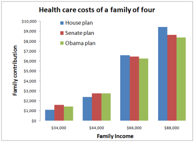
I’m pretty sure they would get a bar chart, comparing just a few data points. Here’s an example:
Here it is again, with data labels:

Same again, with rotated data labels:

Here it is, pimped up a bit to try and entice someone to pick up the publication it’s published in to kill time while standing in line at a bank:

And here it is, pimped up a bit to try and entice someone to write a chartbusters post on it:

Jon Peltier says
Jeff –
Thanks for the alternative approaches. A bar chart may actually be very effective. My scientific background interacted with the continuous nature of the independent variable, leading to the line chart approach.
Channeling Fox News on that last example, eh, or was that the dinnertime libation? Should have scaled the pie sizes with income.
Jeff Weir says
Damn, you’re right. Why didn’t I think of scaling the pie charts? Mind you, with that suggestion, it almost seems like you’d decideded to join ’em, cause you couldn’t beat ’em.
greg says
John,
Nice job with your charts. As I read the comment and example from Jeff (nice job!) I felt that Jeff’s approach simply brought me information. Nothing more. Your chart showed the inflection occurring at 66k for the senate and executive bill but not for the house bill. Also from your chart the house bill showed that the cost at the lower income levels was lower from 34k to 44k. I can see how the payment burden changes based on salary level.
From your type of presentation I could look up my salary and predict my payment. However, Jeff’s presentation was appropriate for the data and the only way your presentation of the data would be appropriate (and would truly allow me to lookup my salary and potential cost) is if the 34k, 44k, 66k and 88k were the exact dollar amounts for each three bills where the payment/income formula changes. If the break point for the formula change was at 50k, then drawing a line between 44k and 66k misrepresents the data.
And Jeff, with your last couple of bar charts, do you even need the y-axis anymore?
Jeff Weir says
Greg: you’re right. Must have been that 2nd glass of vino blocking my Tufte neural pathways!
DaleW says
Sometimes charts hide more than they show. We’d all probably agree that it’s not enough to make good charts, one also must chart the right things. Well, any of these charts* encourage the illusion that average family of four health care costs will be reduced to circa $5K by these reforms.
TANSTAAFL.
The bigger story here is the unplotted subsidy. These reform plans all mandate comparably massive subsidies to shift health care costs over to taxpayers in the future. The US allegedly has the most overpriced health care system in the world now, and such subsidies would ensure fuller participation by more Americans in this overpriced system at future taxpayer expense, with no incentives for individuals to hold down costs. It’s one thing to plan a better social safety net, or even to face the tough rationing decisions that sustainable socialized medicine requires, but another to try to socialize runaway expenses by sleigh of hand so somebody else pays later.
The alarming Greek budget deficit was running at 13% of GDP. In the US, ours currently adds “only” about 10% of our GDP onto our public debt each year. Greece passed an austerity budget, at least. The US Congress seems still focused on additional spending plans. Taxes don’t come close to covering US government spending now or in the foreseeable future after the economy improves. Not even Uncle Sam can charge things forever without catching up on the tab.
*Except for Jeff’s pie charts: more than usual, these pie charts are just wrong.
Jeff Weir says
TANSTAAFL?
Very good commentry, Dale…critiquing how data could be better presented is one thing, critiquing what data should be presented is another.
Glad you hated the pie charts!
DaleW says
Jeff,
Visionary sf author Robert Heinlein helped popularize TANSTAAFL. Nowadays, economists may be more likely to use the acronym NFL.
Entitlement programs are subject to this No Free Lunch principle, as they may have huge direct and hidden costs. If we’re going to chart the benefits of a proposed new entitlement program, should we not also chart the likely costs?
As a start towards fairness [which I try to maintain even towards humble pie charts] it seems these health cost charts should clearly communicate to the reader that if the typical family of four would contribute roughly $1K to $9K of the costs depending on income, the tax-payer would be responsible for all the remainder of this $9K cost per typical family enrolled. Then we might consider the impact of such additional unfunded public liabilities in light of the current official US Federal debt of about 87% of annual GDP, and the annual deficit around 10% of GDP, as the Federal Government is spending 166% or so of its total projected tax revenues for the current fiscal year. Perhaps there are more cost effective alternatives?
It seems to me that the rapidly changing huge $ numbers at sites like usdebtclock.org become slightly distracting if one really tries to grok the data. Perhaps you or Jon would care to try to effectively chart the big picture of US public spending versus revenue and accumulated debt from such numbers?