In Plot your data around the clock, Chandoo proposed a complicated bubble chart to show website traffic vs. time of day.

I thought it was daring of Chandoo to try such a unique treatment of the data, but I found the bubbles difficult to interpret, and it was distracting that I had to look from chart to chart to try to see the whole picture. My complete review of Chandoo’s chart is in Rock Around The Clock.
Jorge Camoes has chimed in with a radar chart solution in Charting around the clock.

Jorge’s chart prevented the side to side motion needed to see the entire picture, but it does not show where the lines join to make a 24-hour record of the data.
Note: This chart is a novelty, and is not as good at representing the data clearly as a line chart would be. It’s really only effective at showing the difference between pairs of points 12 hours apart, the AM and PM values. This chart type cannot effectively show trends or compare values an hour or more apart. For effective data presentation, stick to line charts.
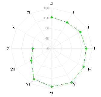
I created my own 12-hour circular graphic, which addresses my conceptual problems with the charts shown thus far. It’s actually a combination radar-XY chart, using the radar to reproduce Jorge’s nice Roman-numeral clock face, and the XY series uses Chandoo’s trig algorithms to locate the actual data.
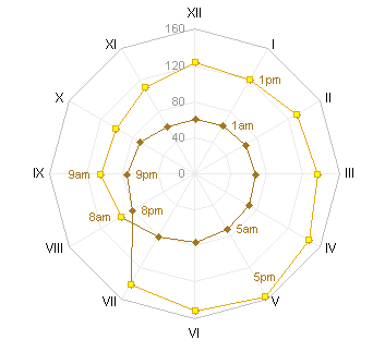
I presented this Radar-XY combination chart in Rock Around The Clock, and in Radar-XY Combination Chart I showed how I made it. This post has instructions for an easier technique that I discovered while writing up that post. There are two versions: a simple version with the same formatting for daytime and nighttime data, and a more detailed version with different formatting for daytime and nighttime data.
Simple One-Format Radar Chart
The simple chart displays all data in a single format.
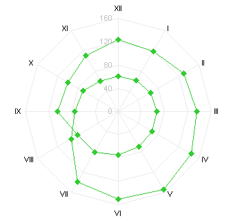
The data for the simple chart has four columns of data, with each column containing data for a six-hour period.

The four six-hour periods, depicted below, are 12 PM to 6 PM, 6 PM to 12 AM, 12 AM to 6 AM, and 6 AM to 12 PM:

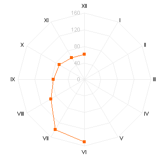

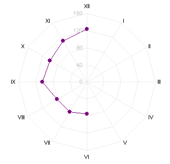
To create the chart, select the entire range A1:E13, and create a radar chart. The chart has four series which all together form a 24-hour cycle.

Simply format all series the same to obtain the single-format chart.
Detailed Day and Night Formatted Chart
This chart displays all data in two formats, one for each half of the day.

The data for the simple chart has four columns of data, with each column containing data for part of a 12-hour period. To fine tune the transitions from one format to the other, adjust how much data is contained in each column.

The four six-hour periods, depicted below, are Afternoon, Evening, Night, and Morning:


To create the chart, select the entire range A1:E13, and create a radar chart. The chart has four series which all together form a 24-hour cycle.

Simply format all series into two formats to obtain the desired chart. The chart above formats Morning and Afternoon as “Daytime” and Evening and Night as “Nighttime”.
Download RadarAroundTheClock.zip to see a workbook with sample data and charts.


Leave a Reply