I was reading Chandoo‘s post Us vs. Them – Compare Sales Performance using Charts & Form Controls, and the first step in his protocol was “Prepare your data”. I’m always telling people to prepare their data first. I tell people to spend five minutes on their data, and save themselves five hours of frustration later on. Pay me now or pay me later.
There are a number of aspects involved in preparing your data, and I’ll cover some of them here. I will concentrate on best practices for chart source data, but the principles also apply for other purposes. Factors to keep in mind are the layout of the data, both in terms of blank rows and columns in the data and whether the data is oriented by row or by column. Aspects of chart data include knowing which ranges of data are used for X and Y values and for series names, and how to get Excel to use the right data for the right parts of the chart. Finally, should you format your chart data so it looks nice in that monthly report, or should you splurge and use multiple data ranges?
Contiguous Data Layout
The best way to arrange data for Excel charts is in a contiguous rectangular range. Contiguous is a two-dollar word that means don’t skip any rows or columns. For many of its features, if you select a single cell in a range of data, Excel will expand the selection until it reaches empty rows and columns, and use that as its first guess for the range you want used.
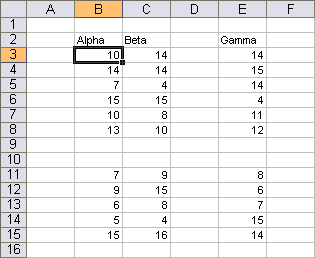
This screenshot shows a discontiguous range, B2:E15 with column D and rows 9-10 blank.
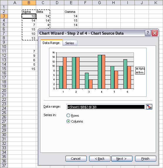
The Chart Wizard was started with cell B3 selected. Note that the highlighted range is only B2:C6. Excel 2007 handles ranges exactly the same way.
Sometimes you’re stuck with a discontiguous range. It’s usually better to convert it into a contiguous range, but if it’s for a one-off chart, that seems like too much trouble. You can select a discontiguous range and the chart wizard will accept it, or you can identify a discontiguous range in the data range selection box in the dialog, but there are rules that the range must adhere to.
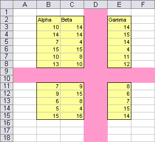
The discontiguous range must be represented as a rectangular range that is subdivided by entire rows and entire columns, like the yellow range B2:E15 below split apart by the pink-shaded column D and rows 9-10. Each area of the range must be selected as a single section: for example, the area E2:E8 must be selected in one step, not as partial sections E2:E4 and E5:E8.
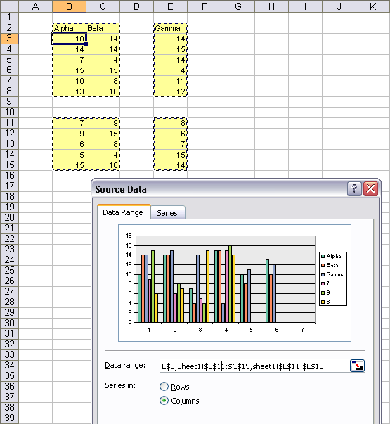
The Chart Wizard accepts this well-formed discontiguous range.
If the range does not meet the shape requirement above, the Chart Wizard will accept it, but will jump to the Series tab, and perhaps define the series mysteriously. The Data Range tab will show a message indicating that the range is too complex to be displayed.
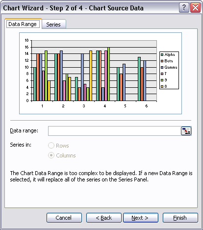
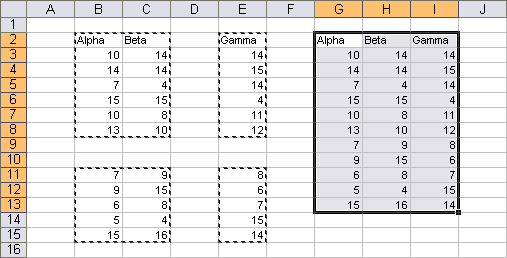
One test for a well-formed discontiguous range is whether Excel allows you to select and copy the range. You can select and copy the yellow highlighted range above. When you paste it, it will fill a contiguous range, as in G2:I13 below.
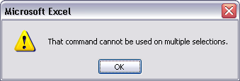
If you try to copy a range which is not well-formed, you get a misleading message that says you can’t do that with multiple selections. Actually you can do it with some multiple selections, just not the one you’ve selected.
Orientation of the Data
By definitions the data range can be laid out in two orientations: By Row and By Column. Some formulas accept 3D references that in effect have a By Sheet dimension, but for charts the data is strictly 2D.
In general it doesn’t really matter how your data is oriented. Out of habit, people probably use series data in columns more frequently. This habit probably results from several factors. First, in Excel 2003 and earlier, there are only 256 columns, which severely limits the number of points in your series. There are over 65,000 rows, which is more than twice the 32,000 points allowed in a series.
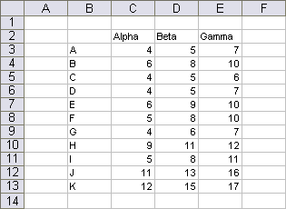
When data is extracted from a database, it generally comes in with records points) in rows and fields (series) in columns. This range may be a dataset resulting from a query of a database which returns values from fields Alpha, Beta, and Gamma for a certain set of other conditions.

When you apply an autofilter to the data,

or in Excel 2003 convert the data range to a List (called a Table in Excel 2007),
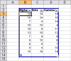
you gain the ability to filter out rows of data which meet various criteria in each column, or sort the data by columns.
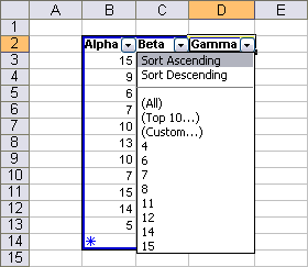
Chart Source Data
In general, Excel tries to use data in the selected range for series names and category labels (X values). When using series in columns, this generally means the first row is reserved for series names and the first column for X values.
Excel uses the text labels in the first column for category labels in this line chart.
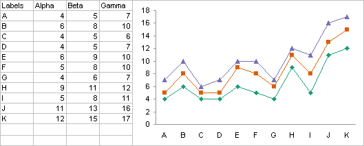
Excel uses the dates in the first column as X values in this line chart.

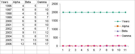
Excel doesn’t see anything special about the years in the first column below. They are numerical values, they are not text, nor are they formatted as dates. Therefore Excel considers them just another set of numbers and plots them as Y values. Of course, they lie far above the other values, which are clustered along the X axis. The X values are simply the counting numbers 1, 2, 3, etc.
That’s funny, in an XY chart with the same data, Excel uses the years as X values.

Excel’s behavior is not so hard to understand. In an XY chart, the first column is (almost) always used for X values. In a Line chart, if the first column is notably different from the other columns, it is also used for X values. This difference may be that the column contains text labels, or that it contains values formatted as dates. If the values are years, then they are not sufficiently different from the Y values for Excel to know that they should be treated differently.
Another way to show Excel that the first column and row should be treated differently is to leave the top left cell blank. Now the first column is different, because it has no header. The first row is also different for the same reason.
The line chart below was made with years in the first column, but the blank cell told Excel to use the years as X values.
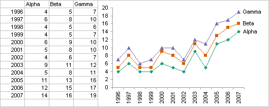
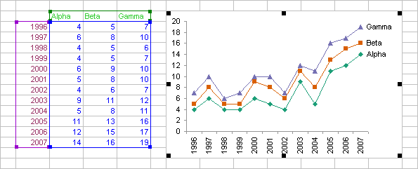
If you select the chart area or plot area, Excel highlights the source data range. The Y values are highlighted with a blue border, the X values with a purple border, and the series names with a green border. I’ve highlighted the text in the cells to match the highlighting rectangles.
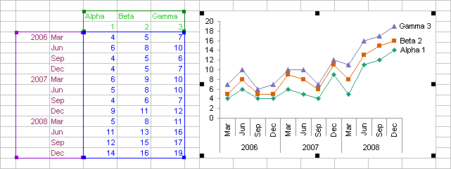
This blank top left range can be taken further. For example, in the range below, the top two row by two column range is blank. Excel uses the first two columns (under the blank cells) for a two-level set of category axis labels, and the first two rows (alongside the blank cells) for a set of two-cell series names. Excel highlights these ranges using the same color scheme.
Multipurpose Data vs. Multiple Copies of the Data
We’ve seen how the source data for a chart might be best laid out like this:

while a financial report may have a table with this formatting:
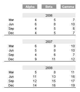
The source data for a pivot table may look similar to the chart’s data, with its blank cells filled in:
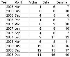
or it may use actual dates in one column rather than years and months in two:

When you have several uses for your data, and each requires a slightly or greatly different layout, what do you do? It will take hours to try to create a decent chart from the financial report’s fancy layout, with its centered labels and blank rows and columns. You’ll never make a proper pivot table from the chart source data or from the financial table.
Back in the day, computer storage came at a premium, and you conserved every byte you could. Since data was stored on magnetic tapes and punch cards, it wasn’t only memory but also reading and writing of the data that was limiting. Nowadays we have terabyte drives for under $1 per GB, which can transfer data at rates of several GB per minute. It is illogical to try to improve storage efficiency by conserving a few bytes here and there. This paradigm has left the building.
The solution is easy. Compile a master table of data, then make several copies of the data that link back to this table. The links keep the copies in synch with the original, while each copy of the data can be rearranged to suit a specific purpose.
Create a worksheet with the source data for a pivot table. Place the source data for a chart on another sheet, and if you have multiple charts that require unique layouts, go nuts! Create as many data sheets as you have charts. Link your data into one table that’s optimized for on-screen viewing, and another table that’s formatted just perfectly for that report you print out for the boss every week. Once created and linked, these tables practically maintain themselves.


Colin Banfield says
Jon, solid article. A couple of things regarding Excel defaults that might have been worth mentioning:
By default, if the data range contains more rows than columns, Excel uses the row data to create the category axis labels (the actual labels used are based on having a column header or not, as you mention). However, if there are more columns than rows or a tie, Excel instead uses the column data to create the category axis labels (the actual labels subject to similar criteria as noted before).
Then there are the default labels and series names applied when no explicit row or column labels exist – not often a good thing…
Jon Peltier says
Colin –
Thanks, I should add this to the article. Note hat in 2003 and earlier, if the number of columns is greater than or equal to the number of rows, then the series are plotted by row. I have a fuzzy memory of 2007 working differently, but I’m too lazy right now to check.
Colin Banfield says
Jon, in Excel 2007, the behavior is identical.
Jon Peltier says
Thanks Colin. I must be thinking of something else. Now what is it about Excel 2007 charts that are different from Excel 2003 charts…?
Colin Banfield says
Everything else? :-)