Microsoft introduced Sparklines as a native feature of Excel 2010. In a rare guest post, Sparklines For Excel vs. Excel 2010 Sparklines by Alex Kerin of Data Driven Consulting compared this new feature to existing third-party sparkline add-ins for Excel. In Sparklines and Data Bars in Excel 2010, I gave an introduction into how to use the new sparkline feature, demonstrated some of the options available for Excel 2010’s sparklines, and also showed how Excel 2010’s implementation of Data Bars was far superior to the original Data Bars in Excel 2007. I’ve also shown How to Make Horizontal Bullet Graphs that can be fitted into the cells of a dashboard.
While it’s good to see sparklines as a native Excel feature, the Excel 2010 implementation is rudimentary, and third-party sparkline products have more functionality and more features than the native Excel sparklines. Yet it’s not necessary to deal with add-ins in order to realize expanded sparkline capabilities in Excel. Excel’s regular charts can be used to create decent sparklines, and this article will show you how.
Native Excel 2010 Sparklines
It’s easy enough to insert sparklines into an Excel 2010 worksheet. First, make sure you are not in “Compatibility Mode”. Compatibility Mode means the active workbook is as compatible as possible with Excel 2003; the most obvious feature is that the worksheet grid has the Excel 2003 numbers of rows and columns, not the expanded grid introduced in Excel 2007.
Select the data range or the location for the sparklines, and click one of the Sparklines buttons on the Insert tab. In this example, I selected the range where I wanted the sparklines to appear, then clicked the Column Sparkline button. The dialog shows the selected range in the Location Range edit box.
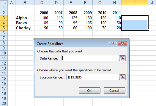
Then I selected the data range, which appears in the Data Range edit box. For some reason, the Location Range edit box is cleared (and each box clears itself when the other box is edited), but Excel remembers the selected range.
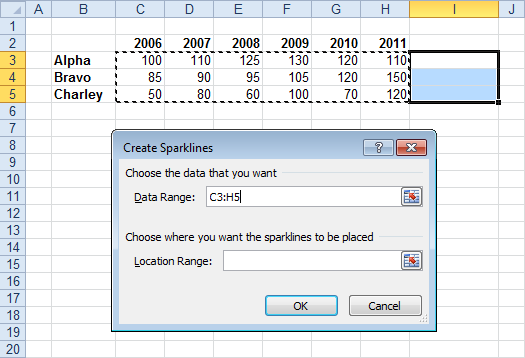
Here are the sparklines with the location range still selected.

Finally, here is the table with sparklines, with the active cell out of the way.

Create Sparklines From Regular Charts
The protocol for generating your own sparklines using regular charts is presented below. This protocol works well in Excel 2010 and 2007. In earlier versions of Excel, charts have a border of several pixels around the plot area, so the chart area must be sized larger than the cell you want the sparkline displayed in. In earlier versions, there is also a limit to how much the chart can be shrunk and still show the entire plot area, so you’ll have to shrink the chart only partway, then shrink the plot area to a smaller fraction of the chart area size.
Keep in mind that while you can use regular charts for sparklines, the small size of a sparkline limits the amount of information you should try to cram into one. Leave out labels and limit yourself to about two series maximum in any given sparkline.
Start creating your sparkline by selecting the data for a single series.

Insert a chart of the desired type. This is a typical Excel 2010 column chart.

Now simplify formatting. Below left shows the chart with the chart area border removed and the chart and plot areas made transparent, so borders and cell fill colors show through. Below right, the legend and any axis and chart titles have been removed.

The bars have been widened in the chart below left (by decreasing the gap width to 50%), and the major unit of the Y axis has been set to a small value, below right.
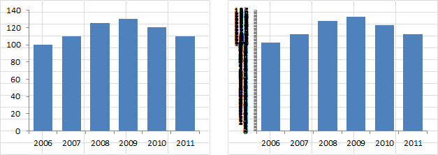
The axes have been hidden by selecting “None” for axis tick marks and axis tick labels and choosing “No line” for the axis line color. Note the size of the plot area within the chart.

For best results, extend the plot area almost to the left and right edges of the chart, and stretch the bottom of the plot area to the bottom of the chart. Leave a large margin between the plot area and the top of the chart. In fact, you may have to increase this top margin in the sparkline, after the chart has been shrunk to fit a cell.
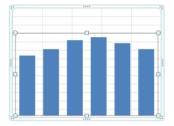
Finally, shrink the chart and position it over the appropriate cell. If you hold down the Alt key while moving or resizing the chart, the chart edges will line up with the cell boundaries. If necessary, shrink the plot area from the top to increase the margin.

When all of the necessary formatting has been applied to the sparkline, and nothing else needs to be done, copy the sparkine and paste it into each of the other cells that need a sparkline. If you hold Ctrl and Alt while dragging the chart, a copy of the chart will be dragged into and aligned with the next cell.

All the charts are formatted identically. They also use the identical data, so let’s fix that.
Select the first sparkline. Notice how the source data is highlighted in the worksheet.

Select the second sparkline. Notice how the highlighted data is from the first row. So is the highlighted data for the third sparkline.

You could change the source data by choosing Select Data from the Chart Tools > Design tab, or from the right-click menu. You could also edit the chart series formula. But the easiest way to adjust the chart data is to drag the range highlight with the mouse. Move the mouse over the highlight until its border thickens, then drag it to the new range. If you’ve selected the plot area or chart area, both the series name and the Y value highlights move together. If you’ve selected the series itself, the series name and Y data must be changed separately.

Correct the third sparkline’s source data in the same way.
Here is the finished table with sparklines. Looks like the built-in sparklines.

You can use any chart type: here’s a line chart with markers.

Why Use Regular Charts?
There are a number of reasons to use regular charts rather than the built-in Excel 2010 sparklines.
Excel Version
One obvious reason is that you might not have upgraded to Excel 2010. If you’re using Excel 2007, the techniques shown here work the same way.
In Excel 2003 and earlier, the chart imposes a thicker border between the plot area and the chart area, so you have to oversize the chart to make the plot area fit as intended. Also, in earlier versions, the plot area only shrinks a certain amount within the chart area, so further shrinking of the chart truncates the plot area. The chart area can only be shrunk so far, but the plot area can be reduced further without shrinking the chart. The result is a chart that’s substantially larger than the cell it covers, but making the plot and chart areas transparent makes this no problem.
Mouseover Information
An important feature of a regular chart that is lacking in a sparkline, is the ability to mouse over a point and read relevant information from a popup. This is very useful in an interactive dashboard.

Combination Charts
What if you want to compare a time series to other data, such as a target value.
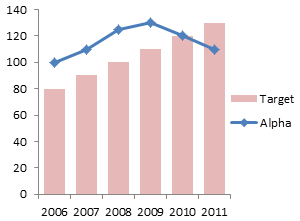
Native sparklines can only plot one timeline, while a regular chart has more flexibility (as do some of the third-party sparkline programs).

Remember the limited resolution of a cell-sized chart: adding the simple target data to these sparklines is almost not worth the effort.
Other Embellishments
You may wish to reverse the vertical axis. For example, your costs are probably reported as positive numbers, but you want to show them as negatives.

Native sparklines do not support reversing the vertical axis, but regular charts do.


teylyn says
Nice post. That certainly comes in useful for pre-2010 versions. If you have 2010, though, combination charts are possible with 2010 Sparklines, too, albeit with a little bit of tricking. See http://www.teylyn.com/how-to-create-a-stacked-column-sparkline/
cheers, teylyn
Jon Peltier says
Teylyn –
That’s a clever way to extract more out of Excel than Excel thinks it can do. I have a comment and a concern.
Comment: Whether your workaround or mine takes more effort is probably a matter of opinion, though I’d opine that using shrunken real charts provides more flexibility.
Concern: In earlier versions of Excel, having too many linked pictures leads to severe performance. “Too many” may be as few as one or two dozen. I haven’t tried this in Excel 2010, but there’s no reason to expect better behavior than in Excel 2007 or 2003. How extensively have you applied your trick in a single worksheet?
derek says
When I looked at the Excel 2010 sparkline bars you show, I was confused by the apparent smallness of the values around 80 or so. Then I realised the sparkbars are being shown with a non-zero origin! Yet another reason to use proper charts.
Jon Peltier says
Derek –
Good point, I hadn’t noticed. You can impose axis limits on sparklines. When I revisit this article (I should do so in a couple weeks) I’ll include that setting.
That also reminds me that I set my minimum to zero on the shrunken charts, but forgot to account for the maximum. I have a way to do that which keeps the axis limits the same on related charts with different data. That’s a worthwhile blog post, which I’ll then reference here.
Jeff Weir says
Hi Jon. I’ve previously used this a lot, as per my comments at https://peltiertech.com/sparklines-for-excel-vs-excel-2010-sparklines-guest-post/
THe advantage over Excel’s native functionality for me was the ability to have multiple series. As per the example in the link above, three series can be put to good use in a sparkline.
I’ve just been working on a sparkline tool that connects dynamic excel graph sparkline to a pivottable in Excel 2010 that might be useful to readers. Plan on turning it into a commercial addin (along with some other pivottable trickery I’m working on), but meanwhile here’s my first cut.
It creates sparklines out of graphs that respond to changes in a pivot table structure. For example, it can handle:
* movement of fields between the Report Filter and Row fields
* addition of more source data including additional dates
* addition or removal of subtotals or grand totals.
* expansion or contraction of number of rows in the pivottable beyond the number of sparklines that currently exist. (i.e. extra are added or deleted as required)
No error handling yet…this is my first cut.
The code
* Counts how big the pivottable (pt) DataBodyRange is
* Works out how many sparklines are required given the DataBodyRange
* Adds named ranges corresponding to the last 12 months data for each row, and also the previous 12 months data for each row
* Amends where each sparkline series points to, in case the pivot structure has changed
* Sets the .MaximumScale of each sparkline axis to be 120% of the largest data point in the series. This way, each sparkline uses the full space available to display the trends, while allowing for a bit of space between its highest entry and the sparkline above.
I’ve uploaded a screenshot to https://skydrive.live.com/redir.aspx?cid=f380a394764ef31f&resid=F380A394764EF31F!283&parid=root and will also try to embed it below.
Have uploaded sample workbook to https://skydrive.live.com/redir.aspx?cid=f380a394764ef31f&resid=F380A394764EF31F!284&parid=root
——————–
Hmmm…Skydrive seems to be playing up. Heres a link to the screenshot on google docs:
https://docs.google.com/open?id=0B1hgC5lSuLjVYTRmNTFhOWYtNDQwMC00MGI1LWFlZWQtMGExODRmYjBmMzIw
And here’s the workbook:
https://docs.google.com/open?id=0B1hgC5lSuLjVZmZiMjBmYWItZTlhOS00NWYzLWE3M2YtOWZhMDc2MjgwNjdl
Michael Pierce says
This is something that I’ve messed around with before, but your approach pointed out a few things I hadn’t considered before. So I have a few questions for you:
(1) Why do you set the major units on the vertical axis to “something small” (I used a value of 1)? It seems to cause the bars to use the vertical space more effectively, but I can’t come up with a reason why it would do that.
(2) Have you thought of deleting the horizontal axis rather than removing the tic marks, labels and line? Doing so seems to give the chart more vertical breathing room.
(3) Do you think it’s important to keep the vertical scale consistent across the multiple charts? For example, the Bravo data points cause the upper limit to reach 160, whereas the other 2 series only scale to 140.
(4) For a line chart, does it make sense to adjust the vertical axis minimum value to something other than zero? The charts end up being so squished vertically, most of the curve disappears. I know this is generally a bad thing to do with full size charts, but was wondering if the minimal size might allow for bending of that “rule.”
Greg says
Your tip on compatibility mode is what I needed to know……..I couldn’t figure out why my Sparklines were Grey’d Out. Thanks.
Tim says
Is it possible to have the color of a Sparkline change according to the slope of the graph? I used the SLOPE function to determine if the slope was positive or negative and then tried to use Conditional Formatting to make the Sparkline red (negative slope) or green (positive slope). I was able to format the Fill this way, but could not figure out a way to have the graph line change accordingly.
Jon Peltier says
Tim –
If you use real chart sparklines, you can use the technique in Conditional Formatting of Lines in an Excel Line Chart Using VBA to format the lines according to slope.
Joris says
Hi,
I’m trying to have sparklines with flexible ranges. for this I’m using an offset formula, but it seems that this is not possible, or I must be doing something wrong. I have evaluated the offset formula and this one is correct. the only additional information I can give you is that the source data is an output of an external access table and that it is on a different sheet than where I would like to have the sparkline.
any ideas?
Jon Peltier says
You don’t show the formula or describe how you tried to implement it.
Check out Dynamic Charts on this blog to make sure you’re using the formulaic approach properly.
Joris says
Jon,
Jon,
This is the offset formula I’m using:
OFFSET(MRP_DATA!$A$1;MATCH(MRP_Workfile!B90;MRP_DATA!B:B;0)-1;8;COUNTIF(MRP_DATA!B:B;MRP_Workfile!B90);1)
I just put this one in the data range of the sparkline.
My intention is to show a forecast trend from my detail data page which has multiple rows per item, as a sparkline in the overview sheet which has just one line per item
Jon Peltier says
Joris –
Data entry boxes like those for the sparkline source data and regular chart data can only accept link formulas, not calculated formulas. They must be links to cell references or range names.
Define a name as in the examples in the article I cited previously, then link to this name as in these examples.
Joris says
Jon,
Thanks, that indeed worked for me.
Jim says
Hey Jon
What’s best way to dynamically update sparkline data range? I have a running weekly sales performance dashboard and would like the sparkline to incorporate the new column that gets added when I update the SQL query that feeds the Pivot Table. I assume some combination of offset and index to get the full range of the table? Thanks in advance!!
Jim
Jon Peltier says
Jim – I would try the same offset dynamic name approach that works for other purposes.
Dan says
Have you encountered any bugs with Sparklines in Excel 2010? I ask because I am showing dips in my sparkline when all values are 100%. I was expecting a flatline. The 100% is a sum formula. But I already checked that all values are truly 100% (no rounding issues). I did this check by cell=1 and observing that it checked out to true. Also added all 100% and made sure it added to a whole number…I’m perplexed. I want to know if others have encountered this.
BTW I also checked that my range is refer to the proper range.
Jeff Weir says
Dan: I too have come across this. Turned out the issue in my case was that the axis minimum was set to Auto. Try setting the axis min to zero. I know this shouldn’t make a difference, but it did in my case. Seems to be ue to some mysterious way that Excel interprets the same value entered in several cells. Probably some math whiz will leave a comment here about floating point errors or suchforth.
Jeff Weir says
Jon: I’ve been punching up some code to automatically generate 2-series sparklines based on a PivotTable date range, and I noticed a couple of weird things that I wonder if you have workarounds for.
Firstly, I find that it’s not enough to set the .plot top and left to zero, because there is still a margin between the plot area and the top and left of the chart-object. You can see this in the image at the following link. The first minichart shows what I get if I use zero. The second shows what I actually want.
http://screencast.com/t/fe34x7DMtD
I get around this by feeding large negative numbers to PlotArea left and top, like so:
cht.Parent.Activate
With cht
.PlotArea.Top = -.Parent.Height
.PlotArea.Left = -.Parent.Width
.PlotArea.Height = .Parent.Height
.PlotArea.Width = .Parent.Width
And secondly, while this works, I have to activate the chart as per that first line of code first, or I get the following error:
Method ‘Top’ of object ‘PlotArea’ failed.
(Strangely, when I step through the code after that error, it works fine).
No big drama selecting the chart. But this kind of unexpected behavior adds hours of debugging and troubleshooting to my development time. You come across this?
I thought this may have been related to your comment at http://www.pcreview.co.uk/threads/plot-area-resize.1785085/ but temporarily shrinking the plot area didn’t make any difference.
Jon Peltier says
Hi Jeff –
I find if I make a chart fit exactly over a cell, this will almost fill the chart with the plot area, without having to activate the chart:
The plot area reaches the top, left, and right edges of the chart, and leaves an unbreachable 3 or 4 pixel margin at the bottom. So I usually cheat and make the chart object slightly larger than the cell it covers, extending below the cell by the width of this margin.
But this kind of unexpected behavior adds hours of debugging and troubleshooting to my development time. You come across this?
All the time.
I just finished a big batch of programming to export large numbers of Excel charts to PowerPoint. I had to allow time for every little operation, like inserting a new slide (the file has to be updated, and the screen needs to be redrawn, and PowerPoint doesn’t have Application.ScreenUpdating), and even copying the Excel chart (the clipboard takes time to update its contents). I allowed for some time by putting different operations into functions that my main code calls, and I also used a liberal amount of DoEvents.