In the wake of the Mark Sanford scandal, in which the South Carolina governor was accused of hiking in the Andes with his mistress or something, political blog FiveThirtyEight has published results of surveys about Sanford in Should Sanford Resign?. I was pointed to the FiveThirtyEight survey results by Andrew Gelman in Doing graphics the George Orwell way, and he got it from Should Mark Sanford Resign?. Andrew’s take is that the pie charts used by FiveThirtyEight to present the survey results weren’t as bad as they first looked.
Polling and Election Results on FiveThirtyEight
I’ve stated in this blog that the FiveThirtyEight web site uses pie charts in a very effective way. It helps that there are only two or three segments in their pies, and the third, if present, is very small. Here is a partial view of the FiveThirtyEight analysis of the November 2008 US elections.
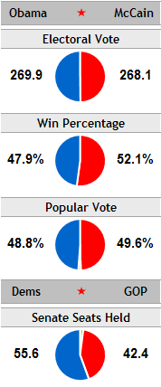
This isn’t a full-blown Chart Busters article, but I thought I’d discuss some alternatives.
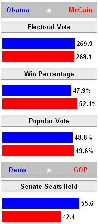
In an unfinished post from last fall, I undertook to replace FiveThirtyEight’s pies with bars, using roughly the same amount of space. The bars may have slightly better resolution, but I didn’t include a third bar for the third tiny segment. Take your pick.
Survey Results
FiveThirtyEight used pie charts to illustrate the survey results. As every second grade student will tell you, pies are the chart of choice when showing parts of a whole. The educational system has trained our children to behave like sheep, and follow the herd.
Editorializing aside, these charts of the poll results are what motivated this post.
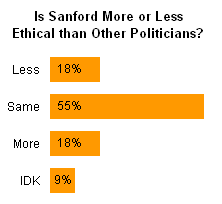
Is Mark Sanford more or less ethical than other politicians?
FiveThirtyEight didn’t even change the Excel defaults for their pie. Black chart border, ugly fill colors, and way more space everywhere than needed, especially on either side of the chart. It’s nice that the data points are labeled, but they are only partially labeled with the percentages, and the reader still must journey back and forth to the legend to see which segment means what. I also think it’s useful to put the results of a poll not in numerical order (55%-18%-18%-9%) but in some value order of the categories (more-same-less).
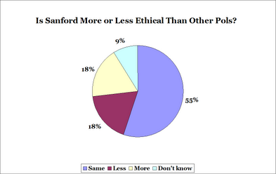
I have redesigned the pie chart, shrinking the white space and using arguably better colors. I also reordered the points, and centered the chart differently to try to make comparisons easier.
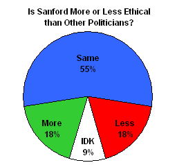
All well and good, but without the percentages, it’s still a guess whether More or Less had a greater response.
So I pulled a bar chart out of my magic hat. We can see that most of the cynical poll responders think Sanford’s ethics are no different than the other politicians, and equal numbers thought he was more ethical and less ethical. 9% have been busy watching Real Housewives and don’t know who Mark Sanford is.
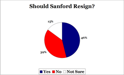
Should Mark Sanford Resign?
FiveThirtyEight used another pie to show whether respondents want Sanford to resign. The colors have been changed from the gruesome defaults, but the large wasted spaces remain, as does the legend and border. Also, FiveThirtyEight didn’t use its usual style where competing results A and B meet at the vertical line at 12 o’clock.
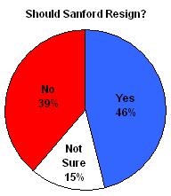
I’ve addressed these stylistic issues in my own version of the pie chart, and it doesn’t totally suck.
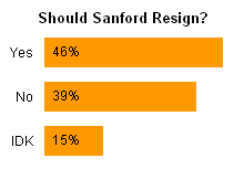
Here’s the obligatory bar chart. Apparently 15% of the respondents think he should stay at the junkyard with his son.


jeff weir says
I weakly prefer the pie charts, but I’m gonna be a political party pooper here…I don’t think it matters what kind of graph you use to address a question like “Is Mark Sanford more or less ethical than other politicians?” …especially with public opinion being as fickle as it is, and given the lack of any relevent cause and effect relationship between the hypothesis and the variables.
In other words, the data lacks the ‘so what’ factor.
Jon Peltier says
Jeff –
This particular set of data lacks the “who cares”, but you could apply the reasoning to a more interesting question like “Which is your favorite Michael Jackson album?” Well, for me, that lacks the “so what” factor too, but you get my drift.
jeff weir says
For sure. Unfortunately these are the kinds of rather meaningless questions that clutter up the newspapers.
In hindsight, it would have been good to ask “Is Michael Jackson more or less ethical than other musicians?” a couple of months ago, then ask it again now, in an attempt to gauge public fickleness or otherwise.
Cheers Jon
Naomi B. Robbins says
This comment only addresses the color choice where Jon says “using arguably better colors.” I placed the original Excel colors and Jon’s colors in vischeck (www.vischeck.com) to see how vischeck says a person with color vision deficiencies (politically correct term for colorblind) would see them. I’m showing how a deuteranope (one form of color vision deficiency) would see them but the other forms are similar. Note that a reader with color problems cannot distinguish the red and green of PeltierPie2 bit can with ExcelPie2.
Jon Peltier says
Naomi –
Thank you for reminding me about color vision deficiencies. I’ve reproduced your experiment here using the image tester at VisCheck. The Excel default colors are to the left, my colors to the right.
Original Colors
Deuteranope (a form of red/green color deficit)
Protanope (another form of red/green color deficit)
Tritanope (a blue/yellow deficit- very rare)
Naomi B. Robbins says
I just want to make it clear that I am not recommending the original Excel default colors. There are many attractive color schemes that all readers can interpret. I also want to take back my comment that the protanope and tritanope were similar to the deuteranope for this example. Clearly, from Jon’s figures above, we notice that the colors they see they are distinguishable.
Chris Read says
Jon,
Just popped onto FiveThirtyEight’s website to see what they’re all about. It seems they have employed someone who’s just been shown how to start Excel, given their shockingly novice charting skills. Here’s another to cringe at:
http://www.fivethirtyeight.com/2009/07/challenge-to-climate-change-skeptics.html
Among the many faults, you’ve got to love a 90 degree head tilt to read x-axis labels…. I look like my West Highland Terrier when he’s trying to work out what I’m saying.
Very interesting comments on VisCheck, I shall definitely be keeping this in mind in future applications!
Chris
Jon Peltier says
I have thought much of what 538 has posted is well done, especially around last fall’s election, but occasionally they miss. The climate change chart wasn’t terrible; they could have used more care with labeling and a lighter touch with the lines.
Thanks to Naomi and VisCheck, looks like I will have to change my default palette again.
Tim Wilson says
Hah! I read the post and had the same thought Naomi had and went and did some poking around with http://colorfilter.wickline.org/ before I scanned the comments. I checked the most common form of color-blindness, deuteranomaly, which is the most common form (affects ~4.9% of men) and the charts work fine. Deuteranopia affects ~1.1%, and there is an issue there, although I was still able to distinguish between the two wedges in question.
BUT, the larger point…is that color blindness (and “printing on a black-and-white printer” and “photocopying”) is another reason that a bar graph often trumps a pie chart — what takes multiple colors (or horrid patterns, or evil color palettes) in a pie chart can often be done monochromatically with a bar graph.
I actually hope to get around to developing an Excel color palette that is both aesthetically pleasing to people without any color deficiency *and* that works for those with the most common forms of color blindness (there are, I think, four different forms of color blindness that occur in roughly 1% of men or more). I did some experimenting with Excel 2007 a while back to at least check their default palette: http://www.gilliganondata.com/index.php/2009/06/18/data-visualization-that-is-color-blind-friendly-excel-2007/
As for fivethirtyeight.com, some of their sidebar charts during the election actually confused me — lots of information crisply presented, but I often found myself wishing for an easy link to an explanation of how to interpret them.
Jon Peltier says
Tim –
Thanks for your comment. I recall seeing your post some time back, and thinking that, hey, Microsoft DID do something right with all those enhancements to Excel 2007’s colors. Then I promptly forgot about it.
The ColorBrewer utility I’ve blogged about doesn’t correct for color vision deficiencies, but it at least indicates whether a selected palette is good, iffy, or bad for someone who has difficulty distinguishing colors.
Naomi B. Robbins says
Here’s another resource on color. It’s a master’s thesis written under Cindy Brewer.
From http://www.personal.psu.edu/cab38/ColorBrewer/ColorBrewer_updates.html
“Steve Gardner’s Master’s thesis evaluated the ColorBrewer schemes for colorblind readers. I’ve linked his whole thesis with his permission (6.1MB .PDF file or 5.5MB zipped which isn’t smaller but it may download more smoothly). He has recommendations that I have not yet incorporated into the schemes, so I want to get that info out to you. Please cite his work if you find it useful. Also, I hope his work prompts further student research. Steve is now working at the National Geographic Society.”
Jon Peltier says
I just remembered an interesting story about a college friend. He had a part time job for the phone company, connecting the wiring for phone lines coming into the dorms and going up to the rooms. Well, Wayne was colorblind, so he was unable to see the color coding on the small wires. Much of his work didn’t require this, but when he was hooking up the specific wires fpr specific phone lines, he’d have to ask one of us to lend a hand (or an eye).
Jon Peltier says
Thanks for the link. I’ve been reading up on color vision, and how the human three-receptor system gives rise to what we think of as color vision. Absence or deficiency in one or another type of receptor gives rise to the various color vision deficiencies.
Most placental mammals have only two receptor types, leading to reduced color discrimination. It is thought that a mutation in early primates split one of the receptor types into two types, giving primates improved color vision. This is nothing compared to birds and reptiles, which have four or five types of receptors (depending on species), extending into ultraviolet. We can’t imagine the richness of colors in their world. See Color Vision in Birds for a nice overview, or Color Vision of Birds for the gory details.